Introduction
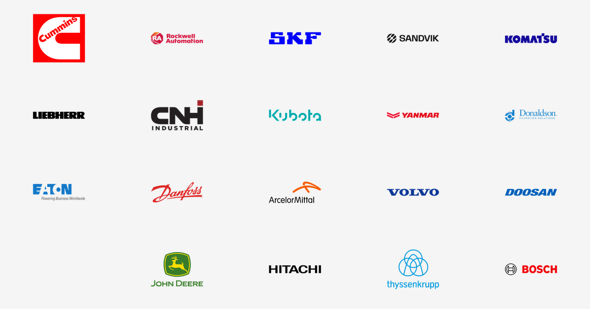
Industrial logos do not try to be pretty. They are painted on engines, bolted to cranes, stamped on steel and read from across a factory floor, so they have to work in one colour, at small sizes, and after years of dust and weather. To mark the launch of our new Industrial & Manufacturing category on VectorDose, here are 19 of the biggest names in heavy industry — the engine builders, the machine makers, the automation firms and the steel giants — what each mark looks like, and why it looks that way.
Note on the three names at the end: Bosch, Hitachi and ThyssenKrupp were held back during sourcing on 23 October because their bare slugs were shadowed by subsidiary products. A live check on 25 October confirms all three now resolve to their own logo pages at the links below, so all 19 brands in this roundup are included on the same footing.
Engines and Power
Cummins — the red C. Cummins, founded in Columbus, Indiana in 1919, builds diesel and natural-gas engines, power-generation equipment and filtration systems. Its mark is a bold red C, #FF0000, with the company name swept across it in white — a letter that reads as both an initial and a piston ring.
Yanmar — the flying Y. Yanmar, founded in Osaka in 1912, built the world’s first commercially viable small diesel engine in 1933 and still makes engines, farm machinery and marine propulsion. Its red #E20D1B lockup pairs a flying-Y symbol with the name, a mark made for engine housings.
Volvo Group — the blue spread wordmark. AB Volvo, founded in Gothenburg in 1927 and entirely separate from Volvo Cars, builds trucks, buses, construction equipment and industrial engines. Its official blue #0D3896 spread wordmark is filed here at volvo-group, because the bare volvo slug belongs to an unrelated product.
Doosan — one blue word. Doosan Group traces its history to a Seoul store opened in 1896, and its industrial core now builds power plants, turbines and desalination facilities. The current mark, refreshed in 2022, drops the old tilted-squares lockup for a single blue #005EB8 wordmark.
Heavy Machinery
John Deere — green and yellow, leaping deer. Deere & Company, founded in 1837 when blacksmith John Deere built a self-scouring steel plow in Illinois, makes agricultural, construction and forestry machinery. Its flat badge — a yellow deer leaping inside a green shield, #387C2B and #FFDD00 — is arguably the most recognised badge in agriculture.
Komatsu — the deep blue name. Komatsu, founded in 1921 in Ishikawa, Japan, is the world’s second-largest maker of construction equipment after Caterpillar, and also makes mining and forestry machinery. Its mark is the company name in deep blue #140A9A, with nothing else to distract from it.
Liebherr — a name, in black. Liebherr, founded in 1949 by Hans Liebherr, who invented the mobile tower crane, is still family-owned and spans cranes, earthmoving and mining machines, aerospace components and refrigeration. Like Hitachi, it bets everything on the word itself, in black #000000.
Kubota — the teal script. Kubota, founded in Osaka in 1890, is Japan’s largest tractor maker and a global leader in compact tractors and diesel engines. Its teal #00A8AB script is unusually soft for heavy machinery — a signature rather than a stamp, which is exactly why it stands out on a tractor bonnet.
CNH Industrial — the merged giant. CNH Industrial was formed in 2013 by merging CNH Global with Fiat Industrial, and designs agricultural machinery under Case IH and New Holland, construction equipment under CASE, and FPT powertrains. Its mark pairs near-black #231F20 with a deep red #A32428.
Automation and Controls
Rockwell Automation — red and orange control. Rockwell Automation, headquartered in Milwaukee with roots back to 1903 and the Allen-Bradley business, is a world leader in industrial automation and digital transformation. Its 2019 mark uses crimson #CD163F with orange #F58025, the colours of a control panel at work.
Eaton — power, in blue. Eaton, founded in 1911 beginning with a gear-driven truck axle, is now a power-management company whose electrical and industrial components manage power in data centres, aircraft, vehicles and factories. Its full lockup pairs blue #1478C7 with near-black #221E1F.
Danfoss — the red signature. Danfoss, a Danish engineering group founded in 1933 by Mads Clausen, who began making expansion valves for refrigeration in his parents’ attic, is still family-owned and leads in drives, hydraulics, heating and cooling. Its mark is a red #D92826 signature script — the founder’s hand, kept as the logo.
Donaldson — filtration, in blue. Donaldson, founded in 1915 when Frank A. Donaldson built a simple air cleaner to stop dust destroying a farmer’s tractor engine, now makes filtration systems for air and liquids worldwide. Its mark is a clean blue #117FCA wordmark, the colour of clean air itself.
Bosch — the armature in a circle. Robert Bosch GmbH, founded in Stuttgart in 1886, is the world’s largest supplier of automotive components and also makes power tools, building technology and industrial systems. Its circular symbol is a drawing of the magneto armature that made the company, in black, beside the name in red capitals, #ED0007 and #000000.
Hitachi — seven black letters, redrawn for 2025. Hitachi, founded in Tokyo in 1910 by electrical engineer Namihei Odaira, began as a repair shop inside a copper mine and now spans digital systems, energy, railways and industrial equipment. Its 2025 redraw gives the black #000000 wordmark squarer, steadier letterforms — the first full refresh in decades.
Bearings, Tools and Steel
SKF — the blue bearing maker. SKF, founded in Gothenburg in 1907 after Sven Wingquist invented the self-aligning ball bearing, is the world’s largest bearing maker. Its current 2025 logotype is a vivid blue #0000FE — if it rotates, SKF probably made the bearing inside it.
Sandvik — black, since 2023. Sandvik, a Swedish engineering group founded in 1862 in Sandviken, where Göran Fredrik Göransson first used the Bessemer process to mass-produce steel, now leads in metal-cutting tools and mining equipment. Its 2023 identity retires the old blue boxed mark for plain black #101010 capitals.
ArcelorMittal — orange and black steel. ArcelorMittal, headquartered in Luxembourg City, is the world’s largest steel producer, created in 2006 when Mittal Steel took over Arcelor. Its mark pairs a hot orange #F25900 with black #000000 — molten metal, cooled into a wordmark.
ThyssenKrupp — three rings, tied in a knot. ThyssenKrupp, formed in 1999 by the merger of steel rivals Thyssen and Krupp, spans steel, materials trading, components and marine systems. Its mark loops three blue #0095D8 rings into a single knot above the name in lowercase — Krupp’s 1875 railway-tyre rings, retied for a merged company.
Conclusion
What ties these 19 marks together is restraint. Almost none of them uses a picture for its own sake: a letter, a ring, a badge or a signature, drawn once and then left alone for decades. That is why they survive on machines — and why they are so useful as downloads, whether for a presentation, a repair manual, a classroom slide or a design mockup.
Download every logo in this roundup in SVG and transparent PNG formats, free at VectorDose — each brand’s page also lists its official brand colours.