Brand Colors
ThyssenKrupp Logo
Download a clean vector or high-resolution PNG, or copy the SVG source directly into your project.
Logo summary
About the ThyssenKrupp Logo Logo
Introduction
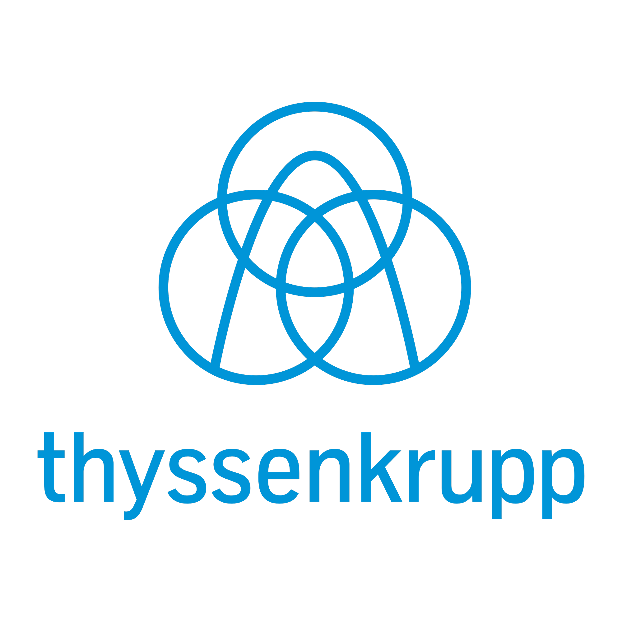
The ThyssenKrupp logo loops three blue rings into a knot above the merged name in lowercase. Download the ThyssenKrupp logo in SVG and PNG formats below, free at VectorDose.
Brand Overview
ThyssenKrupp AG is a German industrial and technology group headquartered in Essen, formed in 1999 by the merger of steel rivals Thyssen and Krupp — houses founded in 1811 and 1812 respectively. The group spans steel, materials trading, industrial components, marine systems (including submarines) and the elevator heritage now carried by its former TK Elevator business.
- Introduced: 1999, Germany
- Formed by: Merger of Thyssen AG and Friedrich Krupp AG
- Industry: Steel, materials, components & marine systems
- Website: thyssenkrupp.com
History of the ThyssenKrupp Logo
Both parents brought famous marks to the 1999 merger: Krupp’s three seamless railway-tyre rings, trademarked in 1875, and Thyssen’s arch. The combined company kept the rings’ idea in a new form — from 2015, three interlaced blue rings drawn as one continuous knot, above the joint name restyled in friendly lowercase as “thyssenkrupp”. It is a rare merger logo that literally ties the partners together.
Meaning of the ThyssenKrupp Logo
- The ring knot: three rings interlaced in one line — two centuries-old firms and their people, inseparable by design.
- The lowercase name: a heavy-industry giant deliberately writing itself small — approachability as strategy.
- Engineering blue: the rings are drawn in the blue of blueprints and of the Rhine-Ruhr steel country.
ThyssenKrupp Logo Colors
| Color | Hex | RGB |
|---|---|---|
| ThyssenKrupp Blue | #0095D8 | 0, 149, 216 |
Conclusion
Two rival dynasties tied in a single blue knot: the ThyssenKrupp logo is the merger drawn honestly.
Download the ThyssenKrupp logo in SVG and transparent PNG formats, free at VectorDose.