Introduction
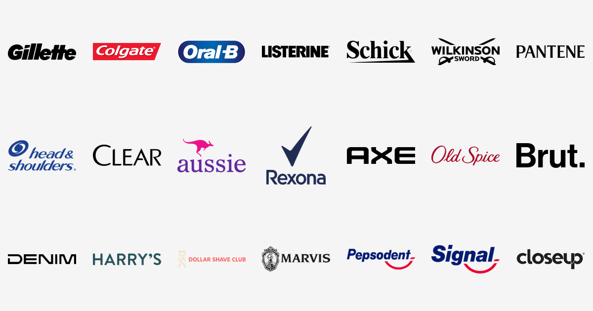
Personal care brands make the most private promises in retail: a closer shave, a brighter smile, hair that behaves. Their logos have to carry those promises from a crowded bathroom shelf, often in a single colour and a handful of letters. To mark the launch of our new Personal Care & Grooming category on VectorDose, here are twenty-one of the most famous personal care and grooming brand logos, what each mark shows, and the story each one is quietly telling.
1. Gillette — The Slanted Wordmark
The Gillette logo is a heavy black wordmark leaning hard to the right — a razor stroke drawn as type. King C. Gillette founded the company in Boston in 1901 on a radical idea: a blade so cheap you threw it away. The name became a generic word for a razor blade in many countries, and the forward-leaning letters have survived more than a century of redesigns with their swagger intact.
2. Colgate — The Red Parallelogram
The Colgate logo sets white italic lettering on a slanted red parallelogram — a flash of red recognised on toothpaste tubes in more than 200 countries. Colgate sold its first toothpaste in 1873, in glass jars, and put it in a tube in 1896; the red badge grew out of the brand’s early red packaging and became its fixed signature in the late 20th century.
3. Oral-B — The Blue Oval
The Oral-B logo wraps its name in a friendly deep-blue oval. The brand was launched in 1950 in California by periodontist Robert W. Hutson, inventor of the modern soft-bristle toothbrush, and is now Procter & Gamble’s oral-care flagship, sold in 150 to 170 countries. The oval reads like a smile and a toothbrush head at once — the whole product promise in one closed shape.
4. Listerine — The Apothecary Capitals
The Listerine logo is tall black capitals that still look printed for a pharmacy bottle — because they were. The mouthwash was developed in 1879 in St. Louis by chemist Joseph Lawrence and named after Joseph Lister, the pioneer of antiseptic surgery. Marketed for generations on the line “Kills germs that cause bad breath”, it is now distributed by Kenvue, and the severe lettering remains its certificate of seriousness.
5. Schick — The Refined Rival
The Schick logo is a calm, confident wordmark — the establishment alternative in the razor wars. The brand’s roots reach back to the 1920s and Jacob Schick, inventor of the dry shaver, whose repeating razor fed fresh blades from a magazine inside the handle. Now owned by Edgewell Personal Care, Schick is one of the world’s biggest razor names, and its mark keeps the polish of the era that invented modern shaving.
6. Wilkinson Sword — The Crossed Swords
The Wilkinson Sword logo crosses two swords over its name — a logo you can date like a coin. The company was founded in London in 1772 by gunmaker Henry Nock, and across its history it has made guns, swords, bayonets, typewriters, garden shears, scissors and motorcycles. Few logos are this literal: the blade maker simply shows you its blades, crossed in heraldic salute, now under Edgewell Personal Care.
7. Pantene — The Vitamin in the Name
The Pantene logo is an elegant black wordmark with a laboratory hidden inside it: the line began in Switzerland in 1945 at Hoffmann-La Roche, and the name comes from panthenol, the pro-vitamin in the formula. Procter & Gamble made Pantene Pro-V world-famous in 1989 with the line “Don’t hate me because I’m beautiful” — and the poised, fashion-magazine lettering still carries that salon confidence.
8. Head & Shoulders — The Blue Swirl
The Head & Shoulders logo sweeps its name in deep blue, clinical yet friendly. Procter & Gamble researched dandruff for about ten years before launching the brand in the United States in 1961, built around the anti-fungal ingredient zinc pyrithione. It became one of the best-selling shampoos in the world — a medical claim dressed in bathroom-blue, with the swirl suggesting the flake-free sweep of a hand through hair.
9. Clear — The Minimalist
The Clear logo is a plain black wordmark with nothing to hide — appropriate for a shampoo whose entire promise is a clear scalp. Unilever’s anti-dandruff brand began in Italy in 1975 as Clinic, was renamed Clear in 1982, and is sold around the world under local names such as Ultrex in Greece and Linic in Portugal. Ambassadors like Cristiano Ronaldo gave the stark mark a sporting edge.
10. Aussie — The Kangaroo Paradox
The Aussie logo bounces its purple-and-magenta name under a famous kangaroo — for a brand that is not Australian at all. Aussie was created in 1979 by American businessman Thomas Redmond, is made by Procter & Gamble in the US and Europe for the UK and US markets, and is not sold in Australia. The logo leans all the way into the myth: “Add some Roo to Your Do!”
11. Rexona — The Tick
The Rexona logo runs a navy wordmark under a bold tick — the check mark of “it won’t let you down”. The deodorant was created in Australia in 1908 by Alice Sheffer of the Sheldon Drug Company and passed to Lever Brothers around 1930. Unilever sells the same brand as Sure in the UK, Ireland and India, and as Degree in the United States and Canada — one formula, three names, a drawer full of different logos.
12. Axe — The Black Block
The Axe logo is four black capitals cut like a chopping block — short, heavy, unmistakable. Unilever launched Axe in France in 1983, inspired by its Impulse brand, and aimed it squarely at young men. Where trademark issues blocked the name — the United Kingdom, Ireland, Australia, New Zealand and China among them — the identical attitude is sold as Lynx, proof that the blocky attitude matters more than the word itself.
13. Old Spice — The Red Script
The Old Spice logo writes its name in a flowing red script that smells of nostalgia. The line began in 1937 as the Early American Old Spice range of the Shulton Company, its men’s products released before Christmas 1937 with a fragrance based on founder William Lightfoot Schultz’s mother’s potpourri. Now a Procter & Gamble brand, the script keeps the clipper-ship romance of early Americana alive in lettering alone.
14. Brut — The Serif Stamp
The Brut logo is a strong serif wordmark stamped like a seal — “The Essence of Man”, as its tagline has it. Launched in 1964 by the American firm Fabergé, Brut’s green bottles became fixtures of men’s bathroom shelves around the world. The brand has been owned by Unilever in most markets since 1990, and the unadorned capital letters still do the macho talking without a single picture.
15. Denim — The Spaced-Out Letters
The Denim logo stretches its name in wide, spaced letters — typography with its shoulders back. The Italian aftershave brand has been a fixture of European barbershops and bathroom shelves since the 1970s, carried by one of Italy’s most quoted advertising lines: “Denim. Per l’uomo che non deve chiedere. Mai.” — for the man who never has to ask. Never. The lettering has the same unbothered confidence.
16. Harry’s — The Startup Serif
The Harry’s logo sets its name in rounded, friendly lettering in a deep slate tone — a barber’s handshake, not a corporate badge. Harry’s was founded in New York City in July 2012 by Andy Katz-Mayfield and Jeff Raider, launched its blade subscription in March 2013, and bought the German Feintechnik razor factory in 2014. When a 2019 sale to Edgewell was blocked by the FTC in 2020, Harry’s stayed independent — logo and all.
17. Dollar Shave Club — The Club Badge
The Dollar Shave Club logo builds a coral-and-cream monogram like a club crest — because membership is the product. The Venice, California company was founded by Michael Dubin and Mark Levine, who bonded over the cost of razor blades; operations began in January 2011, a famously funny launch video made it a viral hit in 2012, and Unilever acquired the club in 2016. The badge turns buying blades into belonging.
18. Marvis — The Vintage Crest
The Marvis logo is ornate, old-world artwork that looks lifted from a vintage apothecary label — because it practically is. The Italian toothpaste, made in Florence by Ludovico Martelli since 1958, became famous for its unusually strong mint and flavours like jasmine mint, ginger mint and liquorice, sold in tubes so handsome that Marvis became a design object as much as a toothpaste.
19. Pepsodent — The Navy-and-Red Smile
The Pepsodent logo pairs deep navy lettering with a red grin underneath. The American toothpaste was introduced in Chicago in 1915 by the Pepsodent Company, and its name came from the formula: pepsin, a digestive agent meant to break down food deposits on teeth. Unilever bought the company in 1944 and still owns the brand outside North America, where it remains a major toothpaste across India and Southeast Asia.
20. Signal — The Striped Paste
The Signal logo carries the stripes that made the brand famous: Unilever’s toothpaste built its name on striped toothpaste — red and white stripes arriving in a single ribbon of paste. Sold in dozens of countries across Europe, Asia, Africa and Latin America, Signal is the family staple of many markets, with ranges for kids, whitening and sensitive teeth under the same striped promise.
21. Close-Up — The First Gel
The Close-Up logo is a crisp black-and-white wordmark aimed at the young — as the product was from day one. Unilever launched Close-Up in 1967 as the first gel toothpaste, marketing it with a lifestyle appeal rather than a medical one. It is now a top-selling toothpaste in countries including India, Pakistan, Nigeria, Brazil and Indonesia — proof that freshness, sold as confidence, travels well.
Conclusion
Twenty-one logos, twenty-one strategies: crossed swords for heritage, a slanted wordmark for sharpness, a kangaroo for a country the brand doesn’t even sell in, and a club crest for a razor subscription. They are joined in the new Personal Care & Grooming category by familiar names already on VectorDose — Dove, Nivea, L’Oréal and Garnier now carry the category alongside their Beauty & Cosmetics home. Every mark above now has its own page in the category — download any of them in SVG and transparent PNG, free, from the VectorDose pages linked in each section.