Snacks are impulse buys, which makes famous snack logos the purest form of packaging design: no time to explain, no room for doubt — just a colour and a letterform that makes a hand reach out. Most lists tell the stories but give you no file. Below are the stories behind seven of the world’s favourite snack logos, each linked to its real logo page for a free SVG and transparent PNG download.
Introduction
Snacks are impulse buys, which makes snack logos the purest form of packaging design: no time to explain, no room for doubt — just a colour and a letterform that makes a hand reach out. To celebrate the launch of our new Snacks & Confectionery category on VectorDose, here are the stories behind seven of the world’s favourite snack logos, from a blue cookie outline to a daisy drawn by Salvador Dalí.
Oreo — The Blue Outline
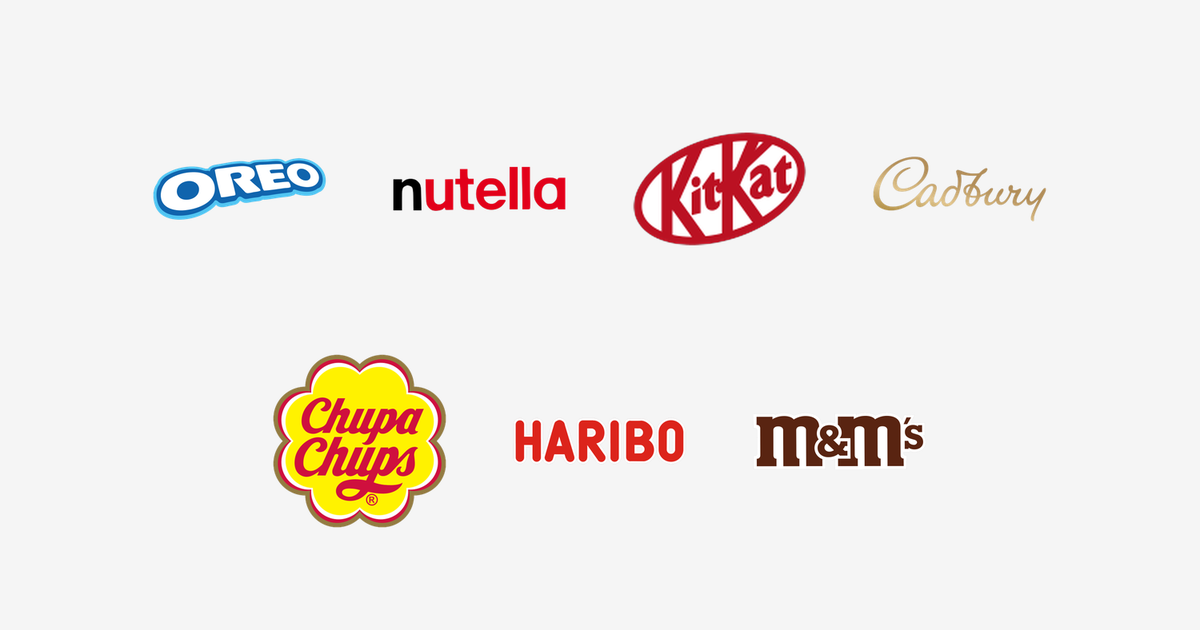
The Oreo logo wraps bold white bubble letters in a bright two-tone blue outline, and the lettering itself mimics the round, stamped look of the cookie. Introduced in 1912 by the National Biscuit Company (Nabisco) in New York, the chocolate sandwich cookie became the best-selling cookie brand in the world, sold in more than 100 countries — and that chunky blue badge, echoing the creme-white filling against the dark biscuit, is readable from the far end of any biscuit aisle.
Nutella — The Black N and the Red
The Nutella logo is the product’s name in lowercase with a single twist: the first letter is black, the rest are red. Ferrero launched Nutella in 1964, developed by Michele Ferrero from his father Pietro’s 1946 hazelnut-and-cocoa paste — and that two-colour split has been the whole identity ever since. One dark letter anchors the word like the first spoonful out of the jar, the warm red does the appetite work, and the soft lowercase letters make a factory product feel homemade.
KitKat — The Tilted Red Oval
The KitKat logo sets white italic lettering inside a tilted red oval. Created by Rowntree’s of York and launched in 1935 as Rowntree’s Chocolate Crisp, the bar was renamed Kit Kat in 1937; Nestlé has made it for most of the world since acquiring Rowntree in 1988, with Hershey producing it under licence in the United States. The oval has been refined rather than replaced for decades — the same lean, the same red-and-white — while the slogan “Have a break, have a Kit Kat” has run since 1957.
Cadbury — The Golden Signature
The Cadbury logo is the founder’s family name written as a flowing hand signature, in gold. John Cadbury opened his Birmingham shop in 1824, and the script — based on the signature of his grandson William — became the house mark for Dairy Milk and the rest of the range. Cadbury redrew the signature with a finer, more contemporary hand in 2020, but the idea is unchanged: a real family’s guarantee rather than a corporate badge, in the colour of the foil under the famous purple wrapper.
Chupa Chups — Dalí’s Daisy
The Chupa Chups logo may be the only snack logo designed by a fine artist: in 1969, founder Enric Bernat asked his friend Salvador Dalí to design a mark for the Spanish lollipop company he had started in 1958, and Dalí drew the name in red script inside a yellow daisy. He also insisted the logo sit on top of the lollipop rather than on the side, so the whole flower is always visible. More than fifty years later, the surrealist’s daisy crowns lollipops in over 150 countries, essentially unchanged.
Haribo — The Founder in the Name
The Haribo logo is glossy red block capitals — and the name is the biography. Hans Riegel founded the company in Bonn, Germany in 1920, and HARIBO is an acronym of HAns RIegel BOnn. Riegel invented the gummy bear in 1922, and his Goldbears became the worldwide standard for gummy candy. The letters are chunky, shiny and red — candy, drawn as type — and need no symbol beside them.
M&M’s — The Two Ms
The M&M’s logo writes the name in chunky brown lowercase — brown for chocolate, honest and unadorned — while each candy carries its own tiny white “m”, printed on the shell since 1950. The brand was introduced in 1941 by Forrest Mars Sr. and Bruce Murrie, the two Ms of the name, inspired by chocolate pellets carried by soldiers in the Spanish Civil War. The spokescandies that arrived in the 1990s turned the letters into characters, but the brown wordmark underneath has stayed happily plain: the candy that melts in your mouth, not in your hand, lets the shells do the talking.
The One That Got Away: Pringles
No snack-logo story is complete without the Pringles moustache — Julius Pringles and his famous face have fronted the stackable crisps for decades, recently restyled with a flatter, more minimal look. The mark is not in our collection yet, but the crisps’ story shows the same rule as every logo above: one strong face, one strong colour, repeated for decades until it becomes impossible to imagine the product any other way.
Conclusion
A blue outline, a black first letter, a tilted oval, a gold signature, a surrealist’s daisy, an acronym and two initials — the world’s favourite snack logos are all different shapes, but they share one discipline: pick a single unforgettable idea and refuse to change it. Every logo in this story (except Julius — for now) is available in SVG and transparent PNG on its VectorDose page, linked in each section.
Download famous snack logos in SVG and transparent PNG
Every logo above is available on its own VectorDose page as a free SVG download and a transparent PNG, with the official brand colours listed on the page. Use the SVG as your master file and export a PNG at the exact size each use needs — and always copy the brand colours exactly, never recolour the artwork.
Frequently asked questions about famous snack logos
Can I download these famous snack logos in SVG? Yes. Every brand linked above has its own VectorDose logo page offering a free SVG download and a transparent PNG.
Are the colours official? Each logo page lists the brand’s official colours. Copy those values exactly in your design work and never recolour the artwork.
SVG or PNG — which format should I use? Use the SVG as your master file for websites and anything that scales. Export a transparent PNG at the exact pixel size when the destination cannot use vectors, such as a slide deck or a social post.
Can I use these logos commercially? Brand logos are trademarks of their owners. Use them for reference, editorial, and design work within each brand’s own usage rules, and check the brand’s official brand page before any commercial use.