Brand Colors
Carrefour Logo
Download a clean vector or high-resolution PNG, or copy the SVG source directly into your project.
Logo summary
About the Carrefour Logo Logo
Introduction
Two arrows locked in a stare, hiding a letter in the gap between them — the Carrefour logo in this download is the current identity of the French hypermarket pioneer.
Brand Overview
Carrefour is a French retail group founded in 1959 in Annecy by the Fournier and Defforey families; its first store opened in 1960 and it went on to invent the hypermarket format in 1963. Headquartered in Massy, France, Carrefour is one of the world’s largest food retailers, trading in more than 30 countries. The name means “crossroads” in French. Its official website is carrefour.com.
History of the Carrefour Logo
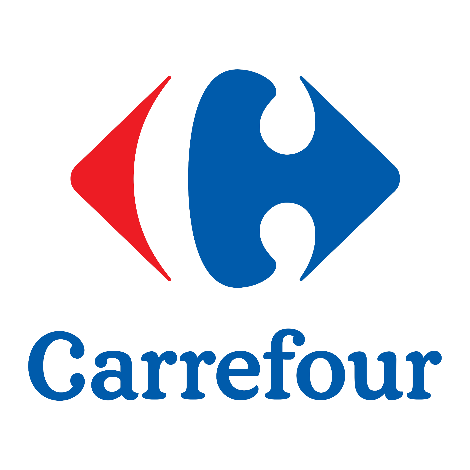
The famous symbol was created in 1966: a blue right-pointing arrowhead and a red left-pointing one, interlocked so the white space between them draws a “C”. The design has survived every corporate era since — hypermarket boom, global expansion and digital reinvention — with only refinements to weight and spacing. The lockup in this download pairs the symbol with the blue Carrefour wordmark, the group’s current primary signature.
Meaning of the Logo
- The hidden C: The initial is never drawn — it exists only as the negative space between the arrows, one of the most celebrated tricks in logo design.
- Two arrows, one crossroads: The opposing arrowheads are the crossroads of the company’s name — choice, in every direction, in one store.
- Red, white and blue: The French flag’s colours, worn quietly: red arrow, white gap, blue arrow.
Carrefour Logo Colors
| Color | Hex Code | Usage |
|---|---|---|
| Carrefour Blue | #005BAB | The right arrowhead and the wordmark (the logo file’s own style values) |
| Carrefour Red | #ED1C24 | The left arrowhead |
The C between the arrows is genuine negative space — the artwork’s background in this download is fully transparent, so the hidden letter appears on any surface.
Conclusion
Carrefour’s logo is a crossroads drawn as a magic trick: two arrows, three flag colours, and a letter that only exists because it isn’t there.
Need the logo in vector format? You are in the right place — download the Carrefour logo in SVG or transparent PNG using the buttons above.