Brand Colors
Click any color to copy its hex code
Yorkshire Tea
Download a clean vector or high-resolution PNG, or copy the SVG source directly into your project.
Logo summary
About the Yorkshire Tea Logo
Introduction
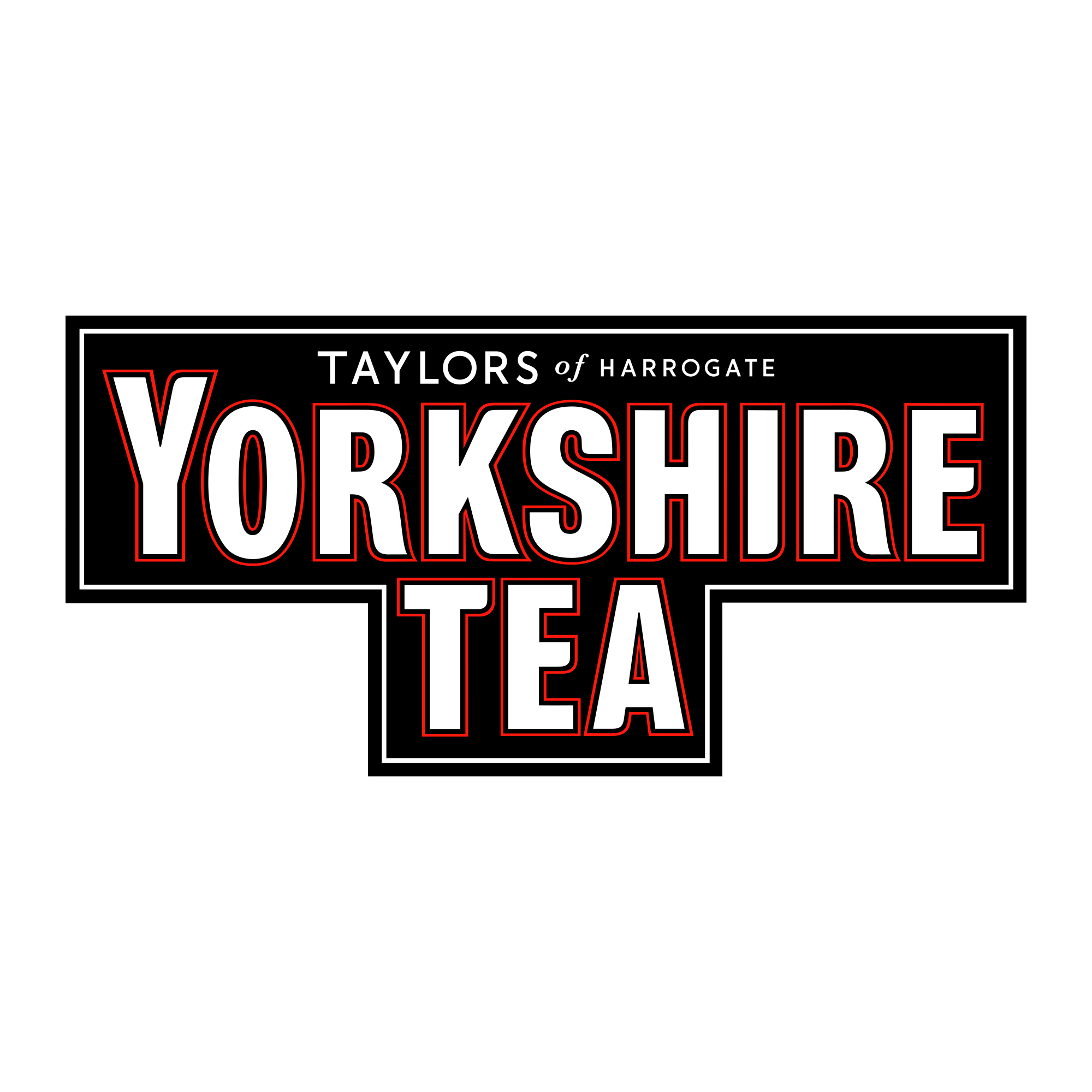
White slab letters with red keylines on a black stepped panel — the Yorkshire Tea logo looks like a brass plaque off a Harrogate tea room, blown up to billboard size. Britain’s best-selling tea signs itself like a monument.
Brand Overview
Yorkshire Tea is a black-tea blend produced since 1977 by Taylors of Harrogate, the tea merchants founded in 1886 by Charles Edward Taylor and now part of the family-owned Bettys & Taylors Group of Harrogate, Yorkshire. Blended for the local water and famously tweaked for everywhere else, Yorkshire Tea overtook its rivals to become Britain’s best-selling tea brand in 2019 — the red box is a fixture of the national kitchen. Its official website is yorkshiretea.co.uk.
History of the Yorkshire Tea Logo
The brand’s identity grew from Taylors’ traditional wordmarks into the black panel device drinkers know today: TAYLORS of HARROGATE in small letters at the top, then YORKSHIRE and TEA in enormous white capitals, each letter edged with a fine red keyline, set into a stepped black plaque. The artwork in this download is the brand’s own current logo file from yorkshiretea.co.uk, matching the artwork of the brand’s 2026 packaging refresh — the same plaque, sharpened, that has anchored the red boxes for decades.
Meaning of the Logo
- The stepped panel: A plaque, a pub sign, and a tea-chest stencil at once — furniture, not graphics.
- The red keylines: A printer’s outline around every letter, keeping the white type crisp on black — and tying the mark to the famous red box.
- Two names, two scales: The merchant’s name whispers at the top; the county shouts below. Yorkshire is the brand; Taylors is merely its maker.
Yorkshire Tea Logo Colors
| Color | Hex Code | Usage |
|---|---|---|
| Black | #000000 | The stepped panel (sampled from the logo artwork) |
| White | #FFFFFF | The lettering (sampled from the logo artwork) |
| Yorkshire Red | #FE180E | The letter keylines (the brand’s own file value) |
Black panel, white letters, red edges — the same three colours as the box, in the same proportions, sampled from Taylors’ own artwork.
Conclusion
Yorkshire Tea’s logo is a plaque that learned to sell tea: black, white, and red-edged, with a whole county as its brand name.
Need the logo in vector format? You are in the right place — download the Yorkshire Tea logo in SVG or transparent PNG using the buttons above.