Brand Colors
Click any color to copy its hex code
Dunkin’
Download a clean vector or high-resolution PNG, or copy the SVG source directly into your project.
Logo summary
About the Dunkin’ Logo
Introduction
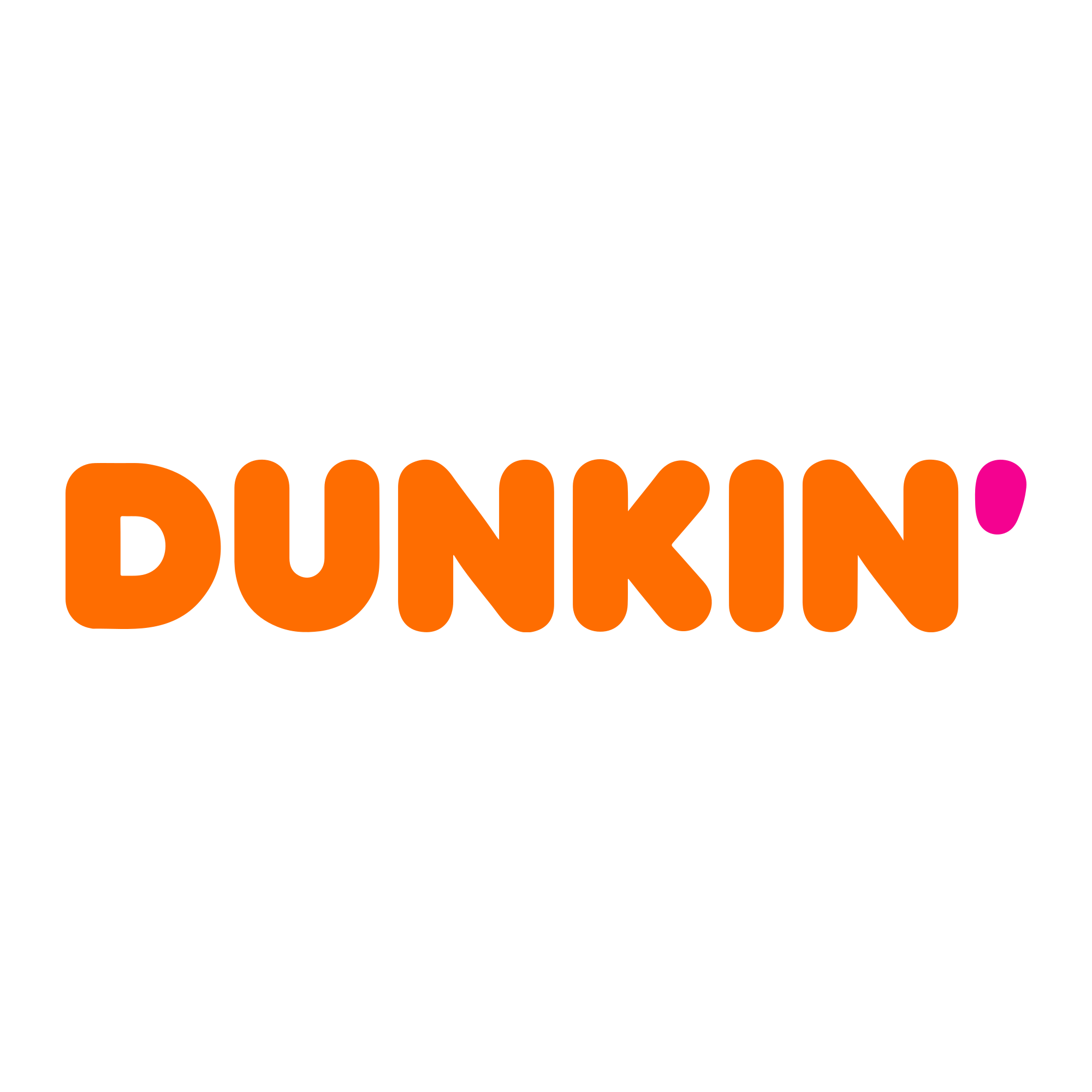
Chunky orange letters and a magenta apostrophe shaped like a coffee drop — the Dunkin’ logo is what happened when America’s doughnut chain decided its first name was enough. The “Donuts” are gone; the colours never left.
Brand Overview
Dunkin’ (Dunkin’ Donuts LLC) is an American coffee and doughnut chain founded in Quincy, Massachusetts, in 1950 by Bill Rosenberg, who had started with a shop called The Open Kettle in 1948. Renamed Dunkin’ Donuts, the chain grew into one of the world’s largest coffee and baked-goods brands — and in 2019 officially shortened its name to just Dunkin’, reflecting a menu led by coffee. Today it is part of Inspire Brands. Its official website is dunkindonuts.com.
History of the Dunkin’ Logo
The orange-and-pink pairing dates to the 1970s, when Dunkin’ Donuts adopted its rounded, puffy lettering — a custom alphabet in the spirit of the era’s soft signage — under the famous pink-and-orange colour scheme. A coffee-cup icon joined the wordmark in later decades. The 2019 rebrand kept everything people recognised — the chunky letters, the orange, the magenta — and simply removed “DONUTS” and the cup, leaving the apostrophe as a pink drop of coffee at the end of the name. The version in this download is that current, shortened mark.
Meaning of the Logo
- The dropped word: Removing “Donuts” declared coffee the main business — and the confidence that one word could carry the brand.
- The apostrophe drop: The magenta apostrophe doubles as a drop of coffee — punctuation turned into product.
- Orange and pink: A pairing chosen for appetite and visibility in the 1970s, now so ownable that the colours alone read as Dunkin’.
Dunkin’ Logo Colors
| Color | Hex Code | Usage |
|---|---|---|
| Dunkin’ Orange | #FE6D01 | The lettering (sampled from the logo artwork) |
| Dunkin’ Pink | #F40290 | The apostrophe (sampled from the logo artwork) |
| White | #FFFFFF | Backgrounds and reversed applications |
The hexes above are the exact fills of the current artwork — a saturated orange with a hot magenta that no rival chain dares to use.
Conclusion
Dunkin’ proved a logo can lose a whole word and gain recognition: seven letters, one drop, two unmistakable colours.
Need the logo in vector format? You are in the right place — download the Dunkin’ logo in SVG or transparent PNG using the buttons above.