Brand Colors
Click any color to copy its hex code
Tazo
Download a clean vector or high-resolution PNG, or copy the SVG source directly into your project.
Logo summary
About the Tazo Logo
Introduction
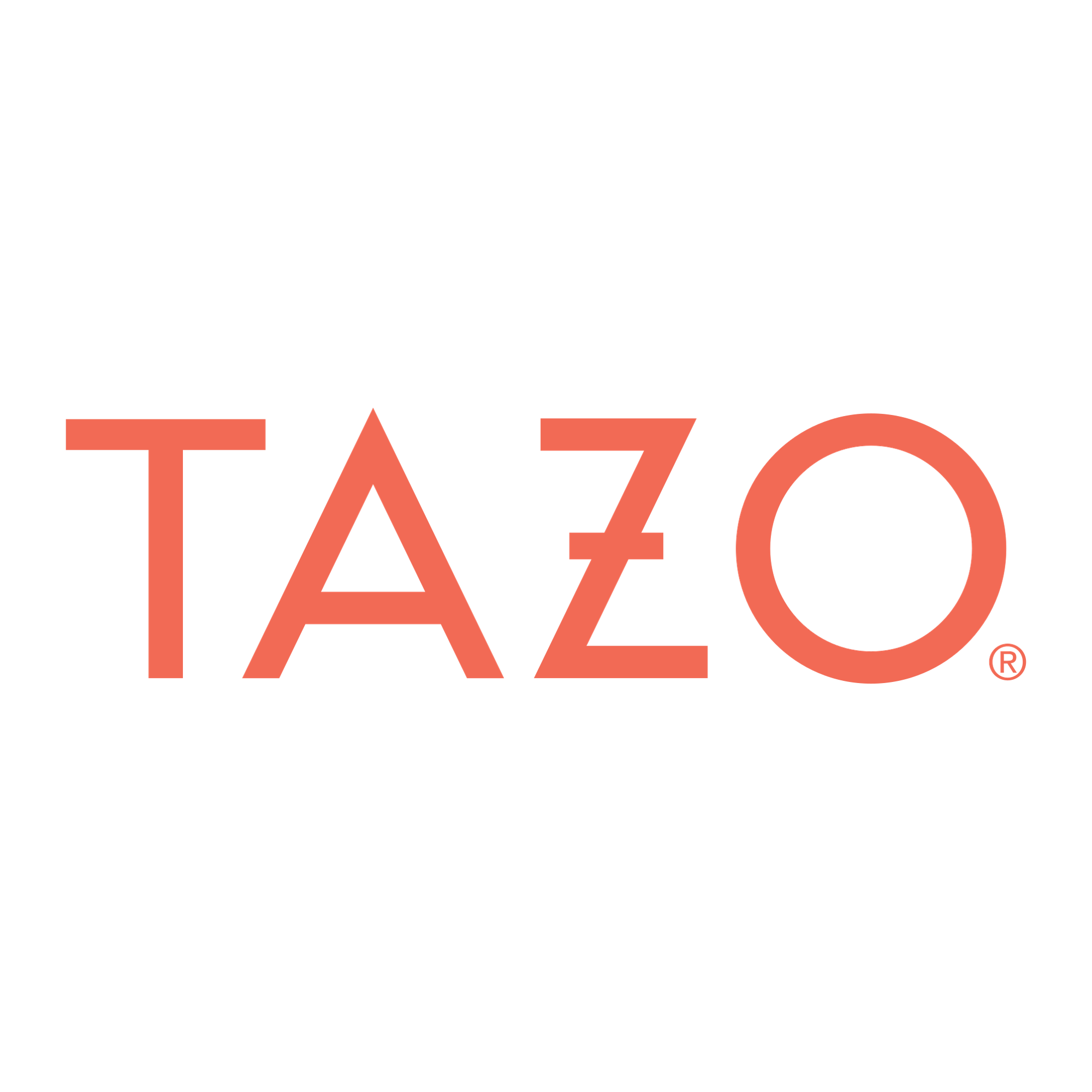
Four geometric letters in a warm coral — a triangle where the A should be, a perfectly round O — the Tazo logo looks like type designed by a jeweller. It is the mark of the American tea blender that treats tea as adventure.
Brand Overview
Tazo (TAZO Tea Company) is an American tea and herbal-tea brand founded in Portland, Oregon, in 1994 by tea pioneer Steve Smith — the blender behind Stash Tea — who built Tazo around bold blends and a traveller’s mystique. Starbucks acquired the brand in 1999 and sold it to Unilever in 2017; today Tazo is part of Lipton Teas and Infusions and based in Kent, Washington. Its official website is tazo.com.
History of the Tazo Logo
Tazo’s first identity was deliberately mystical: an ornate black wordmark in a faux-antique serif, wrapped in ritual language about the “rebirth of tea”. A 2018 rebrand swept the incense away and redrew the name as bold geometric letterforms — the A as a bare triangle, the O a true circle — in a single warm coral. That is the current logo, the version in this download, and it carried Tazo from Starbucks counters to supermarket shelves as a modern, design-led tea brand.
Meaning of the Logo
- The triangular A: A letter reduced to a symbol — part mountain, part tea tag, part alchemy sign, nodding to the brand’s mystical past without the costume.
- The geometric construction: Circles and triangles only — a logo built like a logo system, ready for the vivid patterns of Tazo’s packs.
- The coral colour: Neither tea-brown nor leaf-green — a flavour colour, chosen to taste like the blends: bright, spiced, a little wild.
Tazo Logo Colors
| Color | Hex Code | Usage |
|---|---|---|
| Tazo Coral | #F26A55 | The wordmark (sampled from the logo artwork) |
| White | #FFFFFF | Backgrounds and reversed applications |
The single coral sampled here is the standard one-colour form of the 2018 mark; Tazo’s packaging explodes into patterns around it.
Conclusion
Tazo’s logo distils a tea brand into pure geometry: four shapes, one colour, and a triangle where the A should be.
Need the logo in vector format? You are in the right place — download the Tazo logo in SVG or transparent PNG using the buttons above.