Introduction
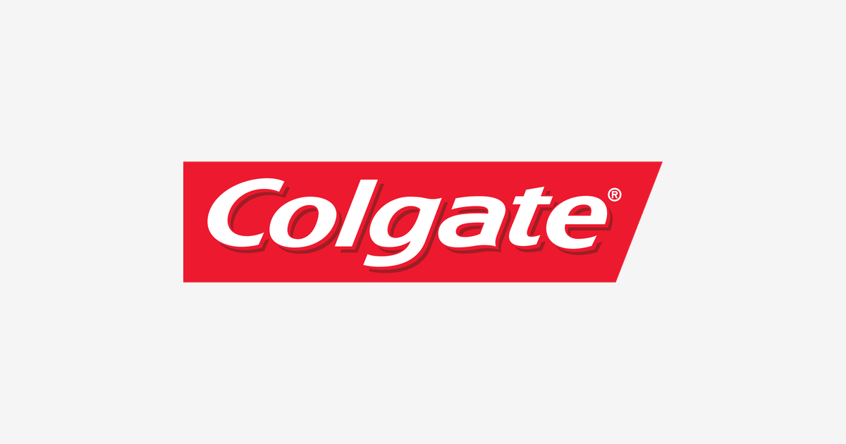
Some logos shout. The Colgate logo smiles: white italic lettering riding a slanted red parallelogram, leaning forward like the grin it promises. That small red flash sits on toothpaste tubes in more than 200 countries and is recognised by people who cannot read a word of it — the signature of a brand that began as a New York soap shop in 1806 and grew into the world’s toothpaste. This is the story of the red smile, and how it taught the world to brush.
1806: A Soap Shop on Dutch Street
Colgate starts long before toothpaste. In 1806, English immigrant William Colgate established a starch, soap and candle factory on Dutch Street in New York City, under the name William Colgate & Company. Soap was the business for decades — perfumed Cashmere Bouquet soap arrived in 1872 — and the family name on the door was the only branding the young company needed.
The product that would take that name around the world appeared in 1873: Colgate’s first toothpaste, an aromatic paste sold in glass jars. It was the beginning of one of the longest product runs in consumer history — the same name, on the same bathroom shelf, for over 150 years and counting.
1896: The Ribbon Tube
The jar was fine; the tube was revolutionary. In 1896 Colgate sold the first toothpaste in a collapsible tube — Colgate Ribbon Dental Cream, built on the tube invented by dentist Washington Sheffield — and by 1908 it was mass-selling toothpaste in tubes. The “ribbon” mattered more than it sounds: a neat ribbon of paste on the brush became the visual shorthand for toothpaste itself, reproduced in Colgate advertising for generations.
Packaging shaped the brand that followed. Colgate’s early packs leaned heavily on red, and as the 20th century standardised the range, red-and-white became the house colours — the seed from which the modern badge would grow.
The Red Parallelogram
The current mark fixes that heritage into geometry: white italic lettering on a red parallelogram, slanted forward like a smile being drawn. Each element does a job:
- The slant: The parallelogram leans into the future — energy and forward motion, and the tilt of a head smiling back at you from the bathroom mirror.
- The white italics: Flowing white lettering stands for clean teeth and freshness, softened by a hand-drawn feel that keeps a chemical product feeling human.
- The red field: Red for vitality, white for hygiene — the product’s two promises in two colours, recognisable across an aisle in any language.
The badge became the brand’s fixed signature in the late 20th century and has been refined rather than replaced ever since — the same discipline as rivals like Oral-B, whose blue oval guards the toothbrush shelf a few steps away.
The Slogan That Taught Brushing
Colgate became a household name in the 1950s on a slogan that rhymed its way into memory: “It Cleans Your Breath While It Cleans Your Teeth”. The television era turned toothpaste into a two-horse race — Colgate against Procter & Gamble’s Crest and Gleem — and when P&G’s fluoride formulas seized the number-one spot, Colgate fought back through decades of advertising until it reclaimed the top sales position. The red badge was the flag in that war: never redesigned away, never surrendered.
Colgate Logo Colours
| Color | Hex Code | Usage |
|---|---|---|
| Colgate Red | #ED192E | The parallelogram badge |
| White | #FFFFFF | The wordmark lettering |
One Badge, Every Bathroom
Today Colgate operates in some 200 countries, and the same slanted badge fronts local rivals on every shelf: Pepsodent with its navy-and-red grin in Asia, Signal with its famous stripes across Europe and Africa, and the bright gel of Close-Up chasing younger brushers. Against all of them, the red parallelogram holds the centre — a piece of oral-care design as disciplined as Listerine‘s apothecary capitals, and far older than any of them.
Conclusion
The Colgate logo turns a simple geometric gesture — a red block, tipped forward, with a name written across it in white — into a global symbol of the healthy smile. From a Dutch Street soap shop in 1806 to tubes in 200 countries, the company changed almost everything about itself except the two things that matter: the name, and the red it wears it in.
Need the logo files for a project? Download the Colgate logo in SVG and transparent PNG from VectorDose.