
Brand Colors
Aquafina Logo
Download a clean vector or high-resolution PNG, or copy the SVG source directly into your project.
Logo summary
About the Aquafina Logo Logo
Introduction
Deep-blue capitals with a wave running through them — the Aquafina logo is the mark of PepsiCo’s purified water, launched in 1994 and built into one of the largest bottled-water brands in the United States.
Brand Overview
Aquafina is a purified drinking water brand of PepsiCo, launched in 1994 in Wichita, Kansas. The water is purified through PepsiCo’s seven-step Hydro-7 process, and the brand competes head-to-head with Coca-Cola’s Dasani as one of America’s two dominant purified waters. Its official website is aquafina.com.
History of the Aquafina Logo
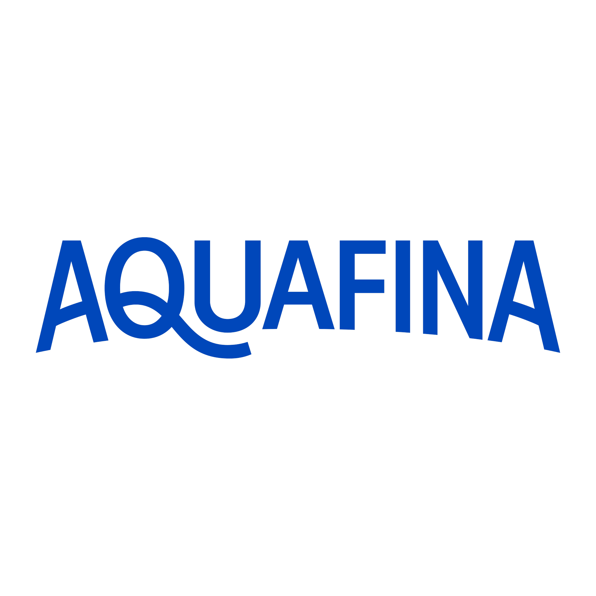
The original Aquafina label dressed the name with mountains and a rising sun. Over successive refreshes the scenery fell away, leaving the current mark: AQUAFINA in strong blue capitals with a single wave stroke flowing through the letters — the purification story told by colour and one curve instead of a landscape.
Meaning of the Logo
- The wave: A single flowing stroke through the name — water in motion, and the one graphic idea the brand kept from its landscape era.
- Saturated blue: Darker and more confident than the pale blues of spring-water rivals: this is engineered purity, not a mountain stream.
- Capitals: Set like a utility mark — Aquafina presents itself as infrastructure, the default water.
Aquafina Logo Colors
| Color | Hex Code | Usage |
|---|---|---|
| Aquafina Blue | #0047BA | The complete wordmark and wave (the logo file’s own fill value) |
A one-colour logo: the blue above is the artwork’s own fill value.
Conclusion
Aquafina’s logo is a wave typed out in capitals — PepsiCo’s answer to spring water, drawn with a ruler and a single curve.
Need the logo in vector format? You are in the right place — download the Aquafina logo in SVG or transparent PNG using the buttons above.