The FedEx logo history has one of design’s most famous punchlines: the white arrow hidden in the negative space between the ‘E’ and the ‘x’, created by Lindon Leader at Landor Associates in 1994 after more than 200 iterations. It replaced the slanted ‘Federal Express’ wordmark of 1973–1994, kept purple and orange (made more purple and more orange, so they could no longer be mistaken for blue and red), and spawned a colour system — orange for Express, green for Ground, red for Freight. This post traces that story and points to a clean SVG and transparent PNG download.
Introduction
Purple and orange. Five letters you have seen on trucks, planes, and parcels your whole life. But look again — really look — at the space between the “E” and the “x”. There is an arrow hiding in the FedEx logo, pointing right, and once you see it you can never unsee it.
This article covers how that arrow got there, the 1994 redesign that produced one of the most awarded logos in history, and why the FedEx colors used to change depending on which truck drove past.
The Company That Invented Overnight
FedEx began as Federal Express, founded by Frederick W. Smith in 1971. Operating from Memphis, Tennessee from 1973, the company essentially invented the overnight delivery business — the hub-and-spoke system, the tracking number, the plane fleet that lands while you sleep.
By the early 1990s the company had outgrown its name. Most people already called it “FedEx”, so in 1994 the nickname became official — and the company hired Landor Associates to design a logo worthy of it. The designer in charge was Lindon Leader, and what he produced became a legend.
The Arrow in the Negative Space
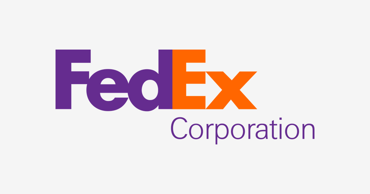
Leader’s design sets “Fed” in purple and “Ex” in orange, in a tight custom bold typeface. The real trick lives in the negative space: the gap between the capital “E” and the lowercase “x” forms a perfect white arrow, pointing right — forward, fast, and in the right direction.
Leader has said the arrow was never meant to be a gimmick shouted at the viewer; it was a quiet reward for looking closely. It worked. The logo has won more than 40 design awards, and Rolling Stone ranked it among the eight best logos of the past 35 years. In survey after survey, a large share of people say they never noticed the arrow until someone pointed it out — which is exactly why it is the textbook example of negative-space design.
What the Logo Means
- The hidden arrow: Speed, direction, and precision — the three promises of an overnight courier, drawn without a single extra line.
- The tight letterspacing: The letters are pushed together until they almost merge — a visual metaphor for an operation with no wasted space and no wasted time.
- The purple base: Purple (officially “FedEx Purple”) gave the brand a dignified, corporate anchor that no rival courier was using.
- The two-word name: Shortening “Federal Express” to “FedEx” turned a stiff government-sounding name into a verb — people now “FedEx” packages the way they “Google” questions.
One Logo, Many Colors
For years, the “Ex” half of the logo was a color code. Each FedEx division had its own shade: orange for Express, green for Ground, red for Freight, and blue for Office. Ground crews, freight handlers, and customers could tell the divisions apart at a glance — while the purple “Fed” stayed constant, holding the family together.
In 2016 FedEx began unifying the system, bringing the operating companies together under the Express orange. The corporate standard you will see on the fleet today — and the version on our product page — is the purple-and-orange pairing below.
| Color | Hex Code | Usage |
|---|---|---|
| FedEx Purple | #652C8F | The “Fed” half of the wordmark |
| FedEx Orange | #FF6600 | The “Ex” half / Express division |
It is a rare case of a two-color logo where the colors themselves carry information: purple for the parent brand, orange for the service moving your package.
Conclusion
The FedEx logo is proof that the smartest idea in the room can be an empty space. One hidden arrow, drawn in 1994, still points the company forward — past rivals like DHL and UPS in every design ranking that matters.
Need the logo files for a project? Download the FedEx logo in SVG and transparent PNG from VectorDose.
Download the FedEx logo in SVG and transparent PNG
Download the FedEx logo on VectorDose in SVG and transparent PNG, with the official brand colours listed on the page. Use the SVG as your master file and export a PNG at the exact size each use needs — and always copy the brand colours exactly, never recolour the artwork.
Frequently asked questions about the FedEx logo
What does the FedEx logo mean? The story above traces the mark’s history and meaning — read it in full, because the meaning sits in the design details, not in a single symbol.
What colours does the FedEx logo use? Use the colours shown in the story above and on the brand’s official pages, copied exactly. Never recolour the artwork to fit your own palette.
Can I download the FedEx logo in SVG and PNG? Yes. Download the FedEx logo on VectorDose in SVG and transparent PNG, with the official brand colours listed on the page.
SVG or PNG — which format should I use? Use the SVG as your master file for websites and anything that scales. Export a transparent PNG at the exact pixel size when the destination cannot use vectors, such as a slide deck or a social post.