DHL Logo: How Red and Yellow Conquered Global Delivery
Introduction
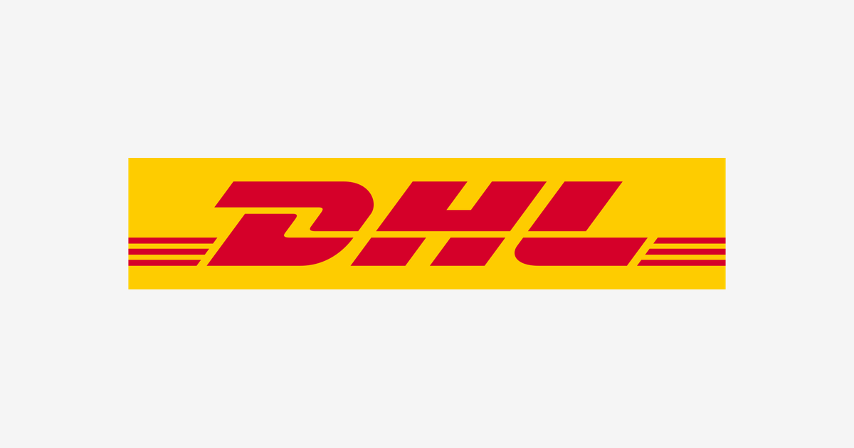
Red letters, slanted like they are late for a flight, on a field of signal yellow. You can spot a DHL van, a DHL jet, or a DHL courier’s jacket from a block away — in Tokyo, in Berlin, in Nairobi. No other delivery brand owns a color combination this loudly, on this many continents.
This article covers how three founders’ initials became the world’s biggest logistics brand, why the logo wears the colors of the German post office, and what those red stripes are really doing.
Three Names, One Route: San Francisco to Honolulu
DHL was founded in San Francisco in 1969 by Adrian Dalsey, Larry Hillblom, and Robert Lynn — the D, the H, and the L are simply their surnames. Their first service was a clever hack: flying shipping documents from San Francisco to Honolulu before the cargo ships arrived, so paperwork could clear customs while the freight was still at sea. Ports saved days; ships saved money.
The idea grew into the first international door-to-door express network. Through the 1970s and 80s DHL expanded across Asia, the Middle East, and Europe faster than its American rivals — which is why, unusually for a US-founded company, its heartland became the whole world except the United States.
The Deutsche Post Era: Where the Yellow Came From
In 1998, Germany’s Deutsche Post began buying into DHL, taking full control by 2002. The takeover repainted the brand. The yellow in today’s logo is Deutsche Post’s own historic post-horn yellow, and the red-and-yellow pairing turned DHL into the express arm of a global logistics empire.
The red italic lettering with its speed stripes stayed — but now it sat on that unmistakable yellow field on vans, aircraft, uniforms, and the Formula 1 and football sponsorships that carried it into hundreds of millions of living rooms.
What the Logo Means
- The italic slant: The letters lean forward like a runner off the blocks — motion is the entire product a courier sells.
- The red speed lines: The horizontal red stripes cutting alongside the letterforms are drawn as motion lines, the visual shorthand for something moving fast. They also work as a subtle underline, framing the name like a label on a parcel.
- The three initials: Dalsey, Hillblom, Lynn — a founders’ monogram so simple it survives every language and alphabet the company ships to.
- Red on yellow: The highest-contrast warm pairing on the road. Warning signs use it for a reason: nothing else reads this fast at this distance.
DHL Logo Colors
| Color | Hex Code | Usage |
|---|---|---|
| DHL Red | #D50029 | The lettering and speed lines |
| DHL Yellow | #FECC00 | The background field |
Where rivals split their colors by division, DHL runs one pairing everywhere — the same red, the same yellow, in more than 220 countries and territories. Consistency at that scale is itself the brand: a promise that the yellow van in a strange city is the same company you used at home.
Conclusion
The DHL logo is a lesson in conquest by color. Three initials, a forward lean, a set of speed lines, and two colors applied without mercy across the planet — against global rivals like FedEx and UPS, DHL chose to be the one you can see coming.
Need the logo files for a project? Download the DHL logo in SVG and transparent PNG from VectorDose.