TripAdvisor Logo: The Owl That Watches a Billion Reviews
Introduction
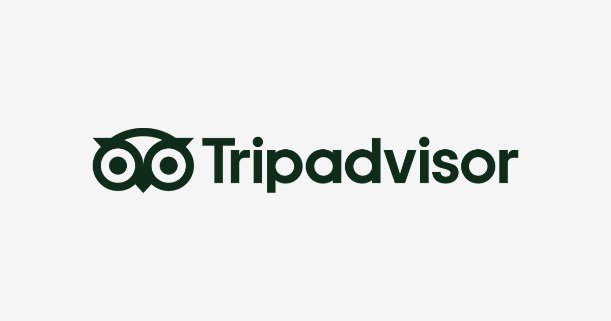
Every traveler has seen it: two wide eyes staring out of a green circle, promising that someone, somewhere, has already stayed in that hotel and lived to review it. The TripAdvisor owl is arguably the most recognized mascot in travel — a bird that has guided more trips than any guidebook in history.
But why an owl? And why did TripAdvisor redesign it in 2025 after two decades? This article looks at the story behind the TripAdvisor logo, what the owl actually means, and the colors that made green the color of the trusted review.
From Search Engine to the World’s Travel Library
TripAdvisor launched in 2000 from a small office above a pizza shop in Needham, Massachusetts. Founder Stephen Kaufer originally built a travel search engine — the reviews were almost an afterthought. They turned out to be the entire business.
Today the platform holds more than a billion reviews across 8 million+ hotels, restaurants, and attractions, with over 400 million people visiting every month. The Travellers’ Choice Awards — those green certificates in hotel lobbies worldwide — are its physical footprint. Acquisitions like Viator (experiences, 2014) and TheFork (restaurant booking) turned a review site into a travel empire.
A Brief History of the Owl
The owl — nicknamed “Ollie” — appeared in the company’s early years as a multicolored, friendly cartoon bird wearing the brand’s green. For two decades it barely changed: continuity was the point. A logo travelers recognized at a glance, in an airport, on a lobby door, in a search result.
In 2025, TripAdvisor finally modernized. The rebrand by studio Koto simplified Ollie into a geometric, minimal owl paired with a clean lowercase wordmark. The charm stayed; the clutter left. The redesign signaled a company moving from desktop review site to mobile-first travel companion.
What the Owl Actually Means
- Wisdom: Owls are the universal symbol of knowledge — the traveler who read every review before booking is the wisest one in the room.
- The eyes: The owl’s huge, watchful eyes are the point. TripAdvisor sees everything — every hotel, every scam, every hidden gem — so you don’t walk in blind.
- Watchfulness at night: Owls are nocturnal. Travel happens around the clock; the owl is awake when you’re booking at 2 AM.
- Approachability: A mascot, not a corporate monogram. Reviews come from people, and the owl keeps the brand human.
TripAdvisor Logo Colors
| Color | Hex Code | Usage |
|---|---|---|
| Deep Green | #0E2C19 | The 2025 owl and wordmark — primary color |
| Mint | #34E0A1 | Brand accent — the review green |
| White | #FFFFFF | Reversed applications |
Green does double duty: it’s the color of “go” (book it) and of the five green bubbles that rate every property on the platform.
Conclusion
The TripAdvisor owl works because it promises exactly what the product delivers: somebody knowledgeable has already been there, watched carefully, and reported back. Twenty-five years in, the eyes are still watching.
Need the logo files for a project? Download the TripAdvisor logo in SVG and transparent PNG from VectorDose.