The Sun Life logo history runs from a detailed sun globe to the simplified yellow circle of the 2026 global rebrand, when Sun Life began writing its brand as one word, Sunlife. News reports cover the announcement, and download dumps offer an old file, but neither traces the whole evolution with its meaning. This post does: the sun globe’s story, what changed in 2026, and what the colours stand for.
Introduction
On October 15, 2026, one of the world’s largest financial services companies changed the way it writes its own name. Sun Life Financial Inc., the Canadian insurance and asset management giant, unveiled a sweeping global rebrand that condenses its name into a single word — Sunlife — alongside a simplified sun-globe logo and a new global tagline, “Making life brighter.”
The Sun Life new logo 2026 is far more than a cosmetic refresh. With roughly C$1.70 trillion in assets under management and operations spanning 15 markets across the Americas, Europe, and Asia, the company says the rebrand reflects just how far it has grown beyond its life-insurance roots. In this article, we trace the history of the Sunlife logo, break down the Sunlife logo meaning, and examine the colors behind one of the financial world’s most recognizable sun symbols.
Brand Overview: Sun Life Financial
Sun Life Financial traces its roots back to 1865, when it was founded in Montreal, Canada — making it one of the country’s oldest life insurance companies. More than 160 years later, and today headquartered in Toronto, the company has grown into a diversified financial services organization operating in 15 markets, including Canada, the United States, the United Kingdom, Ireland, Hong Kong, the Philippines, Japan, India, China, and Australia.
Its businesses now extend well beyond life insurance into health insurance, asset management, and wealth solutions. The company’s shares trade on the Toronto, New York, and Philippine stock exchanges under the ticker SLF. A quick clarification for readers: Sun Life Financial is not the same business as the UK over-50s insurance brand marketed as “SunLife” by Phoenix Group — they are entirely separate companies.
One thing the rebrand does not change is the legal entity, which remains Sun Life Financial Inc. What changes is how the brand presents itself to the world: one name, one mark, one identity.
The October 2026 Rebrand: Sun Life Becomes Sunlife
The rebrand was officially announced on October 15, 2026, and is being rolled out in phases, beginning with digital and client-facing channels. During the transition period, the old and new branding will coexist — so customers across the company’s markets may encounter both identities for some time before the new one fully takes over.
From Two Words to One: The New Name
The most immediately visible change is the name itself: “Sun Life” is now written as a single word, “Sunlife.” The company says the shorter, unified name gives it one clear global identity as it operates across 15 markets. Shorter one-word names have become something of a theme among major corporate rebrands in 2026, and Sunlife fits squarely into that trend.
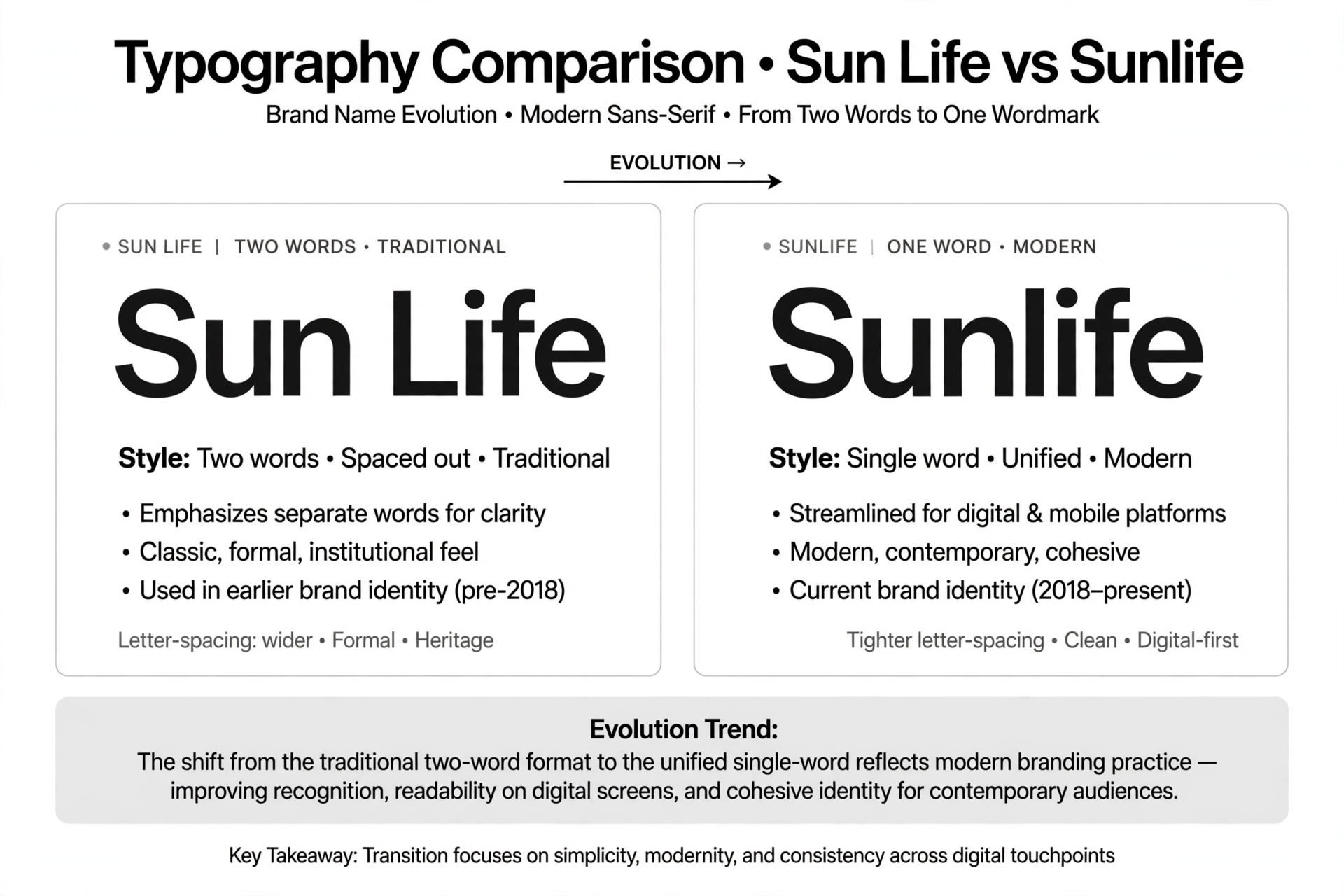
CEO Kevin Strain framed the change as deeper than a new look: “This is about much more than changing how Sunlife looks.” The message is deliberate — the rebrand is meant to signal a broader shift in what the company has become: no longer just a life insurer, but a global organization spanning asset management, health, and wealth.
The New Sunlife Logo: A Simplified Sun-Globe
At the heart of the rebrand is the new Sunlife logo — a simplified and modernized version of the company’s familiar sun-globe mark, redesigned to perform better in digital environments. The sun has been Sun Life’s signature symbol for years, and the 2026 version refines it: cleaner lines, less fine detail, and a mark engineered to stay legible at small sizes, from mobile app icons and social avatars to website headers.
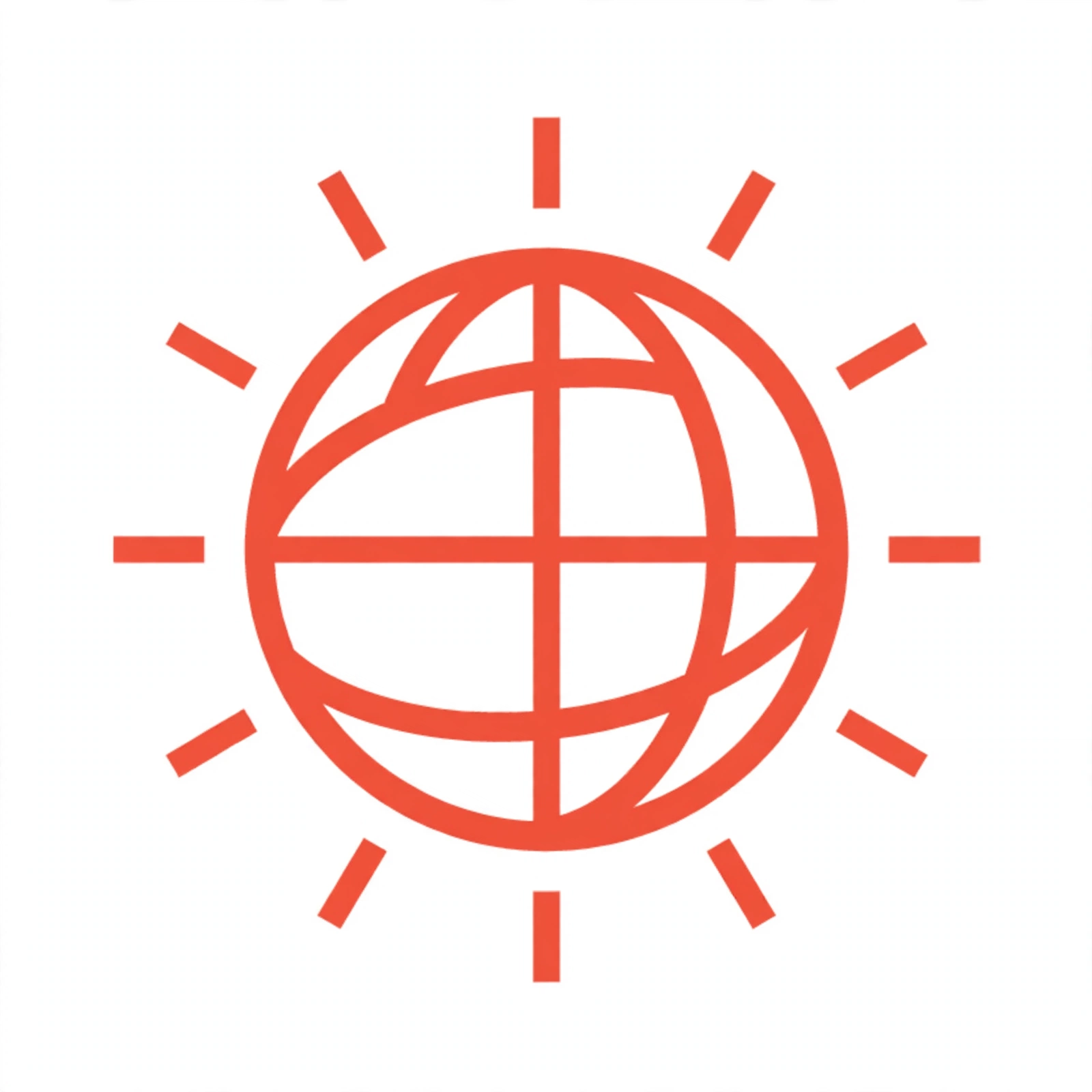
The design direction will be familiar to anyone following brand identity trends: like many legacy institutions, Sunlife has flattened and simplified its emblem for a digital-first world, where a logo must work as a favicon or app icon just as often as it appears on office towers and sponsorship boards.
“Making Life Brighter”: The New Tagline
Alongside the name and logo, Sunlife introduced a new global tagline: “Making life brighter.” The line plays directly on the sun imagery at the core of the brand — brightness as a metaphor for financial security, good health, and optimism about the future. It is the verbal counterpart to the visual sun: simple, warm, and instantly tied to what the symbol has always stood for.
Evolution of the Sun Life Logo
The sun has been central to Sun Life’s visual identity for much of the company’s long history. While the institution dates to 1865, its modern brand identity is built around the sun-globe emblem — a radiant sun partially wrapped by a sweeping arc that suggests a globe.
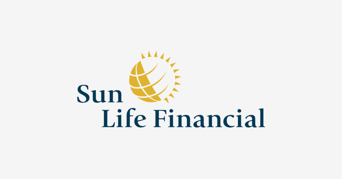
In its most recent iteration before the rebrand, the mark paired a richly detailed, textured sun with the “Sun Life Financial” wordmark set in two words. The October 2026 redesign strips the emblem back to its essence: the sun remains unmistakable, but it is now rendered in a simpler, more geometric form, and the wordmark reads as the single word “sunlife.” The overall effect is a logo designed for screens first — bolder at small sizes, cleaner in motion, and more consistent across every market the company serves.
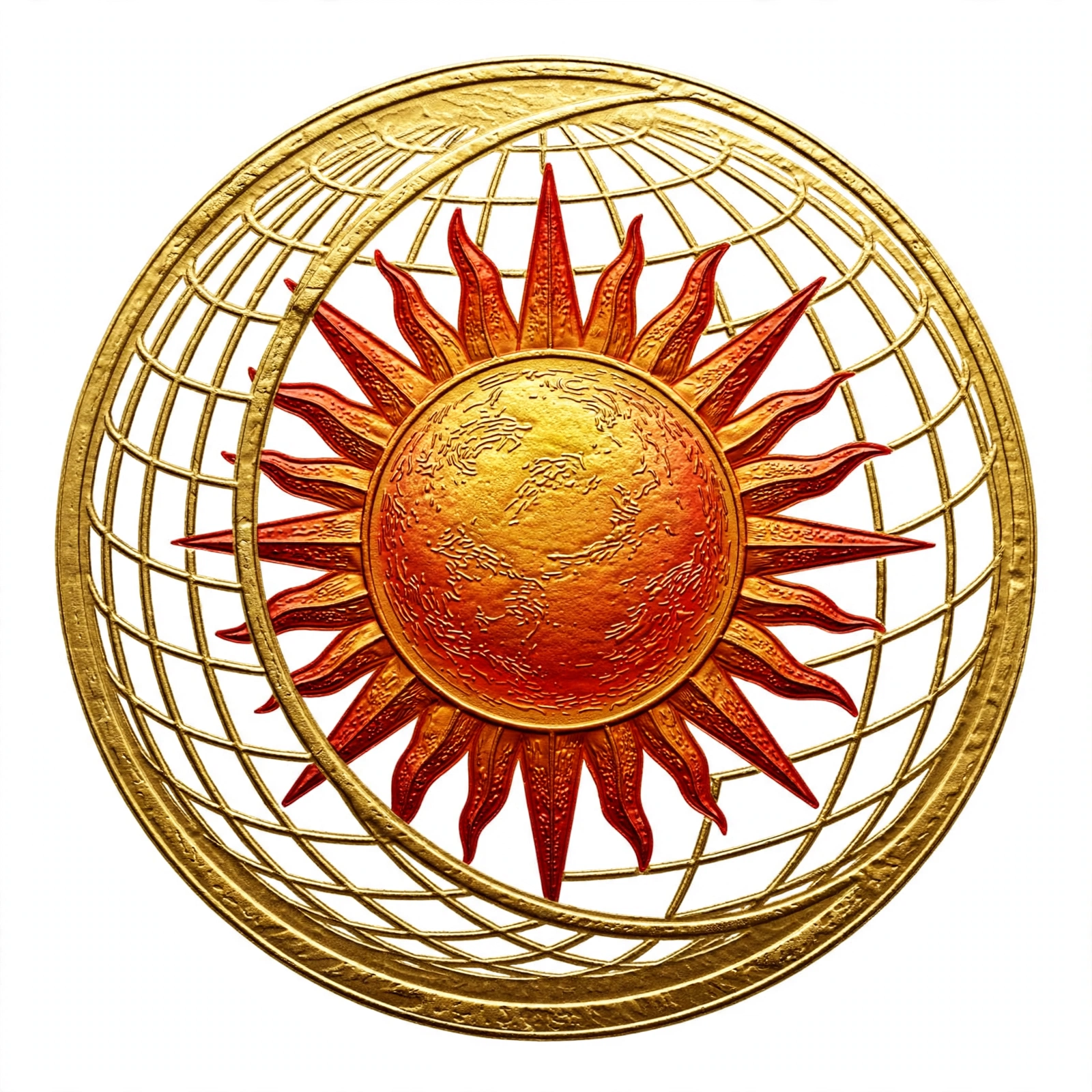
Because the rollout is phased, the previous sun-globe logo will continue to appear in some channels during the transition before the new identity replaces it completely — a common sight during rebrands of this scale.
Sunlife Logo Meaning: What Does the New Mark Symbolize?
Every element of the redesigned Sunlife logo carries meaning:
- The sun: The central symbol stands for optimism, vitality, and brightness — the core brand promise now captured in the “Making life brighter” tagline. For a company whose products are financial security and health, the sun is a natural metaphor for a brighter future for its clients.
- The globe arc: The sweeping curve wrapping the sun represents the company’s global footprint, connecting its 15 markets across the Americas, Europe, and Asia into a single visual idea.
- One word: Setting “Sunlife” as a single word signals unity — one company, one identity, wherever in the world a customer encounters it.
- Simplification itself: The flatter, cleaner forms communicate modernity, clarity, and transparency — qualities the company wants associated with its growing asset management and wealth businesses as much as with its insurance heritage.
Taken together, the mark tells the story the rebrand is built on: the same trusted sun, made simpler and more universal for a company that has outgrown any single product line or national border.
Sunlife Logo Colors
The Sunlife identity is anchored by the brand’s signature sun palette. The dominant color is a warm sun red-orange — the hue of a rising sun — used for the sun-globe emblem. It conveys energy, optimism, and warmth, and it provides instant continuity with the previous identity: even as the shapes were simplified, the color keeps the brand unmistakable to anyone who knew the old mark.
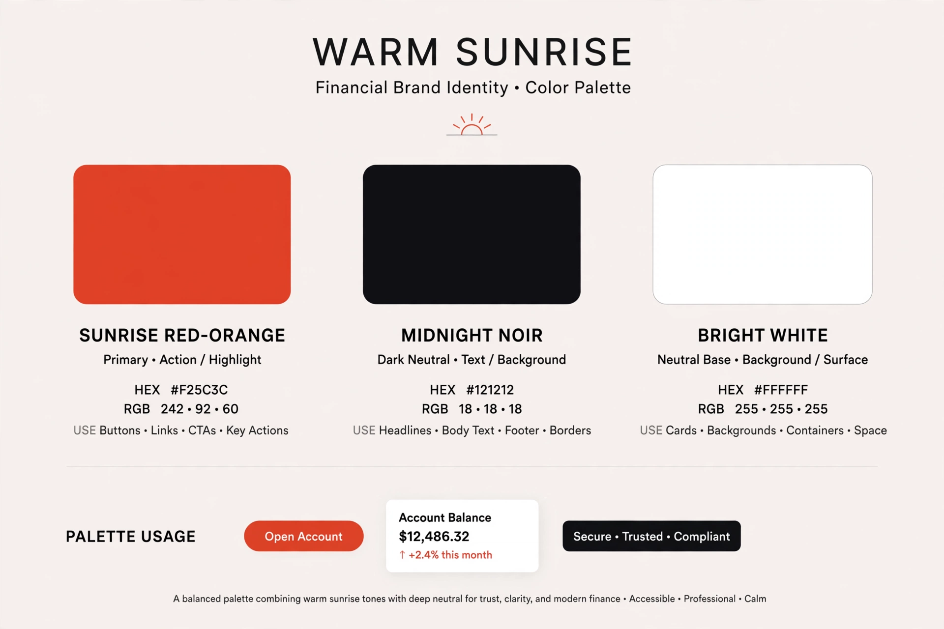
The wordmark is set in a deep, near-black tone that grounds the composition and keeps it legible across light and dark backgrounds, while white supplies the contrast and breathing room in the emblem’s negative space. Together, the palette is classic Sun Life — bright, warm, and confident — refined for digital reproduction, where flat, bold color performs best at every size.
Exact hexadecimal values for the new identity are defined in Sunlife’s official brand guidelines; the shades described here reflect the brand’s public rollout materials.
Conclusion
The Sun Life new logo 2026 closes one chapter and opens another. By condensing its name to Sunlife, simplifying its sun-globe emblem for the digital age, and adopting the “Making life brighter” tagline, the company has built an identity for its next era — global, digital-first, and broader than insurance ever was.
Whether the rebrand resonates with customers across 15 markets remains to be seen, but one thing is certain: after more than 160 years, the sun is still rising on Sunlife — now in a simpler, brighter form.
Looking for the logo files? Download the Sunlife logo in SVG and transparent PNG formats from VectorDose.
Related logos on VectorDose
Sun Life does not have its own VectorDose logo page yet. A related insurance brand you can download today is the State Farm logo in SVG and transparent PNG.
Frequently asked questions about the Sun Life logo
What does the Sun Life logo mean? The story above traces the mark’s history and meaning — read it in full, because the meaning sits in the design details, not in a single symbol.
What colours does the Sun Life logo use? Use the colours shown in the story above and on the brand’s official pages, copied exactly. Never recolour the artwork to fit your own palette.
Can I download the Sun Life logo in SVG and PNG? This brand does not have its own VectorDose logo page yet, so use the brand’s own official brand or press page for the current file, and see the related logos below for similar brands you can download today.
SVG or PNG — which format should I use? Use the SVG as your master file for websites and anything that scales. Export a transparent PNG at the exact pixel size when the destination cannot use vectors, such as a slide deck or a social post.