The SpaceXSI logo history is really three logos in one story: xAI, then SpaceXAI, then SpaceXSI — a chain of rebrands that moved faster than most companies manage in a decade. News coverage follows the drama of each announcement, but no single page traces the whole chain and what each mark actually means. This post does that, in order.
Introduction
The SpaceXSI logo has one of the most unusual stories in modern branding. In the span of just three months, Elon Musk’s artificial intelligence company changed its name — and its visual identity — twice: from xAI to SpaceXAI, and then from SpaceXAI to SpaceXSI. Few companies in history have rebranded this quickly, and fewer still have done it so publicly, with each step announced on X and debated in real time by millions of followers.
If you are searching for the SpaceXSI logo, you are probably looking for the current mark of Musk’s AI venture — or trying to make sense of the confusing trail of names: xAI, SpaceXAI, SpaceXSI. This article covers the complete history of the SpaceXSI logo, what each version looked like, what the designs meant, and the brand’s official colors. One honest note up front: as of October 2026, there is no entirely distinct SpaceXSI mark — the company’s current branding uses SpaceX’s standard logo. The real story here is the remarkable three-identity saga behind it.
What Is SpaceXSI? A Quick Brand Overview
SpaceXSI — short for SpaceX Super Intelligence — is Elon Musk’s artificial intelligence company. It began life as xAI, which Musk launched on July 12, 2023, as a standalone AI startup positioned as a challenger to OpenAI, the company he co-founded years earlier. xAI’s best-known product is Grok, the AI chatbot integrated into X (formerly Twitter).
In February 2026, SpaceX acquired xAI in an all-stock deal, bringing the AI lab under the same corporate roof as Musk’s rocket company. Reported valuations at the time put SpaceX at roughly $1 trillion and xAI at around $250 billion, making it one of the largest tech combinations ever announced. The acquisition set the stage for the rapid-fire rebranding that followed: within months, the xAI name would disappear entirely, replaced first by SpaceXAI and then by SpaceXSI.
Today, SpaceXSI represents Musk’s bet that artificial intelligence — or “super intelligence,” as the company now prefers to call it — belongs alongside spaceflight as one of humanity’s defining frontiers. Understanding the SpaceXSI logo means tracing all three identities the company has worn.
SpaceXSI Logo Evolution
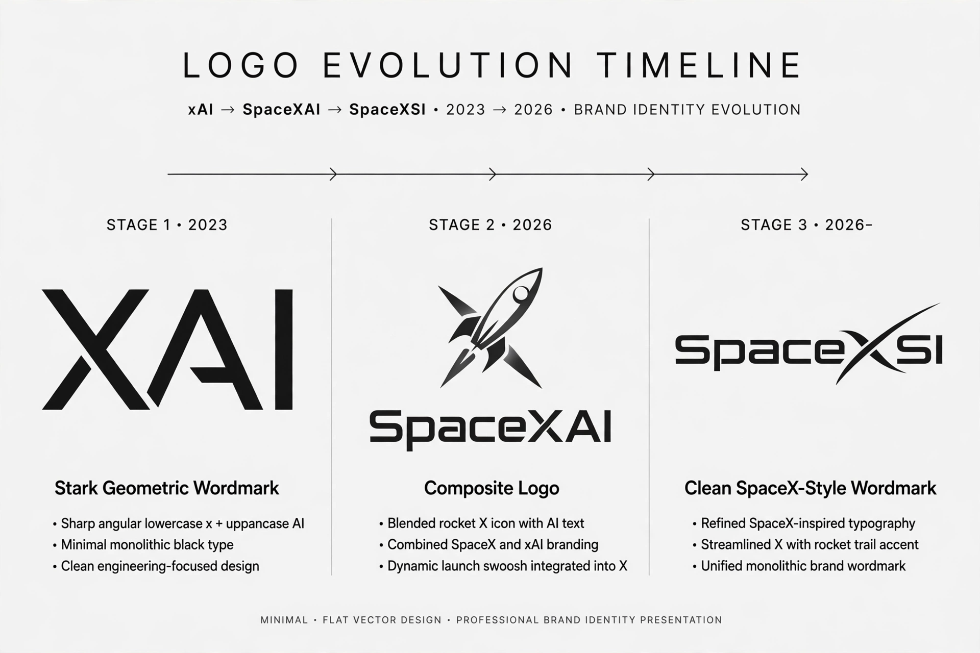
The evolution of the SpaceXSI logo is really three logos in sequence. Each one reflects a different chapter of the company’s short but eventful life.
2023–2026: The xAI Era — The Geometric Black Wordmark
When xAI launched in July 2023, its logo was a stark, geometric black wordmark reading “xAI.” The design was deliberately minimal: custom letterforms with sharp, engineered angles, set in solid black. There was no symbol or icon — just the name, rendered with the kind of precision that suggested mathematics and machinery.
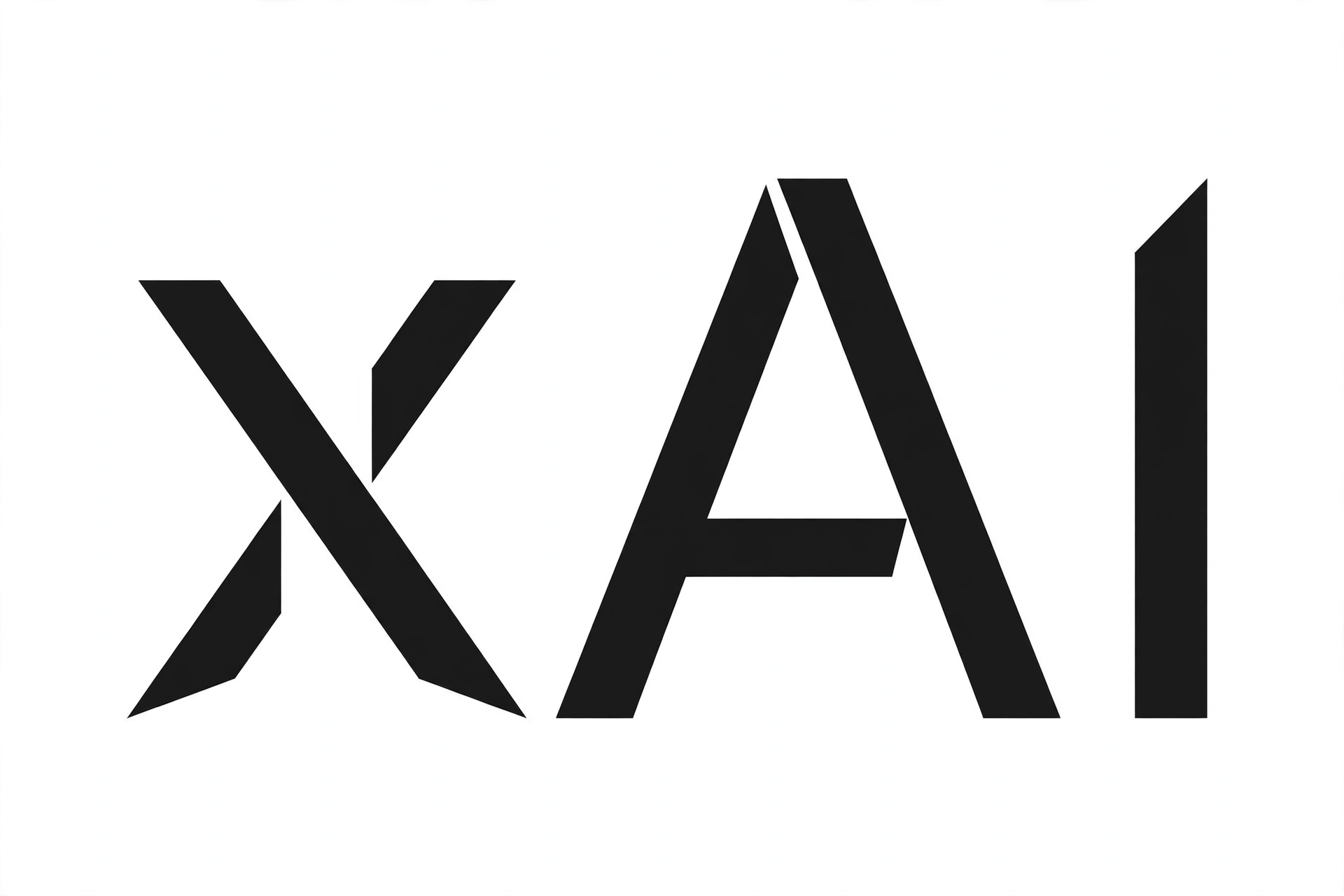
The xAI wordmark communicated exactly what the startup wanted to be: serious, technical, and unadorned. In a field where competitors used friendly gradients and playful shapes, xAI’s all-black geometric mark stood apart as something colder and more ambitious. The lowercase “x” tied it visually to Musk’s broader “X” branding universe — X (the social platform), SpaceX, and the xAI name itself all shared that single letter as a connective thread.
This logo served the company for nearly three years, appearing on the xAI website, the Grok product interface, research publications, and company communications, until the SpaceX acquisition changed everything.
July 2026: The SpaceXAI Era — The Composite Mark
On July 6, 2026, the company announced via an X post that it was now SpaceXAI. Along with the new name came a new composite logo that blended the two parent brands: the recognizable SpaceX “swoosh-X” combined with the xAI wordmark styling. The design attempted to merge SpaceX’s established rocket-company identity with xAI’s artificial intelligence heritage into a single mark.
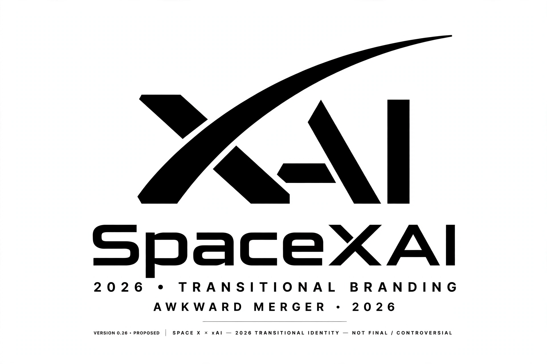
The SpaceXAI logo proved controversial. Design commentators were blunt in their criticism — one widely shared review called it a clumsy composite, and the reaction online was largely negative, with critics arguing that mashing two wordmarks together is rarely good logo design. Even Grok, the company’s own chatbot, reportedly gave the new logo a poor review when users asked its opinion, a detail that delighted commentators.
Despite the criticism, the SpaceXAI identity lasted barely three months. It remains the shortest-lived of the three identities — a transitional mark that now exists mainly as a footnote in the company’s branding history and as a curiosity for logo enthusiasts.
October 2026: The SpaceXSI Era — The SpaceX Standard Logo
The second rename was triggered by politics as much as branding. On September 29, 2026, President Trump signed an executive order titled “Inaugurating the Era of Super Intelligence,” directing federal agencies to use the terms “Super Intelligence” and “SI” instead of “AI.” Musk quickly embraced the new terminology.
On October 4, 2026, Musk posted on X suggesting the shift away from “AI” branding, and when a user asked whether SpaceXAI would be renamed SpaceXSI, Musk replied that the change would be made. The same day, SpaceXAI LLC filed a US trademark application for “SPACEXSI,” signaling the rename was official. The scramble around the new name was real: on October 7, 2026, the domain SpaceXSI.com sold for $174,000.
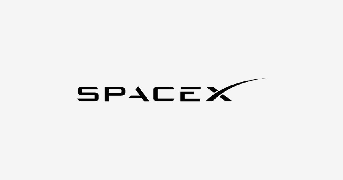
By October 10, 2026, the company’s official X account had been renamed to “SpaceX Super Intelligence” (@SpaceXSI), and on October 13, 2026, the company website and legal terms switched to SpaceXSI branding. Notably, the logo adopted at this stage was simply SpaceX’s standard logo — the well-known SpaceX wordmark — rather than a newly designed mark. In other words, the SpaceXSI “logo” as it exists today is the SpaceX logo applied to the AI company, a choice that sidesteps the design controversy of the SpaceXAI composite entirely.
SpaceXSI Logo Meaning
Each of the three identities carried its own meaning, and together they tell a story about how Musk positions his companies.
The xAI wordmark (2023–2026) meant precision and seriousness. Its geometric black letterforms suggested engineering rigor — a visual promise that this was an AI lab built by people who think in equations. The lowercase “x” linked it to Musk’s personal brand constellation.
The SpaceXAI composite (July–October 2026) was meant to signal unity: two Musk companies, one future. The idea was that spaceflight and artificial intelligence are converging frontiers. In practice, the execution undermined the message — a forced combination that pleased almost no one and lasted only weeks.
The current SpaceXSI identity (October 2026–present) makes a different statement by borrowing the SpaceX logo outright. The meaning here is institutional: the AI venture is no longer a scrappy startup with its own mark, but a division of the SpaceX empire, carrying the parent company’s established visual authority. And the “SI” — Super Intelligence — reflects the Trump-era terminology shift that prompted the rename, positioning the company at the linguistic frontier of the AI debate.
For designers, the honest takeaway is this: the SpaceXSI logo story is less about a single great mark and more about what rapid rebranding looks like in public. Three names, three visual strategies, three months — it is a case study in how not to rush identity design, and in how a strong parent brand can absorb a struggling sub-brand.
SpaceXSI Logo Colors
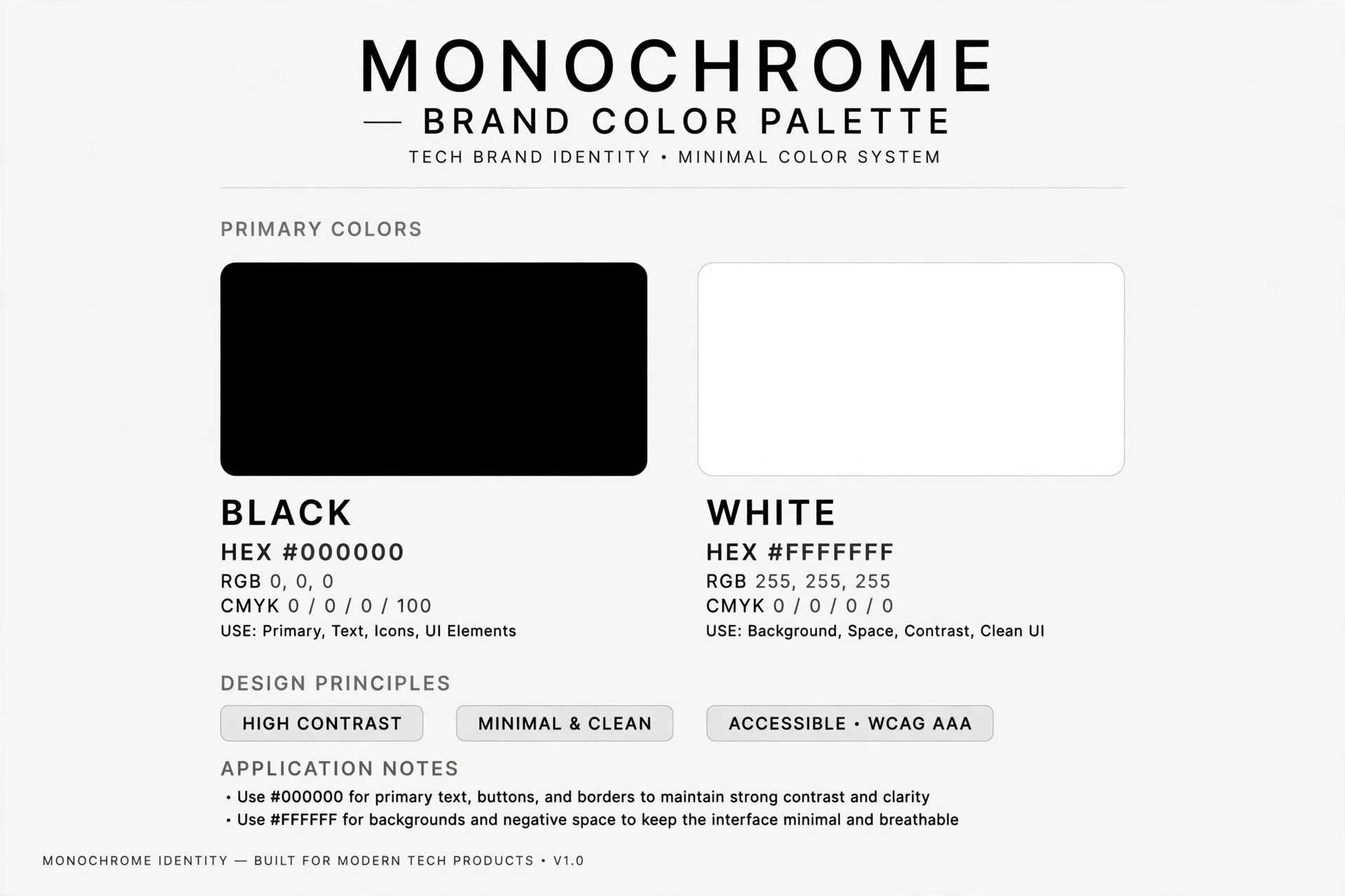
The SpaceXSI brand identity, inherited from SpaceX’s standard logo, is built on a stark black-and-white palette — consistent with the original xAI wordmark’s all-black treatment. The brand has never used bright colors or gradients; its visual language is monochrome and severe.
| Color | Hex Code | Usage |
|---|---|---|
| Black | #000000 | Primary logo color — wordmark on light backgrounds |
| White | #FFFFFF | Reversed logo on dark backgrounds |
Both the original xAI geometric wordmark and the current SpaceX-derived SpaceXSI branding rely on this black-and-white scheme. The short-lived SpaceXAI composite likewise stayed within monochrome. If you are recreating or referencing the SpaceXSI logo, black on white (or white on black) is the authentic treatment.
Conclusion
The SpaceXSI logo history is unlike almost any other in the tech world: a geometric xAI wordmark (2023), a controversial SpaceXAI composite (July 2026), and today’s SpaceX-standard branding under the SpaceXSI name (October 2026) — three identities in three months. Whether the company will eventually design a distinct mark of its own, or continue borrowing the SpaceX logo, remains to be seen.
For now, anyone downloading or referencing the new xAI logo — properly, the SpaceXSI logo — should know they are getting the SpaceX wordmark: black or white, sharp, and unadorned. And if you are looking for the older marks, the SpaceXAI logo and the original xAI wordmark each represent a distinct, dated chapter of one of the fastest rebrands in corporate history. You can download clean SVG and PNG versions of these logos from the VectorDose logo library.
Related logos on VectorDose
SpaceXSI does not have its own VectorDose logo page yet. Reports on the rebrand note that the SpaceXSI branding uses SpaceX’s standard logo, so the closest related download is the SpaceX logo in SVG and transparent PNG.
Frequently asked questions about the SpaceXSI logo
What does the SpaceXSI logo mean? The story above traces the mark’s history and meaning — read it in full, because the meaning sits in the design details, not in a single symbol.
What colours does the SpaceXSI logo use? Use the colours shown in the story above and on the brand’s official pages, copied exactly. Never recolour the artwork to fit your own palette.
Can I download the SpaceXSI logo in SVG and PNG? This brand does not have its own VectorDose logo page yet, so use the brand’s own official brand or press page for the current file, and see the related logos below for similar brands you can download today.
SVG or PNG — which format should I use? Use the SVG as your master file for websites and anything that scales. Export a transparent PNG at the exact pixel size when the destination cannot use vectors, such as a slide deck or a social post.