The Jif logo history is a story of a banner that barely changed for more than 30 years — and then did, in 2026, for a reason that has little to do with looks. Trade press covers the refresh announcement, but no single page puts the logo’s story, its meaning and its colours together. This post does that, from the tri-colour banner to the 2026 redesign.
The Jif logo is one of the most recognizable food brand marks in America — three bold stripes of red, blue and green with playful white lettering that has sat on grocery shelves for generations. In August 2026, The J.M. Smucker Co. unveiled the first major refresh of the Jif brand in more than 30 years, giving the iconic mark its biggest update since most of today’s shoppers were born. This article traces the full Jif logo history, explains what the new Jif logo 2026 changed and why, and breaks down the meaning and colors behind one of peanut butter’s most famous identities.
Jif Brand Overview
Jif is America’s best-selling peanut butter brand, owned by The J.M. Smucker Co. and famous for the long-running “Choosy mothers choose Jif” advertising line. The brand’s logo recognition is extraordinary: according to Smucker, 85% of consumers recognize the Jif logo by its stripes alone. Yet that same research revealed a challenge — most shoppers associated those stripes only with the classic PB&J sandwich, while Jif accounted for just 4% of total snacking occasions. That gap between recognition and relevance is exactly what the 2026 rebrand was designed to close.
The History of Jif: From 1958 to Today
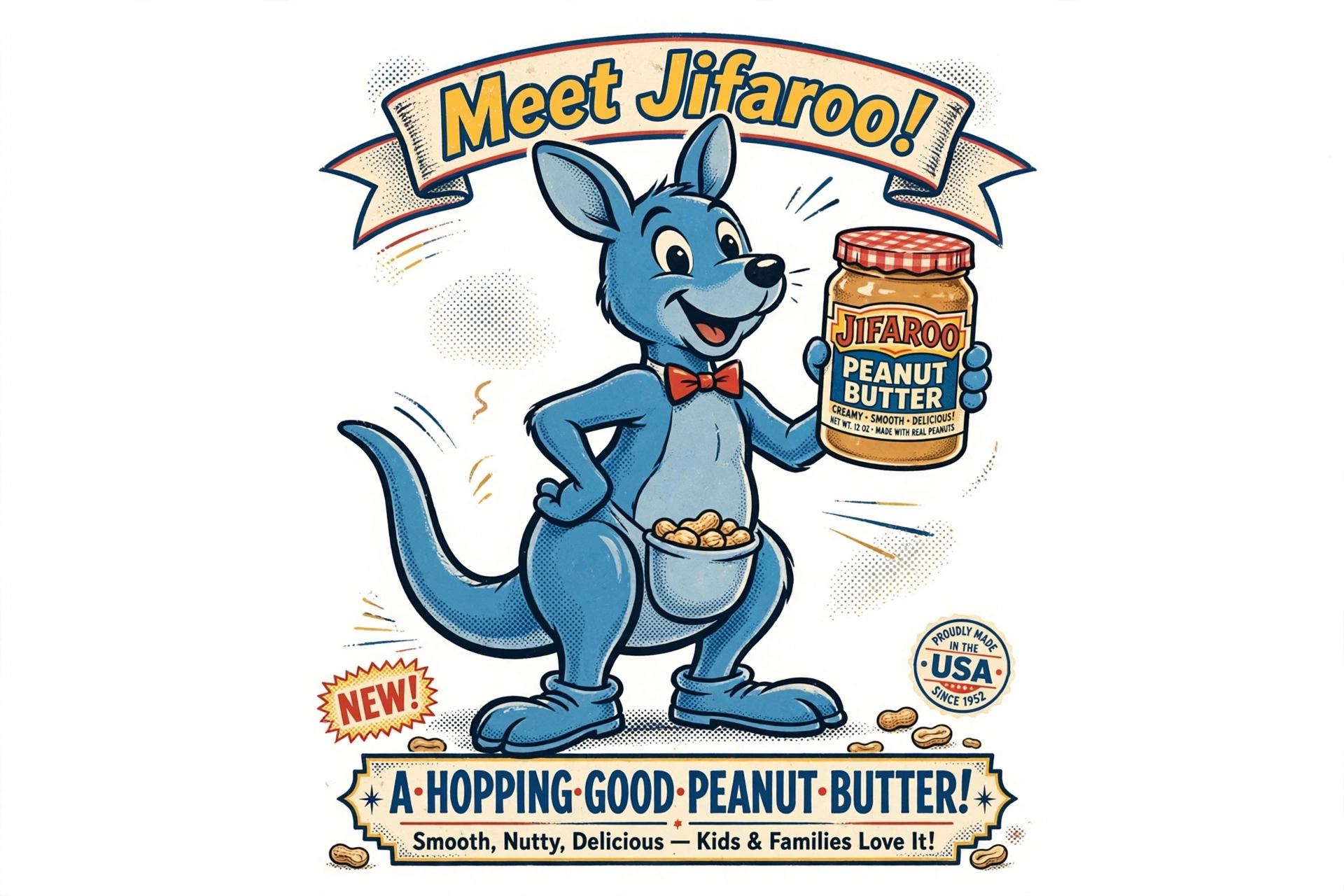
Jif was introduced in 1958, entering a peanut butter market where it would eventually become the category leader. The original jars looked very different from what shoppers know today: they featured a blue kangaroo mascot named Jifaroo, a playful character meant to give the new brand a friendly face. The kangaroo did not last long — Jifaroo faded from Jif’s advertising in the 1960s as the brand shifted toward the cleaner, stripe-based identity that would define it for decades.
Through the following decades, Jif grew into a household staple. The brand’s marketing cemented its place in American kitchens, and by the early 1980s it had secured its long-held position as the country’s best-selling peanut butter. The logo that carried the brand through this entire era — the tri-color banner with its funky white lettering — became so familiar that generations of shoppers could spot it from across the aisle.
Evolution of the Jif Logo
1958: The Original Jars
The earliest Jif packaging centered on Jifaroo, the blue kangaroo mascot. Like many 1950s food brands, Jif leaned on a character to build recognition with families. When the mascot was retired in the 1960s, the brand committed fully to a typographic mark — a decision that proved remarkably durable.
The Classic Era: Three Stripes That Lasted 30+ Years
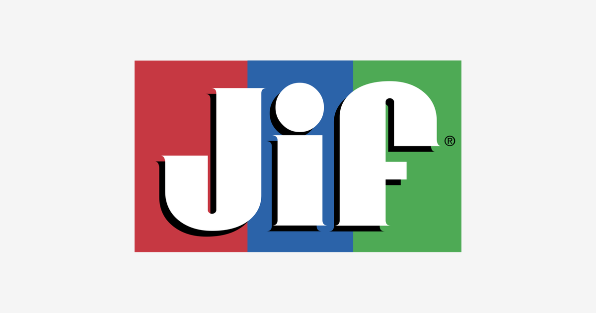
The classic Jif logo that most people picture today consists of the word “jif” in rounded, lowercase white lettering set against three horizontal stripes of red, blue and green. The lettering had a funky, slightly tilted energy, finished with serifs and a dated drop shadow that gave it a three-dimensional feel typical of late-20th-century packaging design.
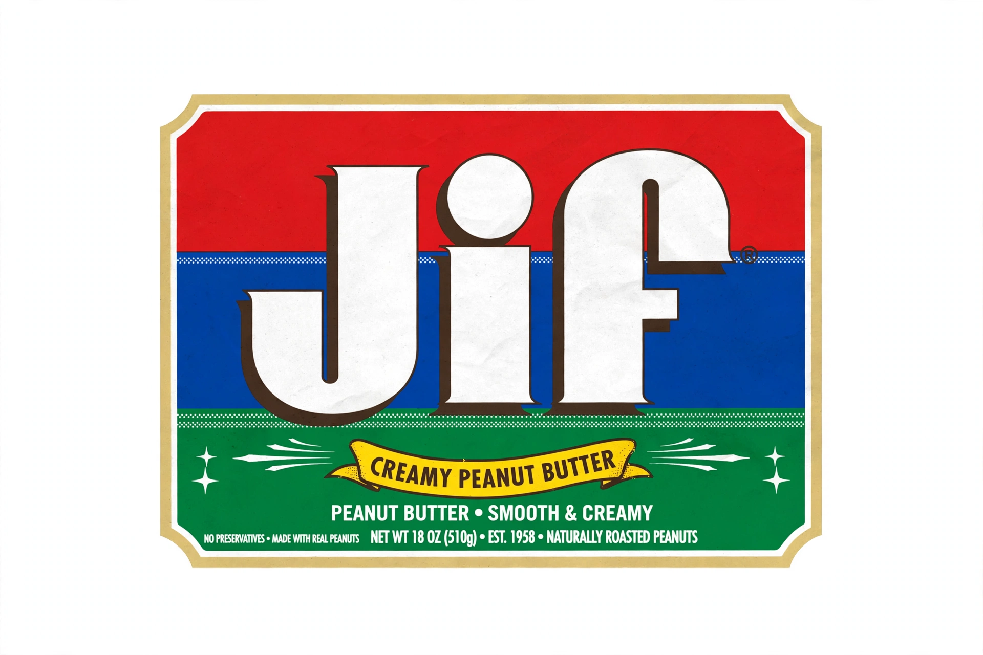
This version of the mark remained essentially unchanged for more than three decades — an eternity in branding. Its longevity is a testament to how well it worked: the stripes were so distinctive that the brand became identifiable by color blocks alone, without a single letter visible. Few food logos achieve that level of visual equity.
2026: The First Major Redesign in Over 30 Years
On August 10, 2026, Smucker revealed the new Jif identity — the first significant overhaul of the brand in a generation. Rather than starting over, the redesign carefully preserves what made the logo famous while dragging its execution into the modern era.
The 2026 Redesign: What Changed and Why
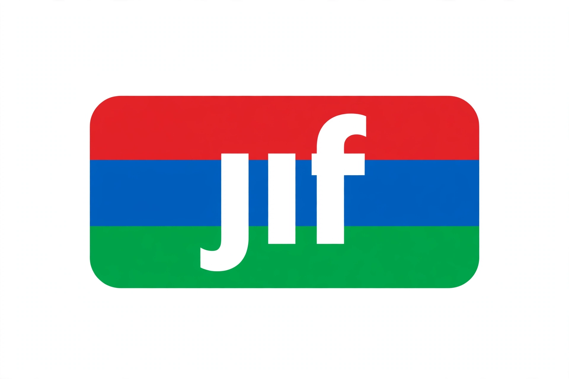
The new Jif logo 2026 keeps the two elements consumers love most: the signature tri-color (red, blue and green) banner and the funky, playful lettering. What it removes are the dated details — the drop shadow is gone, and the serifs have been stripped away, leaving a cleaner, bolder wordmark that reads crisply on both physical packaging and phone screens.
The strategic thinking behind the refresh goes beyond aesthetics. Smucker’s research showed that while 85% of consumers recognized the stripes, they associated Jif almost exclusively with PB&J sandwiches. With the brand capturing only 4% of total snacking occasions, the company saw a major growth opportunity in repositioning Jif as an anytime snack — for dipping, drizzling and mixing — rather than just a sandwich spread.
That strategy comes to life in the launch campaign, “Every Jif’ing Thing,” which debuted alongside the new logo on August 10. In a clever touch, the letters inside the logo’s stripes become rotating prompts — DIP, SIP, MIX — turning the packaging itself into an invitation to use peanut butter in new ways. The creative was led by BBH USA with the bespoke PSOne/Publicis agency team.
The rollout is happening in stages: new packaging began shipping in October 2026 and is reaching store shelves in waves through the fall and into early winter. The refresh also coincides with portfolio additions including squeezable formats, a Peanut Butter & Chocolate spread and Simply Peanut Butter, while the on-the-go line “Jif To Go” has been renamed “Jif Dippers” — all reinforcing the beyond-the-sandwich message.
What Does the Jif Logo Mean?
Every element of the Jif logo was designed for instant shelf recognition, and its meaning is tied directly to that job:
The three stripes are the brand’s most powerful asset. Red, blue and green together create a color combination owned by no other major peanut butter brand, which is precisely why 85% of shoppers can identify Jif from the stripes alone. They convey energy, variety and playfulness — exactly the feelings the 2026 “snacking beyond the sandwich” positioning wants to amplify.
The lowercase white lettering keeps the brand approachable and family-friendly. The rounded, slightly tilted letterforms feel fun rather than corporate, a tone that has helped Jif stay emotionally connected to parents and kids alike for decades.
The rotating stripe prompts (DIP, SIP, MIX) in the 2026 version add a new layer of meaning: the logo is no longer just a name on a jar but a suggestion engine, nudging shoppers toward new ways of enjoying peanut butter.
Jif Logo Color Codes
The Jif identity is built on four colors: the three stripe colors and the white of the lettering.
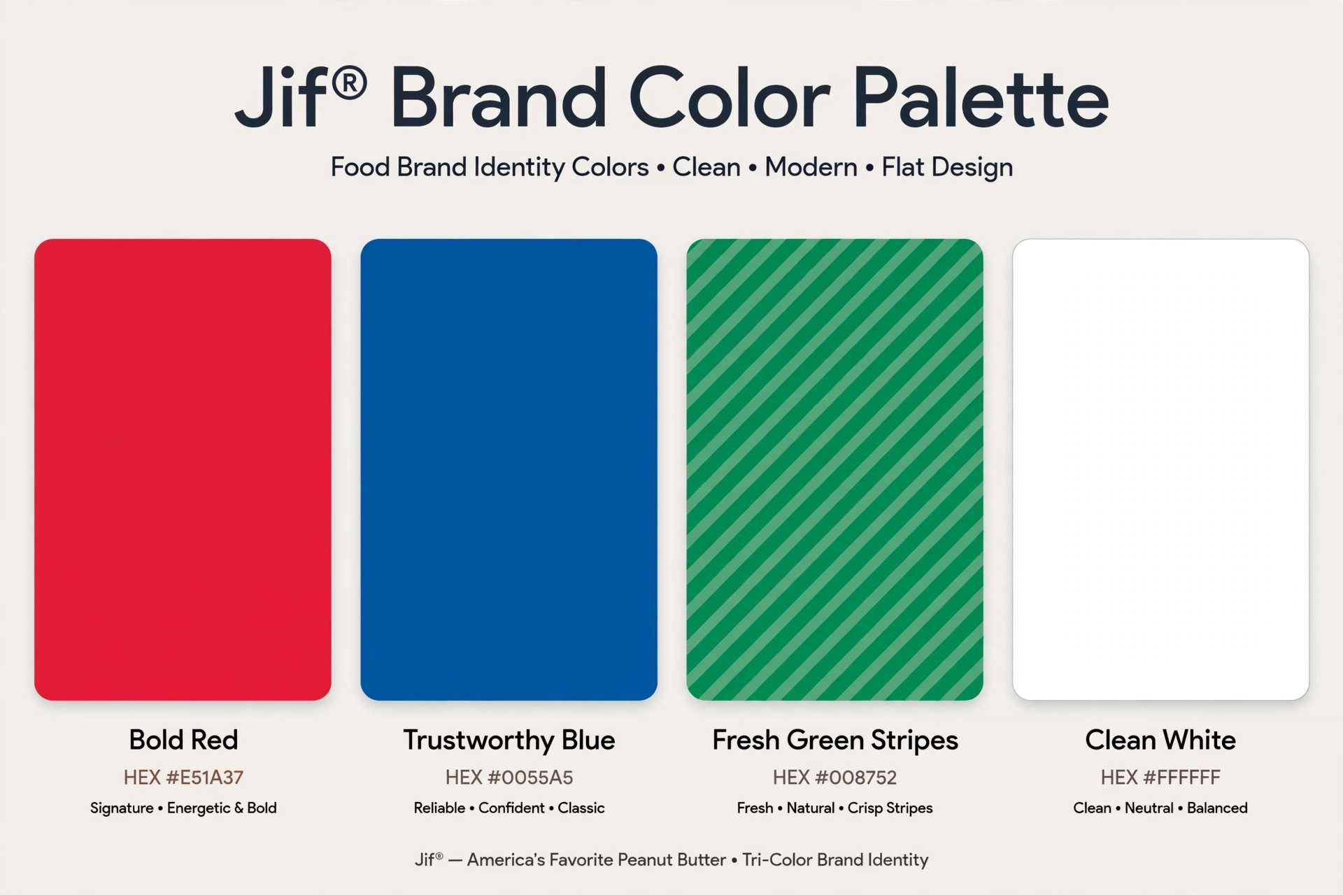
- Jif Red — the top stripe; bold and appetite-stimulating, it anchors the mark with energy.
- Jif Blue — the middle stripe; trustworthy and familiar, it balances the warmth of the red.
- Jif Green — the bottom stripe; fresh and natural, it rounds out the tri-color system.
- White — used for the “jif” wordmark, giving maximum contrast against the saturated stripes.
The 2026 redesign kept this exact tri-color equity intact — Smucker understood that the stripes are the brand, so the refresh modernized the lettering and removed dated effects without touching the color system shoppers recognize. Designers looking to match the palette precisely should sample colors directly from official Jif packaging or the brand’s press assets, as the company does not publish official hex values for the logo.
Conclusion
The story of the Jif logo is the story of a mark that got almost everything right the first time. From the short-lived Jifaroo kangaroo of 1958 to the tri-color banner that defined the brand for over 30 years, Jif built one of the most recognizable identities in American food — then had the discipline to leave it alone for decades. The new Jif logo 2026 respects that legacy: same beloved stripes, same playful spirit, simply cleaned up for the next generation of snackers. Whether shoppers are making a classic PB&J or trying one of the new “DIP, SIP, MIX” occasions, the stripes on the jar will keep doing what they have always done — standing out on the shelf.
Related logos on VectorDose
Jif does not have its own VectorDose logo page yet. A related food brand you can download today is the Oreo logo in SVG and transparent PNG.
Frequently asked questions about the Jif logo
What does the Jif logo mean? The story above traces the mark’s history and meaning — read it in full, because the meaning sits in the design details, not in a single symbol.
What colours does the Jif logo use? Use the colours shown in the story above and on the brand’s official pages, copied exactly. Never recolour the artwork to fit your own palette.
Can I download the Jif logo in SVG and PNG? This brand does not have its own VectorDose logo page yet, so use the brand’s own official brand or press page for the current file, and see the related logos below for similar brands you can download today.
SVG or PNG — which format should I use? Use the SVG as your master file for websites and anything that scales. Export a transparent PNG at the exact pixel size when the destination cannot use vectors, such as a slide deck or a social post.