The TikTok logo history starts in a dark concert hall. ByteDance’s in-house designer, a concert lover, drew the mark from the contrast of a dark arena and bright stage lights — and shaped it as a musical note that doubles as a lowercase ‘d’ for Douyin, ‘shaking sound’ in Chinese. Cyan and magenta offsets give the note its vibrating ‘glitch’ edge, and the 2018 wordmark tightening made ‘TikTok’ one word. This post traces that story and points to a clean SVG and transparent PNG download.
Introduction
Black background. A musical note that looks like it’s vibrating. A flicker of cyan and red at its edges, like a glitch on an old TV. The TikTok logo is one of the few app icons designed to feel like it’s moving — and that was entirely the point.
This article covers the story of the TikTok logo, what the “d” note really represents, and the anaglyph colors that make it pop off the home screen.
From Musical.ly to the World’s Loudest App
TikTok began as Douyin, launched in China by ByteDance in 2016. The international version, TikTok, followed in 2017; ByteDance’s $1 billion acquisition of Musical.ly (2017) and the 2018 merger poured a ready-made Western audience into it.
The result is the defining app of the short-video era: 1.5 billion+ users, an algorithm that manufactures stars overnight, and a logo that teenagers can draw from memory — badly, but recognizably, which is the real test.
History of the TikTok Logo
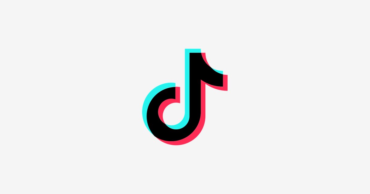
The TikTok mark has been remarkably stable since 2016. The core symbol — a note shaped like a lowercase “d” (for Douyin) — pairs with a bold “TikTok” wordmark. Wordmark tweaks have been minor: slightly rounded letterforms, spacing refinements. The symbol itself never needed saving.
The genius is in the treatment. The note is rendered in white with cyan (#25F4EE) and red (#FE2C55) shadows offset behind it — the classic red-blue anaglyph 3D effect, the same trick as paper 3D glasses. Against black, the note appears to buzz, echoing both a sound wave and the shake of a phone playing music.
What the Logo Means
- The note: Music is the app’s DNA — it began as lip-sync, and sound still powers every trend.
- The “d” shape: A quiet nod to Douyin, the original Chinese app.
- The 3D offset: Vibration and rhythm — the note looks mid-beat, never still. It also echoes a sound wave.
- Black background: The stage. Every video on TikTok plays against darkness; the logo dresses the same way.
TikTok Logo Colors
| Color | Hex Code | Usage |
|---|---|---|
| TikTok Black | #000000 | Background / wordmark |
| TikTok Cyan | #25F4EE | Left 3D shadow |
| TikTok Red | #FE2C55 | Right 3D shadow |
| White | #FFFFFF | The note |
On light backgrounds the logo runs in solid black (note + wordmark); the full anaglyph version lives on black or in the app icon.
Conclusion
TikTok’s logo does what great music marks do: you can almost hear it. A single note, buzzing with borrowed 3D energy, became the emblem of the loudest app on earth.
Need the logo files for a project? Download the TikTok logo in SVG and transparent PNG from VectorDose.
Download the TikTok logo in SVG and transparent PNG
Download the TikTok logo on VectorDose in SVG and transparent PNG, with the official brand colours listed on the page. Use the SVG as your master file and export a PNG at the exact size each use needs — and always copy the brand colours exactly, never recolour the artwork.
Frequently asked questions about the TikTok logo
What does the TikTok logo mean? The story above traces the mark’s history and meaning — read it in full, because the meaning sits in the design details, not in a single symbol.
What colours does the TikTok logo use? Use the colours shown in the story above and on the brand’s official pages, copied exactly. Never recolour the artwork to fit your own palette.
Can I download the TikTok logo in SVG and PNG? Yes. Download the TikTok logo on VectorDose in SVG and transparent PNG, with the official brand colours listed on the page.
SVG or PNG — which format should I use? Use the SVG as your master file for websites and anything that scales. Export a transparent PNG at the exact pixel size when the destination cannot use vectors, such as a slide deck or a social post.