The Pop Mart logo history is easy to miss, because the brand’s characters — above all Labubu, created by artist Kasing Lung and licensed to Pop Mart, spun off into its own series under The Monsters in 2019 — hog every headline. But behind the blind-box phenomenon sits a Beijing company whose own wordmark has stayed deliberately plain, letting the characters do the talking. This post separates the Pop Mart brand from its characters, traces the mark, and points to a clean SVG and transparent PNG download.
Introduction
The Pop Mart logo — bold white letters on an unmistakable red — has become the flag of the global designer-toy boom. In just over a decade, this Beijing company turned the humble “blind box” into a cultural phenomenon, and its red-and-white mark now fronts hundreds of stores across Asia, Europe, and America, plus the viral empire of Labubu.
If you are searching for the Pop Mart logo, you are looking for the mark of the company behind Labubu, Molly, Dimoo, Skullpanda, and Pucky — the collectibles that turned toy unboxings into TikTok’s favorite genre. This article traces the history of the Pop Mart logo, explains what it means, and breaks down the brand’s official colors.
Pop Mart Brand Overview
Pop Mart (Pop Mart International Group Limited) is a Chinese toy company founded in 2010 in Beijing by Wang Ning. It began as a variety store selling toys and lifestyle products, but its breakthrough came from an unlikely insight: young Chinese consumers would pay to buy a sealed “blind box” containing a random designer figurine. The company was credited with creating the entire designer-toy market in China.
Pop Mart went public on the Hong Kong Stock Exchange (SEHK: 9992) in December 2020. Its roster of in-house IPs — Molly (designed by Kenny Wong), Dimoo, Pucky, Skullpanda, and the record-breaking Labubu (created by Kasing Lung) — plus licenses like Disney and Harry Potter, turned it into a global phenomenon. By 2025, the company’s market valuation had surpassed the combined value of Mattel, Hasbro, and Sanrio.
History of the Pop Mart Logo
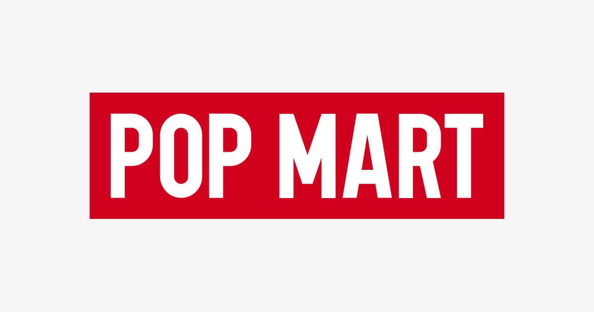
The Pop Mart wordmark is a study in retail confidence: the words “POP MART” set in heavy, condensed, uppercase sans-serif letters — white on a solid red field. The design has remained consistent as the company scaled from a single Beijing shop to a multinational listed company, a testament to how well the original identity worked.
The logo’s genius is its shelf presence. In a mall or on a roboshop vending machine, the red block reads instantly from across a crowded concourse — more like a fashion label or a sports brand than a toy company. As Pop Mart expanded into New York, London, Tokyo, and Paris, the mark needed no localization: two English words, one red, recognized worldwide. The Labubu craze of 2024–2025 — when plush sales surged over 1,000% — put the red logo on millions of new screens via unboxing videos.
Pop Mart Logo Meaning: What Does the Design Symbolize?
- The red field: Red is the color of luck and celebration in Chinese culture — and of urgency in retail. It makes the logo impossible to miss on a shelf and emotionally warm, a deliberate contrast to the cool minimalism of Western toy brands.
- The heavy uppercase type: The thick, tightly spaced letters convey solidity and confidence — this is not a fragile boutique brand but a pop-culture machine. The condensed forms echo streetwear and sneaker branding, aligning Pop Mart with youth culture rather than children’s toys.
- “POP” as a statement: The name itself promises the product’s essence: popular culture, popping open a blind box, the pop of a surprise reveal. The logo is the surprise, packaged.
- White on red: Maximum contrast for maximum visibility — the same principle behind the world’s most recognizable retail marks. It works at every scale, from a storefront to a 3cm toy tag.
Pop Mart Logo Colors
Pop Mart’s identity is a two-color system built for instant recognition.
| Color | Hex Code | Usage |
|---|---|---|
| Pop Mart Red | #D1001F | Primary brand color — the logo field, storefronts, packaging |
| White | #FFFFFF | The “POP MART” wordmark, reversed applications |
| Black | #000000 | Secondary text, product tags, anti-counterfeit labels |
The red (#D1001F, sampled from the official vector artwork) is a deep, slightly blue-leaning red — more “lucky red” than “sale red” — giving the brand warmth without cheapness. It is arguably the most valuable two square inches of red in the toy industry.
Conclusion
The Pop Mart logo is retail branding at its most efficient: two words, one red, zero ambiguity. It turned a Beijing variety store into the defining toy company of the 2020s and rode the Labubu wave to a valuation bigger than Mattel and Hasbro combined. In the attention economy, the loudest color wins — and Pop Mart picked the loudest one.
Looking for the logo files? Download the Pop Mart logo in SVG and transparent PNG formats from VectorDose.
Download the Pop Mart logo in SVG and transparent PNG
Download the Pop Mart logo on VectorDose in SVG and transparent PNG, with the official brand colours listed on the page. Use the SVG as your master file and export a PNG at the exact size each use needs — and always copy the brand colours exactly, never recolour the artwork.
Frequently asked questions about the Pop Mart logo
What does the Pop Mart logo mean? The story above traces the mark’s history and meaning — read it in full, because the meaning sits in the design details, not in a single symbol.
What colours does the Pop Mart logo use? Use the colours shown in the story above and on the brand’s official pages, copied exactly. Never recolour the artwork to fit your own palette.
Can I download the Pop Mart logo in SVG and PNG? Yes. Download the Pop Mart logo on VectorDose in SVG and transparent PNG, with the official brand colours listed on the page.
SVG or PNG — which format should I use? Use the SVG as your master file for websites and anything that scales. Export a transparent PNG at the exact pixel size when the destination cannot use vectors, such as a slide deck or a social post.