The Lemon8 logo history hides in the name itself. ByteDance’s lifestyle app launched in Japan in May 2020 (first as Sharee), reached the US and UK in February 2023, and takes its name from lemonade — fresh things, shared like a refreshing glass — with the 8 standing in for the infinity symbol, an endless supply of discoveries. The current mark, designed by Labbrand from September 2021, keeps that freshness in lemon yellow. This post traces the name, the redesign and the TikTok integration, and points to a clean SVG and transparent PNG download.
Introduction
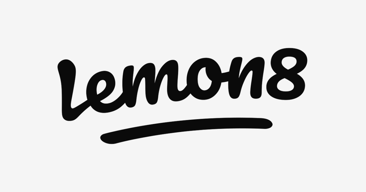
The Lemon8 logo is impossible to miss: a loose, handwritten “lemon8” script with a sweeping underline, splashed in black across a vivid lemon-yellow background. When ByteDance’s lifestyle app surged in the United States in early 2023 — climbing app store charts as users hunted for a TikTok alternative — that sunny yellow icon became one of the most recognizable new marks in social media.
If you are searching for the Lemon8 logo, you are looking for the official mark of ByteDance’s photo-and-video lifestyle platform, often described as a blend of Instagram and Pinterest. This article traces the history of the Lemon8 logo, explains what the playful script means, and breaks down the brand’s signature yellow-and-black palette.
Lemon8 Brand Overview
Lemon8 is a lifestyle content platform developed by ByteDance, the company behind TikTok and CapCut. It launched in March 2020 in Japan, where it steadily grew a devoted audience for beauty, fashion, food, and travel content, before expanding to the United Kingdom and the United States in February 2023. Unlike TikTok’s endless vertical feed, Lemon8 organizes content into curated topic feeds with detailed captions — closer to Pinterest or China’s Xiaohongshu than to short-video apps.
The app’s US rise coincided with mounting political pressure on TikTok, and many users treated Lemon8 as a backup home. In a dramatic turn, Lemon8 was banned in the US on January 19, 2025 alongside TikTok and CapCut following a Supreme Court decision — and, like its siblings, came back online the very next day.
History of the Lemon8 Logo
Lemon8’s original 2020 identity was a modest wordmark, but the brand found its visual voice with a redesign by the branding agency Labbrand, unveiled on September 29, 2021. The new identity introduced the handwritten-style “lemon8” script — casual, energetic, and deliberately imperfect — paired with the bold lemon-yellow that has defined the brand ever since.
The current logo system has two signature forms: the black script wordmark used on light backgrounds and the website header, and the app icon — the same black script reversed out of a solid lemon-yellow rounded square. The wordmark’s most recognizable detail is the long, confident underline swash beneath the text, giving the signature-like logo the feel of a personal endorsement.
Lemon8 Logo Meaning: What Does the Script Symbolize?
The Lemon8 logo is designed to feel like a friend’s recommendation, not a corporation’s trademark:
- Handwritten authenticity: The loose script lettering suggests a personal note or diary entry — fitting for a platform built on genuine lifestyle sharing rather than performance.
- The underline swash: The sweeping underline reads as a signature flourish, as if the brand is personally signing off on the creativity of its community.
- Lemon yellow: The vivid yellow is the brand’s emotional core — optimism, energy, freshness, and playfulness. It makes the app icon unmissable on a crowded home screen.
- Black script on yellow: The high-contrast pairing keeps the playful lettering bold and legible, balancing friendliness with confidence.
Lemon8 Logo Colors
The Lemon8 identity is built on a simple, high-energy pairing sampled directly from the official app icon.
| Color | Hex Code | Usage |
|---|---|---|
| Lemon Yellow | #FFF700 | Signature brand color — app icon background, key brand accents |
| Lemon Black | #0A0A0A | Primary wordmark color — the “lemon8” script on light backgrounds |
| White | #FFFFFF | Reversed applications and clean background surfaces |
The yellow is deliberately electric — closer to a highlighter than to a natural lemon — ensuring the brand reads as digital-native and youthful rather than organic or artisanal.
Conclusion
The Lemon8 logo shows how a single bold color choice can carry a brand. A casual handwritten script in black on vivid lemon yellow — designed by Labbrand in 2021 — gave ByteDance’s lifestyle app an identity as sunny and distinctive as its community, surviving app-store bans and political storms without losing its brightness.
Whether Lemon8 becomes the next big lifestyle platform or remains TikTok’s sunny sibling, its yellow icon has already earned its place: the happiest-looking logo in social media.
Looking for the logo files? Download the Lemon8 logo in SVG and transparent PNG formats from VectorDose.
Download the Lemon8 logo in SVG and transparent PNG
Download the Lemon8 logo on VectorDose in SVG and transparent PNG, with the official brand colours listed on the page. Use the SVG as your master file and export a PNG at the exact size each use needs — and always copy the brand colours exactly, never recolour the artwork.
Frequently asked questions about the Lemon8 logo
What does the Lemon8 logo mean? The story above traces the mark’s history and meaning — read it in full, because the meaning sits in the design details, not in a single symbol.
What colours does the Lemon8 logo use? Use the colours shown in the story above and on the brand’s official pages, copied exactly. Never recolour the artwork to fit your own palette.
Can I download the Lemon8 logo in SVG and PNG? Yes. Download the Lemon8 logo on VectorDose in SVG and transparent PNG, with the official brand colours listed on the page.
SVG or PNG — which format should I use? Use the SVG as your master file for websites and anything that scales. Export a transparent PNG at the exact pixel size when the destination cannot use vectors, such as a slide deck or a social post.