The Instagram logo history runs from Kevin Systrom’s own 2010 Polaroid-style camera, through Cole Rise’s polished 2011 Bell & Howell-inspired version, to the dramatic 2016 flat redesign — a simple camera outline filled with a warm-to-cool gradient that its makers described as feeling ‘made of light’. The camera survived every change because it is the brand’s core: capturing moments. This post traces that arc and points to a clean SVG and transparent PNG download.
Introduction
It started as a Polaroid-style camera with a rainbow stripe. Today it’s a rounded square with a circle and a dot — three shapes that 2 billion people recognize instantly. The Instagram logo has one of the most debated redesign stories in tech, and its gradient is now as famous as the app itself.
This article traces how the Instagram logo evolved from a detailed retro camera to the minimal glyph we know, what each element means, and the colors behind the world’s most copied gradient.
The App Behind the Icon
Instagram launched in 2010, built by Kevin Systrom and Mike Krieger from the bones of a check-in app called Burbn. The bet was simple: phone cameras were getting good, and people would rather share photos than statuses.
Facebook bought it in 2012 for $1 billion — a price mocked at the time, now considered the deal of the decade. Stories (2016), Reels (2020), and shopping turned a photo app into the internet’s visual town square. The logo had to survive all of it.
Logo History: Skeuomorphic Camera to Gradient Glyph
The original 2010 logo, designed by Cole Rise, was a realistic one-tap rendering of a vintage Polaroid camera — rainbow stripe, lens, viewfinder and all. It was charming, and completely unusable at small sizes.
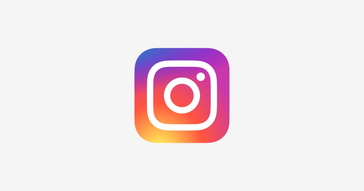
A simplified flat camera followed in 2013 as iOS 7 killed skeuomorphism. Then came May 2016: the redesign that broke the internet for a weekend. Instagram replaced the camera with an abstract glyph — rounded square (camera body), circle (lens), dot (viewfinder/flash) — drenched in a sunset gradient of purple, pink, orange, and yellow. The backlash was loud; the recognition was instant. Within months the new mark was untouchable, and the app kept the same glyph — refined only slightly since — because it prints perfectly from a 16-pixel favicon to a billboard.
What the Logo Means
- The rounded square: The camera body, reduced to its simplest possible outline.
- The circle: The lens — the entire reason the app exists.
- The dot: The viewfinder and flash, the last surviving detail of the original camera.
- The gradient: A sunset — warmth, creativity, and the “golden hour” every photographer chases. It also mirrors the rainbow stripe on the 2010 original.
Instagram Logo Colors
| Color | Hex Code | Usage |
|---|---|---|
| Instagram Purple | #833AB4 | Gradient start |
| Instagram Pink/Red | #FD1D1D | Gradient middle |
| Instagram Orange | #FCB045 | Gradient end — the sunset glow |
| White | #FFFFFF | The glyph line work |
The gradient flows diagonally — violet at the top-left warming into yellow-orange at the bottom-right — and the white line glyph floats on top. A monochrome black or white version exists for single-color use.
Conclusion
The Instagram logo is a masterclass in designing for the smallest screen first. Three shapes and a sunset replaced a detailed illustration — and became more iconic, not less.
Need the logo files for a project? Download the Instagram logo in SVG and transparent PNG from VectorDose.
Download the Instagram logo in SVG and transparent PNG
Download the Instagram logo on VectorDose in SVG and transparent PNG, with the official brand colours listed on the page. Use the SVG as your master file and export a PNG at the exact size each use needs — and always copy the brand colours exactly, never recolour the artwork.
Frequently asked questions about the Instagram logo
What does the Instagram logo mean? The story above traces the mark’s history and meaning — read it in full, because the meaning sits in the design details, not in a single symbol.
What colours does the Instagram logo use? Use the colours shown in the story above and on the brand’s official pages, copied exactly. Never recolour the artwork to fit your own palette.
Can I download the Instagram logo in SVG and PNG? Yes. Download the Instagram logo on VectorDose in SVG and transparent PNG, with the official brand colours listed on the page.
SVG or PNG — which format should I use? Use the SVG as your master file for websites and anything that scales. Export a transparent PNG at the exact pixel size when the destination cannot use vectors, such as a slide deck or a social post.