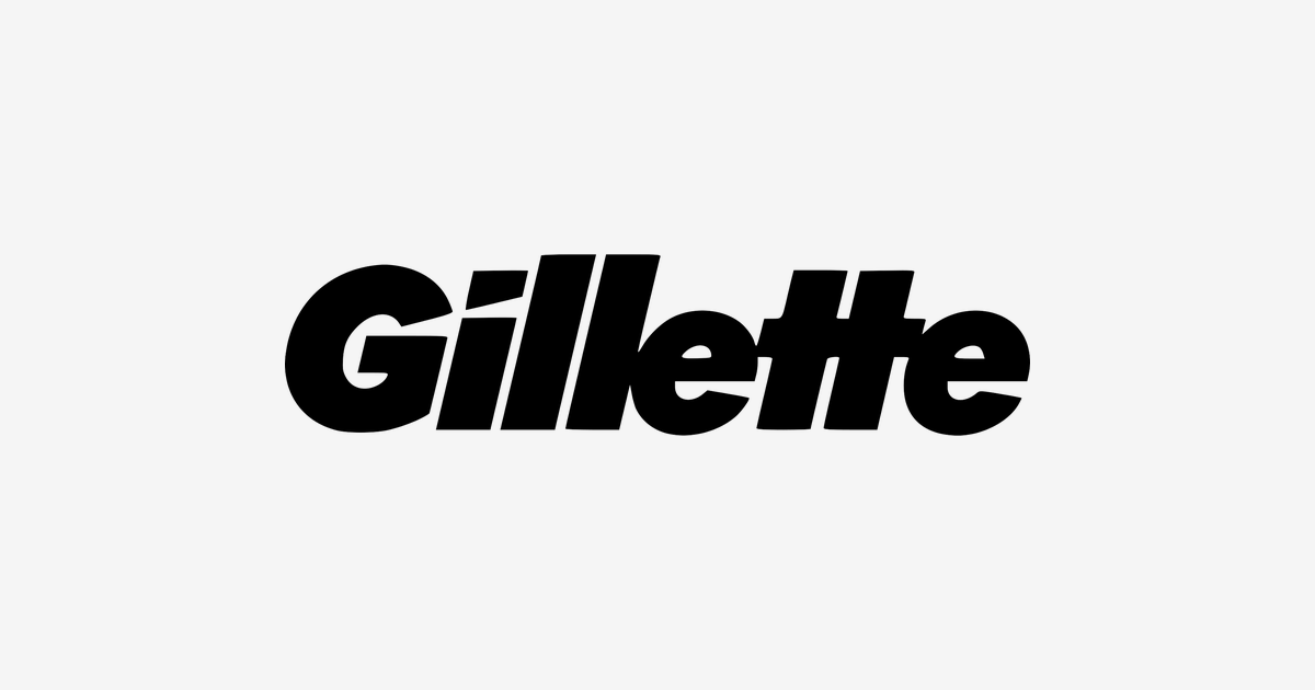
The Gillette logo history starts in 1901 with King C. Gillette’s safety razors, and its original mark featured an arrow piercing the letters. In 1974 the letters grew larger — the bold form that remains today — and in 2009 designers cut the dot of the ‘i’ into an asymmetrically sliced square, a notch meant to suggest impeccable sharpness, with a matching nick in the ‘G’. The slanted first stroke reads as a blade edge: precision, speed and a clean shave. This post traces that story and points to a clean SVG and transparent PNG download.
Introduction
Some logos make a promise. The Gillette logo makes a cut: a heavy black wordmark leaning forward like a blade mid-stroke, so familiar that in many countries the brand name is simply the word for a razor blade. For well over a century that slanted signature has stood for one idea — the shave, perfected — on razors carried into two world wars and bathrooms in almost every country on earth. This is the story of how a Boston salesman’s disposable idea built the most famous mark in men’s grooming.
1895: Advice from a Cork Salesman
Gillette begins with a piece of advice. King Camp Gillette was a travelling salesman whose mentor, William Painter — inventor of the Crown cork bottle cap — urged him to invent something like the cork itself: used once, then thrown away. Gillette had the idea in 1895: a thin, cheap, disposable razor blade, so men would never need to strop and hone a heavy straight razor again.
Turning the idea into steel took six years. MIT-trained chemist William Emery Nickerson finally devised a way to grind blades from thin sheet steel, and on 28 September 1901 Gillette and his partners founded the American Safety Razor Company in Boston, Massachusetts — the business that would soon rename itself the Gillette Safety Razor Company.
1903–1918: Fifty-One Razors, Then an Army
Production began in 1903, and the first year’s figures were humble: 51 razors and 168 blades sold. The second year told a different story — 90,884 razors and 123,648 blades — and by 1905 the company had a London sales office and a blade plant in Paris. The disposable era had begun.
Then came the First World War. In 1918 the US military began issuing Gillette shaving kits to every American serviceman; that year the company sold 3.5 million razors and 32 million blades. Millions of soldiers came home with a new daily habit — the clean shave, done by themselves, with a Gillette. The brand spent the following decades collecting on that habit: in 1947 it sold a billion blades, and by 1950 it held around half of the entire US blade market.
The Slanted Wordmark
Through all of it, the badge barely changed its posture. Gillette’s lettering has been italic and forward-leaning for most of its life, sharpening over the decades into today’s compact black wordmark:
- The slant: The heavy forward italic mimics the swift stroke of a razor across the face — speed and sharpness built into the letterforms themselves.
- The cut: Small refinements have cleaned a precise cut through the letters and stripped away older serifs and outlines, so the mark reads like something machined, not drawn.
- The black master: The primary logo is plain black — a confident, no-nonsense signature that prints cleanly on any pack colour, from entry-level disposables to flagship cartridges.
It is a lesson in restraint: while the razors gained blades — two, three, then five with the Mach3 of 1998 and the Fusion of 2006 — the wordmark simply got quieter and surer of itself.
“The Best a Man Can Get”
In 1989 Gillette launched the slogan that would define it for thirty years: “The Best a Man Can Get”. The line survived logo refreshes, cartridge wars and the rise of subscription rivals like Schick and the upstart Harry’s. In 2019 the brand briefly rewrote it as “The Best Men Can Be” — and in 2023 the original line returned, a thirty-four-year-old slogan still sharper than anything written to replace it.
Gillette Logo Colours
| Color | Hex Code | Usage |
|---|---|---|
| Gillette Black | #000000 | The primary wordmark |
| White | #FFFFFF | The wordmark reversed out of dark packaging |
From Boston to the P&G Era
In 2005 The Gillette Company merged into Procter & Gamble, becoming part of the largest consumer-goods house in the world — yet the slanted signature stayed exactly where it had always been, on the front of the pack. That continuity is the brand’s real achievement. Older British rivals like Wilkinson Sword carry their heritage in heraldry; Gillette carries its own in a lean — a company founded in 1901 whose logo still moves at the speed of its first idea.
Conclusion
The Gillette logo is a masterclass in keeping one idea for over a hundred years: a wordmark cut at the angle of a razor stroke, in uncompromising black, under a slogan older than most of its customers. Kings of shaves have come and gone — disposables, cartridges, subscriptions — but the slanted signature from Boston still signs the category.
Need the logo files for a project? Download the Gillette logo in SVG and transparent PNG from VectorDose.
Download the Gillette logo in SVG and transparent PNG
Download the Gillette logo on VectorDose in SVG and transparent PNG, with the official brand colours listed on the page. Use the SVG as your master file and export a PNG at the exact size each use needs — and always copy the brand colours exactly, never recolour the artwork.
Frequently asked questions about the Gillette logo
What does the Gillette logo mean? The story above traces the mark’s history and meaning — read it in full, because the meaning sits in the design details, not in a single symbol.
What colours does the Gillette logo use? Use the colours shown in the story above and on the brand’s official pages, copied exactly. Never recolour the artwork to fit your own palette.
Can I download the Gillette logo in SVG and PNG? Yes. Download the Gillette logo on VectorDose in SVG and transparent PNG, with the official brand colours listed on the page.
SVG or PNG — which format should I use? Use the SVG as your master file for websites and anything that scales. Export a transparent PNG at the exact pixel size when the destination cannot use vectors, such as a slide deck or a social post.