The Disney logo history is really two histories wearing one name. The corporate mark is Walt Disney’s stylised signature — no castle, no character. The castle belongs to the film studio, Walt Disney Pictures: it arrived in 1985, modelled on Disneyland’s Sleeping Beauty Castle, and was redrawn in 2006 blending Sleeping Beauty and Cinderella Castle. Most pages blur the two, leaving readers unsure which logo they came to see. This post keeps them apart, traces both, and points to clean SVG and transparent PNG downloads.
Introduction
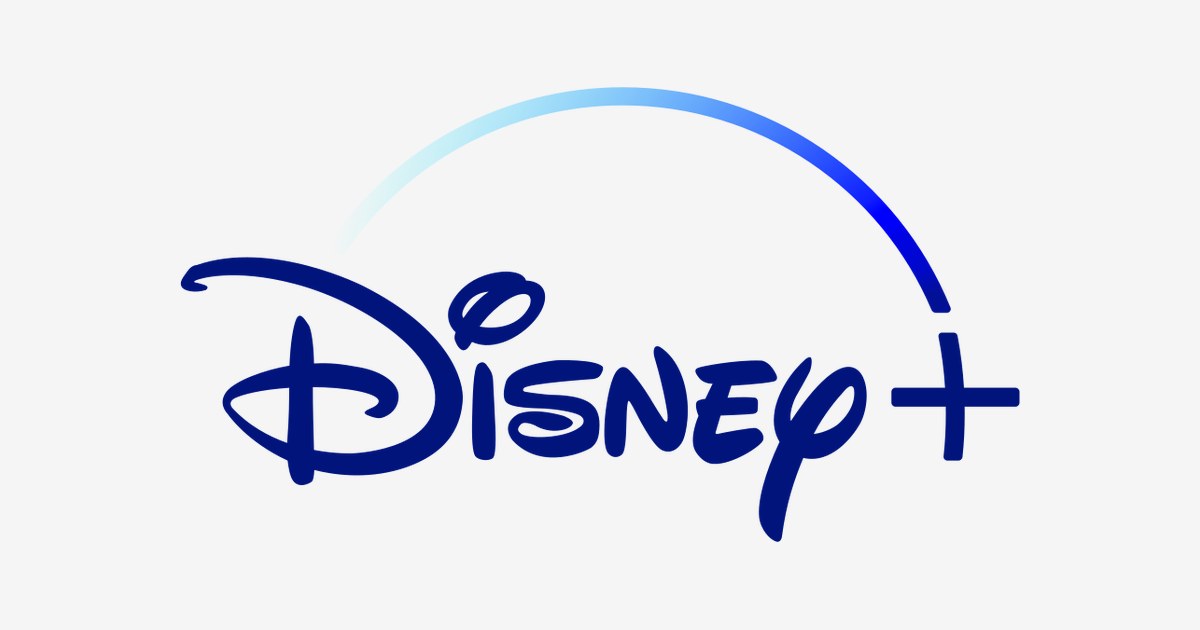
The Disney+ logo — Walt Disney’s famous signature with a sweeping arc and a bold “+” — is the emblem of the streaming service that proved legacy studios could beat Silicon Valley at its own game. Launched in November 2019, Disney+ signed up 10 million subscribers on its first day and became one of the world’s largest streaming platforms within two years.
If you are searching for the Disney+ logo, you are looking for the mark of the home of Disney, Pixar, Marvel, Star Wars, and National Geographic. This article traces the history of the Disney+ logo — including its dramatic 2024 color change — explains what the arc means, and breaks down the brand’s official colors.
Disney+ Brand Overview
Disney+ is an American subscription video-on-demand service owned by The Walt Disney Company. It launched on November 12, 2019, in the United States, Canada, and the Netherlands, as Disney’s flagship entry into streaming. The timing was perfect: the service became a lockdown-era phenomenon, with its deep catalog of beloved franchises drawing families worldwide.
By 2024, Disney+ had merged its offering with Hulu in the United States (the “Hulu on Disney+” hub) and absorbed Star+ in Latin America — a consolidation that triggered the brand’s first major logo refresh. Today it ranks among the three largest streaming services in the world, behind only Netflix and Amazon Prime Video.
History of the Disney+ Logo
The original Disney+ logo was designed by Trollbäck & Company for the 2019 launch: the classic Disney signature wordmark with the iconic arc (the “Disney D” flourish) sweeping over it and a “+” sign, rendered in a deep blue-to-cyan gradient evoking a starry night sky. The design nodded to the magic of the Disney castle opening sequence that precedes every film.
In March 2024, Disney unveiled a refreshed logo designed with Loyalkaspar to mark the Hulu integration. The arc was redrawn, the “+” was made thicker and more legible at small sizes, and — most dramatically — the blue was replaced by a glowing teal color named “Aurora,” after both the aurora borealis and Princess Aurora of Sleeping Beauty. Aurora blends Disney’s blue with Hulu’s green, symbolizing the union of the two services. The animated version even opens with an audio mnemonic composed by Oscar-winner Ludwig Göransson.
Disney+ Logo Meaning: What Does the Arc Symbolize?
- The signature wordmark: Walt Disney’s own stylized signature — used across the company since his lifetime — instantly communicates magic, nostalgia, and a century of storytelling.
- The arc: The sweeping curve recalls the arc over the Disney castle in the classic film opening, with a star trailing across the night sky. In the 2019 logo it rendered as a gradient “shooting star”; in 2024 it became a solid white swoosh, appearing before the wordmark in the new animation.
- The “+” sign: The plus marks the service as “Disney and more” — the company’s entire universe of brands (Pixar, Marvel, Star Wars, National Geographic, Hulu) under one roof.
- The color shift to Aurora: Moving from blue to teal signaled a strategic pivot: Disney+ was no longer just the family service — it was now the combined home of Disney and Hulu’s general entertainment, standing apart from a sea of blue streaming logos.
Disney+ Logo Colors
Disney+ has had two color eras: the original night-sky blue gradient (2019–2024) and the current glowing Aurora teal.
| Color | Hex Code | Usage |
|---|---|---|
| Disney+ Blue | #113CCF | Original brand color (2019–2024) — the night-sky gradient |
| Aurora Teal | #00D6B3 | Current brand color (2024–present) — blend of Disney blue and Hulu green |
| White | #FFFFFF | Wordmark and arc in the 2024 identity, reversed applications |
| Deep Navy | #0A0A2E | Background of the app splash screen and launch animation |
Note: Disney has never published exact hex values for “Aurora” — the teal is rendered as a luminous gradient in official artwork. The values above are the widely cited approximations used across brand references.
Conclusion
The Disney+ logo tells the story of streaming’s maturation in miniature: it began as pure Disney magic — signature, arc, and starry blue — and evolved into Aurora, a color that literally merges two companies. Few rebrands have been as symbolically loaded as swapping blue for teal, and few logos carry as much nostalgia per pixel as that famous signature.
Looking for the logo files? Download the Disney+ logo in SVG and transparent PNG formats from VectorDose.
Download the Disney logo in SVG and transparent PNG
Download the Disney Plus logo and the Disney logo on VectorDose in SVG and transparent PNG, with the official brand colours listed on each page. Use the SVG as your master file and export a PNG at the exact size each use needs — and always copy the brand colours exactly, never recolour the artwork.
Frequently asked questions about the Disney logo
What does the Disney logo mean? The story above traces the mark’s history and meaning — read it in full, because the meaning sits in the design details, not in a single symbol.
What colours does the Disney logo use? Use the colours shown in the story above and on the brand’s official pages, copied exactly. Never recolour the artwork to fit your own palette.
Can I download the Disney logo in SVG and PNG? Yes. Download the Disney logo on VectorDose in SVG and transparent PNG, with the official brand colours listed on the page.
SVG or PNG — which format should I use? Use the SVG as your master file for websites and anything that scales. Export a transparent PNG at the exact pixel size when the destination cannot use vectors, such as a slide deck or a social post.