The Dettol logo history begins in 1929, when scientists Albert Leopold Rickett and Dr. William Colebrook Reynolds formulated an antiseptic that could disinfect skin without irritation — a breakthrough that cut sepsis in maternity wards. The logo’s white sword, piercing the name on green, stands for exactly that: the fight against germs, with green and white borrowed from the hospital. From the 1950s shield to the 1970s minimalist rapier to the 1994 lime-green sphere, the sword never left. This post traces that line and points to a clean SVG and transparent PNG download.
Introduction
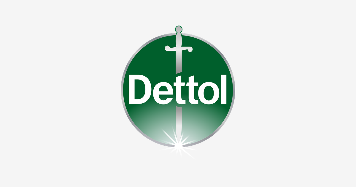
Some logos describe a product. The Dettol logo makes a promise: a silver sword laid across a deep green disc, the white wordmark standing behind it like a shield. For more than ninety years that small emblem has stood for one idea — protection — on antiseptic bottles, soaps and sprays in homes around the world. This is the story of how a 1933 antiseptic liquid from Britain built one of the most trusted marks in household care.
1933: An Antiseptic Is Born
Dettol began in 1933 with the introduction of its original antiseptic liquid, created by the British-Dutch concern Reckitt Benckiser — today known simply as Reckitt. Even the name was an invention: it was coined by British scientist Lloyd Roake, giving the new liquid a short, clinical, unmistakably medical-sounding name that could be pronounced in any pharmacy in the world.
The brown-bottled antiseptic liquid became the foundation of everything that followed. From that single product, the Dettol line expanded over the decades into soaps, hand washes, surface sprays, wipes, hand sanitisers and laundry sanitisers — one of the widest hygiene ranges under any single name, sold across most of the world.
The Sword in the Disc
The emblem at the centre of the identity is a sword, drawn in silver, laid across the brand’s green circle with a bright sparkle flashing at its tip. It has anchored Dettol’s packaging for decades, and its meaning is deliberately blunt:
- The sword: Protection made visible. Germs cannot be seen, so the logo gives the fight a weapon — Dettol as the blade that cuts them down, the promise the brand has made since 1933.
- The circle: A complete, unbroken disc — coverage with no gaps. Whatever the sword guards, it guards entirely.
- The sparkle: The starburst at the sword’s tip is the visible moment of disinfection — the instant clean happens.
The current version of the mark is a cleaner, more clinical rendering of that same device: the disc simplified, the sword sharpened, the whole emblem flattened so it survives at the size of an app icon or a pocket-sized sanitiser label without losing recognition.
Why Green?
Colour is where Dettol made its most distinctive choice. The cleaning aisle is dominated by blues and whites, but Dettol owns a deep, surgical green — the colour of antiseptic care, of hospital corridors and clinical hygiene. Where blue says “clean”, green says “disinfected”: a stronger, more medical claim, and one no major rival can borrow without looking like Dettol.
The green also does quieter work. It separates the antiseptic liquid from the bleach brands, signals the brand instantly on the shelf even before the sword registers, and pairs with white — purity, sterility — in the wordmark that stands across the disc.
Dettol Logo Colours
| Color | Hex Code | Usage |
|---|---|---|
| Dettol Green | #00783F | The disc behind the wordmark |
| Dettol Light Green | #53AD33 | The lighter green gradient in the disc |
| White | #FFFFFF | The wordmark and sword highlights |
From Pharmacy Shelves to Every Household
Dettol’s identity was built in the pharmacy era, when an antiseptic was bought on a pharmacist’s recommendation and trust was the entire sales pitch. The remarkable thing about the sword-and-disc is how little it needed to change as the brand moved onto every household shelf — into bathrooms, kitchens, laundry rooms and, more recently, the global hygiene routines where hand sanitisers and surface sprays became everyday essentials.
Each redesign has been a refinement rather than a replacement: cleaner edges, a flatter disc, a brighter flash at the sword’s tip. Reckitt understood what heritage brands learn the hard way — with a mark this trusted, recognition is the asset, and you polish it rather than reinvent it.
Conclusion
The Dettol logo is a masterclass in saying one thing forever: a sword for protection, a disc for complete coverage, and a green no one else owns — carried from a 1933 antiseptic bottle to one of the world’s biggest hygiene ranges without ever changing its mind. In a category full of shouting claims, the quiet emblem of a drawn sword still speaks loudest.
Need the logo files for a project? Download the Dettol logo in SVG and transparent PNG from VectorDose.
Download the Dettol logo in SVG and transparent PNG
Download the Dettol logo on VectorDose in SVG and transparent PNG, with the official brand colours listed on the page. Use the SVG as your master file and export a PNG at the exact size each use needs — and always copy the brand colours exactly, never recolour the artwork.
Frequently asked questions about the Dettol logo
What does the Dettol logo mean? The story above traces the mark’s history and meaning — read it in full, because the meaning sits in the design details, not in a single symbol.
What colours does the Dettol logo use? Use the colours shown in the story above and on the brand’s official pages, copied exactly. Never recolour the artwork to fit your own palette.
Can I download the Dettol logo in SVG and PNG? Yes. Download the Dettol logo on VectorDose in SVG and transparent PNG, with the official brand colours listed on the page.
SVG or PNG — which format should I use? Use the SVG as your master file for websites and anything that scales. Export a transparent PNG at the exact pixel size when the destination cannot use vectors, such as a slide deck or a social post.