The A24 logo history is unusual: a logo that has barely changed since 2012, because it never needed to. History pages describe the mark and download pages hand you a file, but rarely in the same place. This post brings them together — what the minimal black-and-white A24 mark means, why it stayed monochrome, and where to download it in SVG and transparent PNG.
Introduction
The A24 logo — stark black letterforms on screen, geometric yet oddly elegant — has become a seal of quality for a generation of film lovers. When those letters unfold at the start of a movie, audiences know what to expect: something original, unsettling, beautiful, or all three at once. Few production logos carry as much cultural weight as these three characters.
If you are searching for the A24 logo, you are looking for the mark of the independent studio behind Moonlight, Everything Everywhere All at Once, Hereditary, Euphoria, and The Brutalist. This article traces the history of the A24 logo, explains what its design means, and breaks down the brand’s official colors.
A24 Brand Overview
A24 (legally A24 Films LLC) is an American independent entertainment company founded on August 20, 2012, in New York City by Daniel Katz (formerly of Guggenheim Partners’ film finance group), David Fenkel (formerly of Oscilloscope Laboratories), and John Hodges (formerly of Big Beach Films). The name comes from the Italian Autostrada A24 motorway — the road Katz was driving on when he decided to start the company.
A24 began as a film distributor with a mission to share “movies with a distinctive point of view,” releasing Spring Breakers and The Bling Ring in 2013 before expanding into production and television. Its breakthrough came with Moonlight (2016), which won the Academy Award for Best Picture, followed by Everything Everywhere All at Once (2022), which won seven Oscars including Best Picture. The company has cultivated one of the most passionate fanbases in entertainment — often described as an indie-film “cult.”
History of the A24 Logo
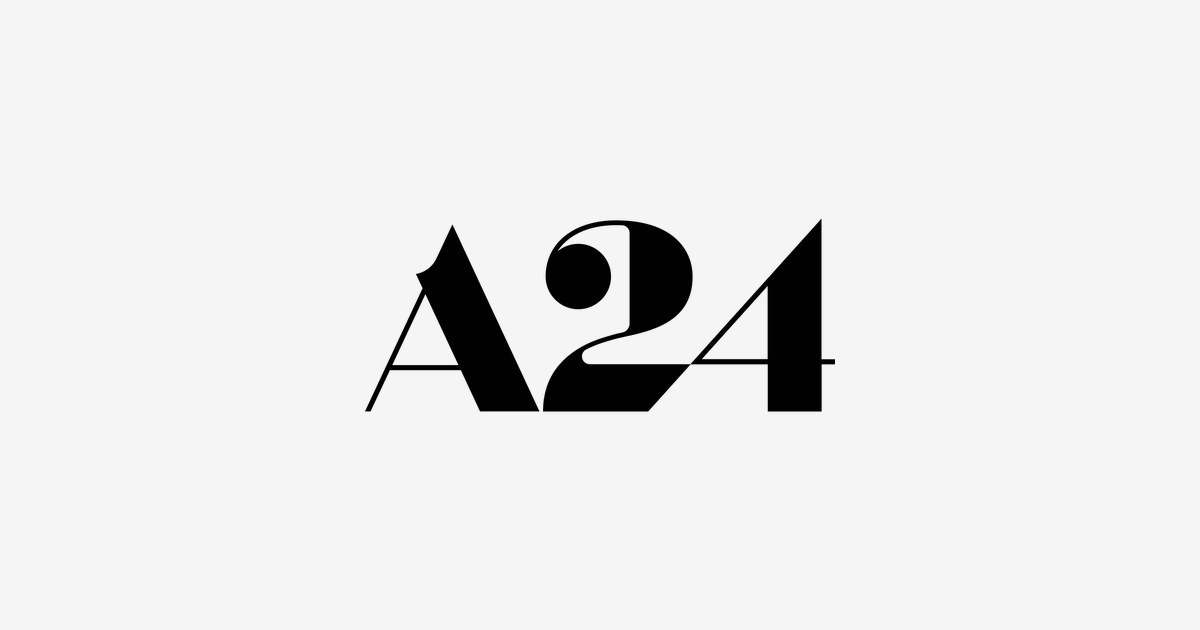
In 2012, A24 hired New York creative agency GrandArmy to design its identity, asking for something modern that still echoed the golden age of Hollywood. The result — designed by Adam Grabowski — was the now-famous “A24” mark: a custom wordmark where each letterform is built from simple geometry (rectangles, trapezoids, circles, semicircles) with striking contrasts in stroke thickness.
The logo debuted in 2013 with the company’s first releases and has never changed. Its animated version — thin lines and shapes flying together to form “A24” on a black screen — plays before every A24 film and has become as beloved as the movies themselves. In an industry of constant rebrands, A24’s visual identity has remained untouched for over a decade.
A24 Logo Meaning: What Does the Design Symbolize?
- Geometric purity: The “A” is constructed from crisp angular forms (a truncated rectangle, an elongated trapezoid), giving the mark authority and foundation — the studio as a serious artistic institution.
- The fluid “2”: The “2” curves gracefully with an elongated, brushstroke-like tail, contrasting the rigid “A” — a visual metaphor for the studio’s blend of discipline and artistic freedom.
- The connected “4”: The “4” flows from the “2,” suggesting unity and coherence across the company’s diverse output, from horror to coming-of-age drama.
- Monochrome restraint: The strict black-and-white palette is a statement of confidence — no gradients, no gimmicks. It says the films are the stars, not the logo. As the founders put it: “here, the stars are the films, not us.”
- Old Hollywood, new school: The deco-influenced letterforms nod to classic cinema glamour while the minimalism feels unmistakably modern — exactly the duality A24 occupies in the film industry.
A24 Logo Colors
A24’s identity is famously monochromatic — the absence of color is the brand.
| Color | Hex Code | Usage |
|---|---|---|
| Black | #000000 | Primary — the logo on light backgrounds, the opening title card |
| White | #FFFFFF | Reversed — the white-on-black logo seen before films |
The black-and-white scheme has never varied since 2012. It fits the studio’s ethos perfectly: raw, genuine, and unadorned — letting the structural elegance of the letterforms carry the entire brand.
Conclusion
The A24 logo is proof that restraint can be the boldest branding move of all. Three geometric characters in black and white have become shorthand for a certain kind of cinema — adventurous, auteur-driven, uncompromising. In a landscape of ever-changing entertainment logos, A24’s has stayed exactly the same, because it was right the first time.
Looking for the logo files? Download the A24 logo in SVG and transparent PNG formats from VectorDose.
Download the A24 logo in SVG and transparent PNG
Download the A24 logo on VectorDose in SVG and transparent PNG, with the official brand colours listed on the page. Use the SVG as your master file and export a PNG at the exact size each use needs — and always copy the brand colours exactly, never recolour the artwork.
Frequently asked questions about the A24 logo
What does the A24 logo mean? The story above traces the mark’s history and meaning — read it in full, because the meaning sits in the design details, not in a single symbol.
What colours does the A24 logo use? Use the colours shown in the story above and on the brand’s official pages, copied exactly. Never recolour the artwork to fit your own palette.
Can I download the A24 logo in SVG and PNG? Yes. Download the A24 logo on VectorDose in SVG and transparent PNG, with the official brand colours listed on the page.
SVG or PNG — which format should I use? Use the SVG as your master file for websites and anything that scales. Export a transparent PNG at the exact pixel size when the destination cannot use vectors, such as a slide deck or a social post.