Introduction
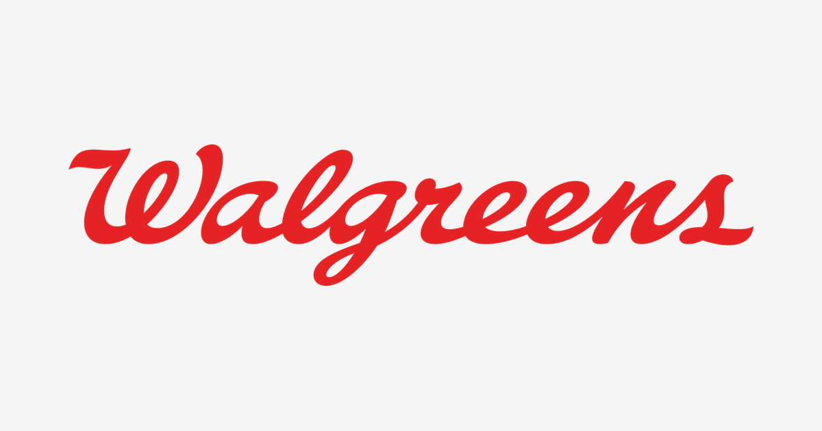
Most American logos are printed. The Walgreens logo is signed. One unbroken ribbon of red handwriting — looping out of a grand capital W, running the length of the name and finishing in a flourish — has fronted the country’s corner drugstores for generations. This is the story of how a single Chicago pharmacist’s shop, founded in 1901, turned a signature into one of the most recognisable marks in American retail.
A Pharmacist Buys His Own Shop
Walgreens began in 1901 in Chicago, Illinois, when Charles Rudolph Walgreen, a pharmacist working in a small neighbourhood drugstore, bought the shop from his employer. It was a modest start — one store, one counter, one man’s name. But that name was the brand from day one, and Walgreen signed it the way pharmacists signed prescriptions: in flowing handwriting.
The timing could hardly have been better. America was falling in love with the corner drugstore, and Walgreen proved unusually good at giving people reasons to visit one.
Milkshakes, Prohibition and Explosive Growth
The 1920s made Walgreens. Company lore credits the era of Prohibition — when prescriptions could legally include medicinal whiskey — with filling the stores, but the famous growth engine was sweeter: in 1922, store employee “Pop” Coulson added two scoops of vanilla ice cream to the standard malted milk, and the resulting Walgreens malted milkshake became a sensation. Customers queued for shakes, and stayed for everything else. From a handful of Chicago shops, the chain exploded to nearly 400 stores by the end of the decade.
Through all of it, the name on the fascia stayed handwritten. While rival retailers modernised into block capitals and geometric badges, Walgreens kept its signature — the signature quietly became the point. Anyone can print a name; only one chain could sign it.
Why a Script Works for a Pharmacy
A pharmacy is a trust business disguised as a retail business. You hand its staff your prescriptions, your health worries and your family’s emergencies. The Walgreens script is engineered for exactly that relationship:
- The signature: Handwriting is personal by definition. The logo reads as the pharmacist’s own hand — a promise of a neighbourhood professional who knows your name, rather than an anonymous retail machine.
- The flourish: The sweeping final stroke is the gesture of a signature being finished — confidence, decisiveness, and a prescription signed off.
- The refusal to shout: Script is inherently softer than the bold sans-serifs around it, which on a pharmacy — a place people visit when they feel unwell — is precisely the right volume.
The 2020 Refresh and the Standalone W
The current logo arrived with a major brand refresh in 2020. Walgreens wisely kept the beloved script but redrew it: cleaner strokes, a brighter and more confident red, and letterforms that survive being shrunk onto an app icon or a prescription label. The refresh also freed the capital W to work on its own as a standalone symbol — the grand first letter, with its loops and flourish, carries the whole brand in the spaces where the full signature will not fit, from storefront signage to the phone in your pocket.
It is the version Walgreens publishes today — and the one on our logo page — now doing duty across roughly 9,000 stores and as the retail face of Walgreens Boots Alliance, the group formed when Walgreens combined with Britain’s Boots.
One Colour: Walgreens Red
| Color | Hex Code | Usage |
|---|---|---|
| Walgreens Red | #E62324 | The complete script wordmark |
The Walgreens identity is a true one-colour logo. The red is pure visibility engineering — bright enough to be spotted from a moving car, warm enough to stay friendly once you are close — and it is reversed to white only when it sits on the brand’s own red or on photography. One name, one hand, one colour: nothing else has ever been needed.
Conclusion
The Walgreens logo is a pharmacist’s signature scaled to a nation: founded on a Chicago corner in 1901, sweetened by a milkshake, and refined in 2020 into the bright red ribbon of handwriting Americans still read as “the corner drugstore”. In an industry of printed names, the signed one wins.
Need the logo files for a project? Download the Walgreens logo in SVG and transparent PNG from VectorDose.