The Paramount logo history is the longest unbroken story in Hollywood: a mountain and a ring of stars that has survived more than a century while other studio marks were redrawn beyond recognition. Legend traces the mountain to a doodle W. W. Hodkinson made in a 1914 meeting, modelled on Utah’s Ben Lomond, and the stars to the contracted actors the studio wanted to celebrate — 24 at first, later standardised at 22. This post traces that evolution, what the mountain and stars mean, and where to download the mark in SVG and transparent PNG.
Introduction
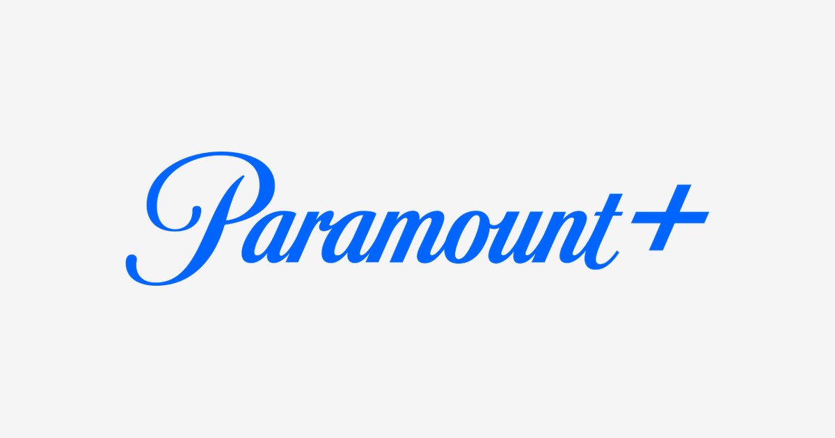
The Paramount+ logo — a snow-capped mountain ringed by stars with the company’s famous script wordmark — is one of the most recognizable emblems in streaming. When ViacomCBS rebranded its CBS All Access service as Paramount+ in March 2021, it chose not to invent something new, but to lean on more than a century of Hollywood heritage: the Paramount mountain, a symbol that has opened countless films since the 1910s.
If you are searching for the Paramount+ logo, you are looking for the mark of the streaming service now owned by Paramount Skydance, home to franchises like Star Trek, SpongeBob SquarePants, Yellowstone, and the UEFA Champions League. This article traces the history of the Paramount+ logo, explains what its mountain and stars mean, and breaks down the brand’s official colors.
Paramount+ Brand Overview
Paramount+ is an American subscription video-on-demand service. Its roots go back to CBS All Access, launched on October 28, 2014 — one of the first major-studio streaming services. The Paramount+ name itself first appeared earlier, in 2017, as a TV Everywhere offering in Scandinavia, before rolling out to Hungary, Latin America, and Russia.
On September 15, 2020, ViacomCBS announced that CBS All Access (in the US and Canada) and 10 All Access (in Australia) would be rebranded as Paramount+. The relaunch took effect on March 4, 2021. The service has since grown into a global platform with over 79 million subscribers (as of early 2025), combining Paramount Pictures films, CBS programming, Nickelodeon, MTV, Comedy Central, and live sports. In August 2025, parent company Paramount Global merged with Skydance Media to form Paramount Skydance.
History of the Paramount+ Logo
The Paramount mountain has been used by the studio since 1914 — legend says founder W.W. Hodkinson sketched it from memories of a mountain from his Utah childhood. The streaming era of the mark began in 2017, when the first Paramount+ logo launched in the Nordics: the classic mountain inside a dark blue circle with 22 stars around it and the script wordmark, designed by Gretel.
For the 2021 global relaunch, branding agency Loyalkaspar rebuilt the mark. The blue became lighter and brighter (#0064FF), the stars moved from outside the circle to inside it, the mountain’s shading was modernized, and the wordmark grew larger and more confident. A subtle detail: the new emblem has 13 stars instead of 22 — matching the number of letters in “Paramount Plus.” The logo has remained unchanged since, carrying the service through its international expansion and the 2025 Skydance merger.
Paramount+ Logo Meaning: What Do the Mountain and Stars Symbolize?
- The mountain: The pinnacle the brand aspires to reach — the peak of cinematic achievement. It directly ties the streaming service to Paramount Pictures’ century of filmmaking heritage, instantly communicating trust and quality to viewers.
- The stars: The 13 stars represent excellence and high standards across the platform’s content — films, series, sports, and news. They echo the original Paramount emblem, where stars once stood for the studio’s contracted stars of 1914.
- The script wordmark: Written in a custom “Paramount Script” typeface, the flowing signature-style lettering adds elegance and continuity with the legendary studio identity.
- The “+” sign: Aligned precisely with the “t” in Paramount, the plus signals that this is more than a studio — it is a platform offering exclusive, expanded content beyond traditional television.
Paramount+ Logo Colors
The Paramount+ identity is built around a vivid, confident blue — brighter than the old studio navy — conveying ambition, modernity, and the energy of streaming.
| Color | Hex Code | Usage |
|---|---|---|
| Paramount Blue | #0064FF | Primary brand color — the mountain circle, wordmark, and app icon |
| White | #FFFFFF | Mountain, stars, and wordmark in reversed applications |
| Black | #000000 | Wordmark on light backgrounds, secondary text |
The #0064FF blue is noticeably lighter than Paramount Pictures’ traditional dark navy — a deliberate choice to make the streaming brand feel fresh, digital, and distinct from the film studio while keeping the mountain-and-stars heritage intact.
Conclusion
The Paramount+ logo is a masterclass in heritage branding: rather than chasing a trendy streaming aesthetic, it took a 100-year-old mountain and simply gave it a brighter blue and a bigger stage. The 13 stars, the snow-capped peak, and the flowing script carry the weight of Hollywood history into the streaming wars — proof that the strongest new logos are sometimes the oldest ones, refreshed.
Looking for the logo files? Download the Paramount+ logo in SVG and transparent PNG formats from VectorDose.
Download the Paramount Plus logo in SVG and transparent PNG
Download the Paramount Plus logo on VectorDose in SVG and transparent PNG, with the official brand colours listed on the page. Use the SVG as your master file and export a PNG at the exact size each use needs — and always copy the brand colours exactly, never recolour the artwork.
Frequently asked questions about the Paramount logo
What does the Paramount logo mean? The story above traces the mark’s history and meaning — read it in full, because the meaning sits in the design details, not in a single symbol.
What colours does the Paramount logo use? Use the colours shown in the story above and on the brand’s official pages, copied exactly. Never recolour the artwork to fit your own palette.
Can I download the Paramount logo in SVG and PNG? Yes. Download the Paramount logo on VectorDose in SVG and transparent PNG, with the official brand colours listed on the page.
SVG or PNG — which format should I use? Use the SVG as your master file for websites and anything that scales. Export a transparent PNG at the exact pixel size when the destination cannot use vectors, such as a slide deck or a social post.