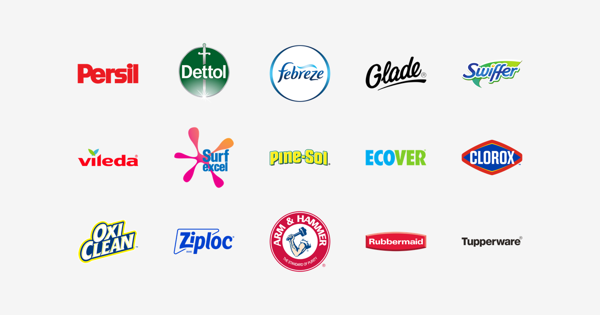
Searching for cleaning brand logos in SVG gives you history wikis that tell the story but offer no usable file, or logo-makers selling templates for a cleaning business of your own. This page gives you the real thing: 15 famous cleaning brand logos, what each mark shows, and a link to its own VectorDose page for a free SVG and transparent PNG download.
Introduction
Cleaning brands have the hardest job in the supermarket. Nobody dreams about detergent, sprays or storage boxes — so their logos must turn chores into trust, freshness and power in a single glance from the end of an aisle. To mark the launch of our new Cleaning & Household category on VectorDose, here are fifteen of the most famous cleaning brand logos, what each mark shows, and the story each one is quietly telling.
1. Persil — The Red Wordmark
The Persil logo is a bold red wordmark with the confidence of a brand that started it all — in 1907, Henkel’s Persil was the first commercially available detergent to combine bleach with soap powder, and its name is literally a chemistry lesson: PERborate + SILicate. Around two billion washes later, that heavy red lettering remains one of laundry’s most recognised shelf colours.
2. Dettol — The Sword and the Disc
The Dettol logo sets a white wordmark across a deep green circle, cut through by a silver sword with a sparkle at its tip. The brand began in 1933 with an antiseptic liquid from Reckitt, and the sword says exactly what the product promises: protection — a weapon drawn against germs, held inside the green of clinical care.
3. Febreze — The Ring of Fresh Air
The Febreze logo writes the name in a flowing blue script inside a white disc ringed in blue. Launched by Procter & Gamble in the mid-1990s, Febreze built its name on eliminating odours rather than masking them — and the little curl above the lettering is that benefit drawn in one stroke: a breath of fresh air.
4. Glade — The Perfume Signature
The Glade logo is an elegant black script with one long, sweeping underline. S. C. Johnson introduced Glade in 1956, and the fashion-label styling is deliberate: this is fragrance, not just air freshener. By refusing to pick a colour, the black mark lets every scent in the range own its own.
5. Swiffer — The Cleaning Stroke
The Swiffer logo rides its rounded blue script on a green leaf-shaped swoosh. P&G launched Swiffer in 1999 and quietly retired the mop and bucket for a generation — the swoosh reads as both a cleaning stroke and a fresh leaf, and the forward-leaning letters promise the whole job will be quick.
6. Vileda — The Sprouting Letters
The Vileda logo is a warm red lowercase wordmark topped with two small leaves in green and blue. The name itself is a pun on the German wie Leder — “like leather” — a nod to the feel of the Freudenberg Group’s original non-woven cloth, while the sprout signals the brand’s newer, longer-life materials.
7. Surf Excel — The Splash
The Surf Excel logo bursts its blue wordmark through a pink-and-orange splash — the moment a stain lifts out of fabric, frozen as a starburst. Unilever’s laundry flagship for India, Pakistan, Bangladesh and Sri Lanka, it keeps the heritage Surf blue for trust and adds two-tone colour no rival dares to use.
8. Pine-Sol — The Sunny Sign
The Pine-Sol logo is chunky sunshine-yellow lettering framed in pine green — signage, not typography, built to be read off a bottle at arm’s length. Created in 1929 and now owned by Clorox, the brand rose to fame in the 1950s on the strength of that pine-clean scent the green outline still advertises.
9. Ecover — The Two-Tone Promise
The Ecover logo splits its own name in two: blue ECO, green VER. The Belgian company was making plant-based, phosphate-free cleaners from 1979 — long before “eco” was a supermarket category — and the plain, unfussy capitals match the pitch: water and sky in blue, plants in green, no greenwash theatre.
10. Clorox — The Diamond
The Clorox logo sets a white wordmark inside a deep-blue diamond framed in red. The Clorox Company began as a liquid bleach business in Oakland, California in 1913, and the diamond is a shape no competitor uses — a badge you can spot from the far end of the aisle before you can read a single letter.
11. OxiClean — The Tilted Badge
The OxiClean logo puts white-and-yellow lettering on a navy badge that leans forward — nothing about it sits still. Introduced in 1997 and now owned by Church & Dwight, OxiClean became an infomercial legend, and the logo keeps that energy: a highlighter-yellow outline shouting from the shelf, with deep-blue science holding it credible.
12. Ziploc — The Bag-Shaped Frame
The Ziploc logo wraps its chunky blue wordmark in a famous angled outline — the frame is a storage bag seen face-on, the product as its own logo border. First test-marketed by Dow in 1968 and now made by S. C. Johnson, Ziploc did what every brand dreams of: its name became the generic word for the product itself.
13. Arm & Hammer — The Strongman’s Seal
The Arm & Hammer logo shows a muscular arm swinging a hammer inside a red disc, ringed by the slogan “The Standard of Purity”. The arm is Vulcan’s — strength and honest industry — and Church & Dwight turned a humble box of baking soda into toothpaste, detergent, deodorant and cat litter, all stamped with the same seal.
14. Rubbermaid — The Red Banner
The Rubbermaid logo runs a white wordmark along a curved red banner — and the curve is a container lid seen from the side, the product hiding inside the logo. Now part of Newell Brands, Rubbermaid sells function, not fashion, and the plain utilitarian lettering on workshop red says so on every bin and box.
15. Tupperware — The Word That Became a Category
The Tupperware logo is a clean black wordmark with no symbol at all — because Earl Tupper’s name, launched in 1946 and sold through the famous Tupperware parties, became the word for airtight food storage itself. When your name is the category, the most confident logo is just your name, set plainly.
Conclusion
Fifteen logos, fifteen strategies: a sword for protection, a diamond for recognition, a splash for stain removal and a name so famous it needed no symbol at all. Every mark above now has its own page in our new Cleaning & Household category — download any of them in SVG and transparent PNG, free, from the VectorDose pages linked in each section.
Download cleaning brand logos SVG in SVG and transparent PNG
Every logo above is available on its own VectorDose page as a free SVG download and a transparent PNG, with the official brand colours listed on the page. Use the SVG as your master file and export a PNG at the exact size each use needs — and always copy the brand colours exactly, never recolour the artwork.
Frequently asked questions about cleaning brand logos SVG
Can I download these cleaning brand logos SVG in SVG? Yes. Every brand linked above has its own VectorDose logo page offering a free SVG download and a transparent PNG.
Are the colours official? Each logo page lists the brand’s official colours. Copy those values exactly in your design work and never recolour the artwork.
SVG or PNG — which format should I use? Use the SVG as your master file for websites and anything that scales. Export a transparent PNG at the exact pixel size when the destination cannot use vectors, such as a slide deck or a social post.
Can I use these logos commercially? Brand logos are trademarks of their owners. Use them for reference, editorial, and design work within each brand’s own usage rules, and check the brand’s official brand page before any commercial use.