The Philadelphia Phillies are a baseball team that has been around for over 130 years. They have had many different logos over the years, but the original logo is still very special to fans. The logo represents the team’s American heritage and bright future, symbolizing national pride. This article will examine the meaning of the Philadelphia Phillies logo and why it is so vital to the team and its fans.
Brand Overview
The Philadelphia Phillies, founded in 1883, are the oldest continuous, single-name, single-city franchise in American professional sports and a cornerstone of Major League Baseball’s (MLB) National League East Division. With a rich history spanning over a century, the Phillies have won two World Series championships (1980, 2008) and multiple National League pennants. Known for legendary players such as Mike Schmidt, Steve Carlton, and Jimmy Rollins, the team has built a strong reputation for its competitive spirit and commitment to excellence. Citizens Bank Park, their iconic home stadium in South Philadelphia, offers a world-class fan experience, highlighted by the signature “Liberty Bell” home run display and a vibrant atmosphere that draws thousands of passionate supporters. The Phillie Phanatic, the team’s beloved mascot, adds joy and excitement to every game.
Beyond the field, the Phillies are deeply engaged in community outreach through Phillies Charities, Inc., supporting initiatives focused on education, health, and social services throughout the Greater Philadelphia region. Their distinctive red, white, and blue colors, classic script logo, and proud “P” cap design are symbols of a legacy built on tradition and loyalty. The Phillies’ brand embodies the heart and determination of Philadelphia, resonating with a dedicated fan base known for their unwavering support through every season. With a focus on continued growth and competitiveness, the team remains a cherished part of Philadelphia’s sports culture and a prominent name in MLB.
History
The Philadelphia Phillies are a professional baseball team founded in 1883 and still based in Philadelphia, Pennsylvania. It has been part of MLB since 2000 and was previously part of the NL. The team always kept its city and name the same.
The team’s first owners were Al Reich and John Rogers. Over the years, it has had several owners, with Robert Carpenter being the last individual owner. The team’s final name was created in 1884 and has had about 16 logos over the years.
The team has undergone radical rebranding and redesigns over the years, with a desire to find a face, choose a simple name, and modernize the design.
Logo evolution
1900
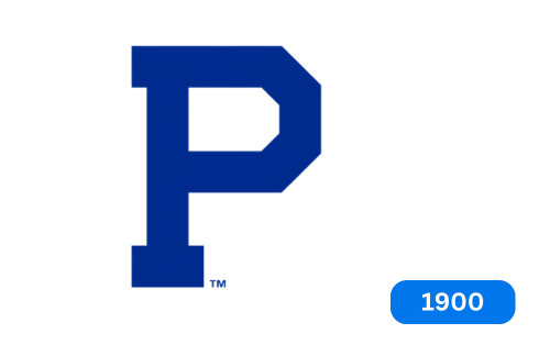
The initial logo for the Phillies franchise consisted of a simple blue letter, “P,” representing the city of Philadelphia.
1901
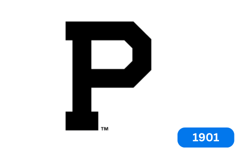
Earlier, the letter “P” was painted in blue. However, it has now been updated to black.
1910
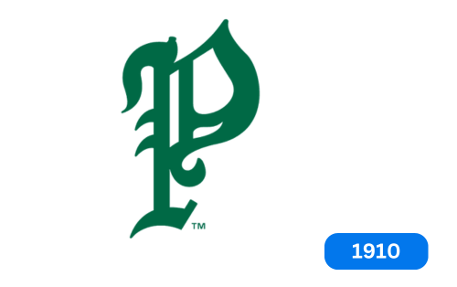
After ten years, the club updated its logo by adding the green letter “P” to represent its name.
1911
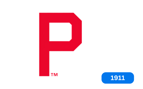
The club has reverted to the large red letter “P” as its symbol. The club began using the large red letter “P” as its symbol.
1915-1937
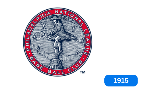
In 1915, the Philadelphia National League baseball club updated its logo. The new design features a blue baseball field with a person from Philadelphia. The image was surrounded by a red ring with the words “Philadelphia National League Baseball Club” written in white. The design was raised, as on coins and medals.
1938-1939
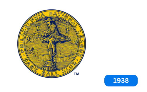
In 1938, the Phillies baseball team changed their logo colors to orange and blue. Orange was used only for the lettering that read “Philadelphia National Baseball Club” and the logo’s background. This change gave the logo a new look and helped differentiate it from other team logos.
1939-1943
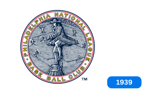
In 1939, the club returned to their original logo design. They made some changes in colors and framing. The letter was now dark grey and had a double red outline in a white frame. He gave the logo a new look while retaining its original design.
1944-1945
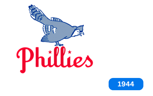
Back in 1944, the Phillies baseball team decided to change their logo. The new logo was a significant departure from the old one. It featured a light and delicate image of a gray and bluebird perched atop a red “Phillies” logotype. The dots above the “I” in “Phillies” were replaced with red five-point stars. The new logo was a fresh and modern take on the team’s branding and helped establish a new identity for the Phillies.
1946-1949
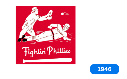
In 1946, the Phillies baseball team unveiled a new badge with a bright and solid red square as its background. The badge depicted two baseball players, one lying down and the other preparing to catch the ball. The wordmark “fightin’ Flies” was placed in the Orrin portion of the book’s logo and underlined by an image of a bat. All emblem elements were painted white, making it a striking and memorable design. The badge became an iconic symbol of the Phillies and their fighting spirit and remains a beloved part of their history.
1950-1969
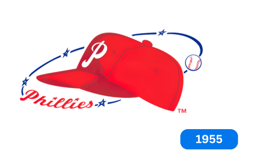
In 1950, the Philadelphia Phillies baseball team created a logo consisting of a red cap with a white letter “P.” The cap was surrounded by a thin blue circle with the word “Phillies” written in red cursive with a white baseball. The team used this logo for almost twenty years.
1970
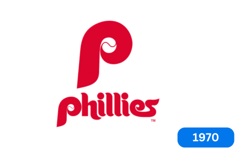
The eleventh club logo features a red letter “P” with a white baseball. The full name of the team is written below the logo.
1976-1980
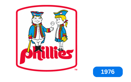
1976, the team underwent a redesign, introducing its iconic and recognizable logo. Lugo had two children from Philadelphia, a boy and a girl. The boy was holding a baseball bat and ball and posing before the girl. The Cubs were placed in red above a stylized, bold “Phillies” logotype and enclosed in a red frame. This sign became known as “Phil and Phyllis”.
1981
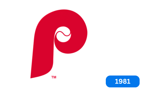
The baseball team logo has been updated! Instead of just a team name, there’s an excellent baseball in the middle. And the best part? The team name is now displayed with a bright red “p”!
1982
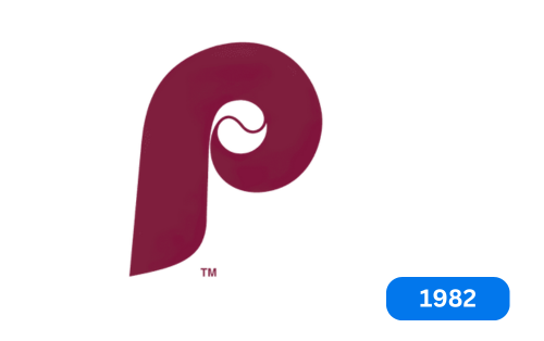
In 1982, the club created a new logo with the letter ‘p,’ changing its color from red to brown.
1992-2018
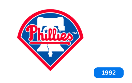
In 1992, the club decided to create a new logo. The logo they came up with was a solid blue badge with an arched top and a sharper bottom. A white silhouette of a Liberty Bell was drawn in blue, and the red line “Flies” was written on it. A thick red outline was added around the badge to balance the letters. This logo has been used by the club ever since.
2019-Today
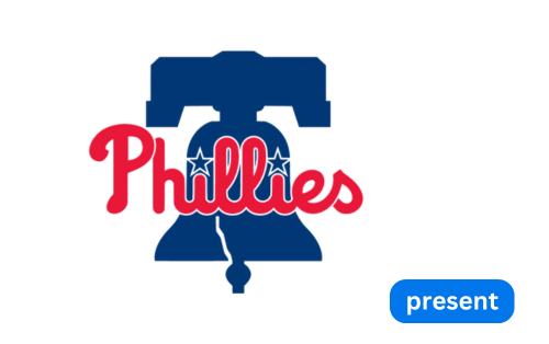
The Philadelphia Phillies, a professional baseball team, has a simple but meaningful logo. The logo features the word “Phillies” in front of the Liberty Bell. The previous version inspired the logo, which included a bell and a stadium with a red border around it. The team’s logo reflects their national spirit and desire to stay true to their roots while confidently looking to the future.
A distinctive feature of the logo is that two stars replace the dots on the letter “i.” This clever design choice effectively frames the letters “ll” and adds uniqueness to the logo. The team logo symbolizes their rich history and their commitment to excellence. It represents his passion for the game and his dedication to his fans.
Font and colors
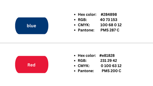
The word “Phillies” is written uniquely, making it stand out. It’s written in italics but doesn’t tilt to the right like most italics do. The capital “P” is uniquely connected to the lowercase “h,” and the two “ll” letters are very close to each other. Instead of a dot, each “i” has a little star above it, and the letter “s” looks a little different, too. The team’s logo uses blue for the bell and stars, red for the club name, and white for the background and lines around the logo.
Color codes of Philadelphia Phillies Logo
Conclusion
The Philadelphia club has had many different logos over the years, all featuring the letter “P” in other writing styles. These logos show objects such as a Philadelphia man throwing a ball, a Blue Jay, two players playing a game, a baseball cap, and a Liberty Bell. The most commonly used logo is a seal-like symbol with a striker. Logos come in various designs: stark, cartoonish, realistic, and even dash-like. Having different styles is to find something that makes the team feel confident and helps them win. Nowadays, the club uses a simple logo with only a few details: a cracked bell and one word written on it.


