The Minnesota Twins, a professional baseball team from Minneapolis, recently announced their rebranding. They have unveiled a new logo and uniform to be used from 2023. The team is known for its ‘TC’ and cursive ‘M’ logo. The classic logo remains, but a new primary logo has been introduced to add meaning to the team’s history and future. So, let’s scroll down and learn more about the story behind the Minnesota Twins iconic logo!
Brand Overview
History of the Minnesota Twins’ team
The Minnesota Twins are an experienced baseball team situated in Minneapolis, Minnesota. Founded in 1901, the team was first named the Washington Nationals, later known as the Senators. After 60 years, the team moved to Minneapolis-St. Paul was renamed the Twins to reflect the area’s famous nickname, the Twin Cities. The team was owned by the Pohlad family from 1984 to 2009
Importance of logos in the sports era
Sports logos are crucial for teams to build their identity and connect with their fans. They represent the team’s support for their city and country, a sports logo that unites fans under a unified symbol.
Evolution of Minnesota Twins’ Logos
There have been five versions of the logo since the Minnesota Twins changed their name in 1961. The latest redesign in 2023 introduced a new logo and color scheme. Fans have responded positively to the new look.
1961-1975
![]()
When the Minnesota baseball team changed its name to “Minnesota Twins” in the late 1960s, they also updated their logo. Illustrator Ray Barton created a famous image of two baseball players, “Minnie” and “Paul,” shaking hands over the Mississippi River, wearing uniforms with the initials of Minneapolis and St. Paul. The image was set against a light blue outline of Minnesota and a white baseball. Despite being paid only $15 for his work, the owner, Griffith, chose Barton’s design as the team’s official emblem.
1976-1986
![]()
The Minnesota Twins have updated their emblem to a newer version. It’s pretty similar to the old one but has some noticeable changes. The iconic Twins logo shows Minnie and Paul shaking hands over the Mississippi River with “Win! Twins!”. Also, the light blue color has been replaced with a darker shade of blue.
1987-2009
![]()
The logo of the 1987 Minnesota Twins features a red “Twins” inscription underlined by the word “win” on a giant baseball in red and white. The word “Minnesota” is depicted above in black.
2010-2022
![]()
The Minnesota Twins baseball team updated their logo back in 2010. The new design is based on a classic rondel, a transparent circle with a wide stripe, border, and central ring. In the center, there’s a baseball with two stripes in a stylish “herringbone” pattern, indicating the direction of the sport. The team name “Twins” runs horizontally across the ball in dark red with lower shadows, making it look cool and three-dimensional. The letters “T” and “s” extend beyond the inner circle, giving the logo a modern look. The design also includes the team’s location, “Minnesota,” and the phrase “Baseball Club,” along with blue and white lines along the edge. Overall, the sleek and modern design captures the team’s spirit.
2023-today
![]()
Sports teams usually have logos related to their name, but in 2022, the Minnesota Twins did something different. They added the TC monogram to their coat of arms, which left fans wondering what it meant. It turns out that TC stands for “Twin Cities,” which refers to the Minneapolis-St—Paul area where the team moved to back in 1961. The logo features a large blue “T” and a flattened red “C” that intertwine to symbolize the unity of the two independent cities.
This new logo was announced in November 2022 at the Mall of America, a significant location as it used to be the home of the Minnesota Twins’ former stadium. The change was made for the 2023 season.
Comparisons New with Previous Logos
The club’s new logo, introduced in 2023, is an updated version of the previous one. The baseball is now in a blue circle with white lettering that reads “Minnesota Baseball Club.” “Twin” is now underlined and more prominent. The font is modern and stylish, with sharp elements.
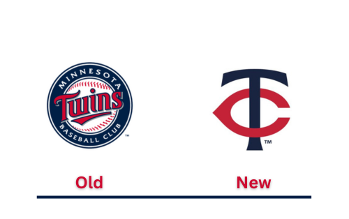
The team’s logo is a combination of the letters “T” and “C,” representing the “twin cities” of Minneapolis and St. Paul. The navy blue “T” is superimposed on the red “C,” strikingly contrasting the white background. The interlocking letters symbolize the close relationship between the two cities and embody team spirit and regional pride. The logo is simple, bold, and compelling, representing the essence of the team and its roots in the heart of the Upper Midwest.
Primary logo
![]()
Beginning in 2023, the Minnesota Twins will have a new primary logo. The logo features a navy blue T and a red C joined together. The letters T and C represent the Twin Cities, a nickname for Minneapolis and St. Paul. Compared to the old logo that the Twins used for over 60 years, the new logo has some updates. The T looks different at the end; the C is shorter, and the blue is darker.
Secondary logo
![]()
Starting in the 2023 season, the Minnesota Twins have a new secondary logo that’s simple yet striking. It features a navy blue letter “M” for Minnesota and a bright red star that stands for the North Star. The font used for the “M” is the same as in the team’s primary TC logo.
Design Elements
Minnesota twins’ uniform colors
Exciting news for Minnesota Twins fans – they will be introducing four new uniforms for the 2023 season. These include a white home uniform, a gray pinstripe uniform for away games, a navy blue alternate uniform that can be worn at home and on the road, and an eye-catching cream alternate uniform for home wear. The cream uniform is particularly notable as it will have the words “Twin Cities” emblazoned across the front. Fans will want to watch for these new uniforms coming in 2023!
Color Codes of Minnesota Twins logo
![]()
Cap logo design
Beginning in 2023, the Minnesota Twins will sport new logos on their home and road caps. The new home cap logo will feature a white T and a red C interlocking to represent the Twin Cities (Minneapolis and St. Paul). The lettering has been updated with minor changes – the ending serif of the T has been modified, the C is shortened, and the blue has been darkened.
On the other hand, the new Roadcap logo will feature a white M under a red star for Minnesota that symbolizes the North Star. The M has been carefully designed to match the font family used in the primary TC logo.
Primary cap
![]()
The Minnesota Twins will debut a new home cap for the 2023 season. The cap will have a navy blue background with a white and red primary TC logo. The hat will come with blue buttons and a visor. The TC logo has been slightly updated for 2023, and the shade of blue has been darkened.
Secondary cap
![]()
In 2023, the Minnesota Twins will have a new road cap design. The cap will be navy blue with a white M on the front. Above the M, there will be a red North Star. Additionally, the cap will have a blue button and visor.
Conclusion
The newest logo for the Minnesota Twins, which will be used through the 2023 season, has more than just a cosmetic upgrade. It marks a new phase in the team’s story, where old and new come together seamlessly. Although some fans have expressed their distaste for the logo, it is poised to become a permanent symbol of Twins pride.
FAQs
Why did the Twins get a new logo?
The Minnesota Twins logo’s new look reflects their values while looking to the future with a modern and uniquely Minnesotan perspective. The classic logo hasn’t been completely replaced, but the new core logo is designed to bring a new perspective to the franchise’s history and future aspirations.
What was the twin’s original name?
Minnesota, who plays in the American League (AL). They were known as the Senators and lived in Washington, DC, until 1960 before moving to Minneapolis in 1961. The Twins have won three World Series titles (in 1924, 1987, and 1991) and six AL pennants throughout history.
When did the Twins become twin cities?
The Minnesota Twins, a baseball team, take their name from the Twin Cities nickname given to Minneapolis and Saint Paul. Founded in 1901 as the Washington Senators and later moved to Minnesota, the team officially became the Minnesota Twins starting from the 1961 season.