The Denver Basketball Club was founded in 1967, and its name is a nod to the state’s history and the club’s roots. The team’s logo and name represent the Gold Rush era, while the current logo marks a new development chapter. Throughout their 54-year history, the Denver Nuggets have had five different logos. Before the 1950s, many teams didn’t have official logos, so they used their team colors or jerseys instead. The Denver Nuggets are a professional basketball team that competes in the NBA’s Western Conference. They’re owned by Kroenke Sports & Entertainment and play their home games at the Ball Arena. So, let’s scroll down and learn more about the story behind Denver Nuggets iconic logo!
Brand Overview
Head coach: Michael Malone
Owner: Kroenke Sports & Entertainment
CEO: Robert Pack
Founded: 1967
Headquarters: Denver, Colorado, U, S
Website: Nuggets
Download free logos: PNG&SVG
Nuggets logo History
The Denver Nuggets basketball team was formed in 1967 in Denver, Colorado. Previously, they were called the Denver Rockets and played in the American Basketball Association (ABA). Later, they moved to the NBA after the merger of the NBL and BAA. Unfortunately, the team was disbanded for a while.
In 1967, a group of businessmen led by James Trendle and George McCann, the new ABA commissioner, decided to revive the team, which they named the Denver Larks. However, due to funding problems, they had to sell a majority stake to Bill Ringsby, owner of Rocket Truck Lines. Rings renamed the team the Denver Rockets, and they made the playoffs five times during their seven-year existence. In 1972, new owners took over, and the merger of the ABA and NBA meant that teams with identical names could no longer exist. Since the Houston Rockets were already in the NBA, Denver had to change its name again. They chose the Denver Nuggets, referring to the gold rush of the 1850s when gold was discovered in Colorado. The nickname “nuggets” comes from “nuggets of gold”.
Nuggets Logo Evolution
In 1968
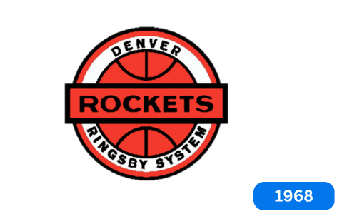
The basketball team’s logo was unveiled to the public in 1968. It was created by team owner Bill Ringsby and featured an orange basketball in the center of a classic goal sign. The white stripe at the bottom of the logo reads “Ringsby System,” while the top reads “Denver.” “Rockets,” the team’s former name, was written in a long rectangle in the circle. The logo was simple and stylish, with a red basketball in the center of a white circle, a double black and red outline, and bold “Rockets” letters with a horizontal red banner. The “Denver Ringsby System” inscription was written around the ball on a white background.
In 1972
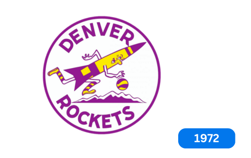
The Rockets underwent a significant redesign in 1972, which saw them change their colors to yellow and purple and adopt a more playful caricature design. The team’s management decided to include the franchise name in the logo, which depicts a colorful rocket holding a basketball and flying over a mountain background. The circular mark displays the team name above and below, while the wordmark is written in all capital letters in a purple sans-serif typeface, which surrounds the logo’s circle. This new design was a significant change from the team’s original look and has become an iconic symbol of the Rockets franchise.
In 1974
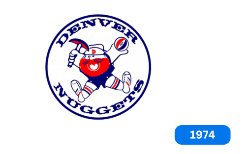
The basketball team in Denver went through a significant rebranding. They changed their name from “Denver Rockets” to “Denver Nuggets” and created a new logo. The logo features a character named Maxie the Miner, whom Yukon explorer Cornelius inspires. Maxi is depicted in red, blue, and white colors and is always shown with an expression of joy, jumping up and down with a puck in one hand and a small ball in the other. The team name is written around a picture of a miner, with a thin blue line around everything.
In 1976
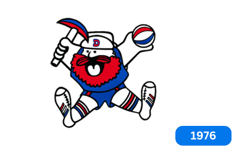
In the late 1970s, the Denver Nuggets had a logo that resembled their previous one. The only real difference was that they got rid of the circle. They also made other changes, such as darkening the colors, blackening Maxie the Miner’s mouth, and highlighting the “D” on his hat. He also took the acronym from the ball. These changes made the logo brighter and more appealing.
In 1982
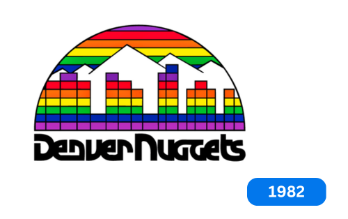
In 1982, the Denver Nuggets underwent a redesign that introduced a cool disco-style logo to identify the club. The following year, the team adopted a new logo considered the most colorful in their history. The design features a semicircle with rainbow lines and colorful houses of different-colored squares set against a backdrop of snow-white mountains. The logo represents the skyline of the so-called “Rainbow City” and was created by talented artists who aimed to convey a variety of gems in the design. At the bottom of the sign is an inscription that reads “Denver Nuggets.” Which has been given the shape of a jewel. The wordmark uses the same typeface as the previous logo and is placed in black below the image.
In 1994
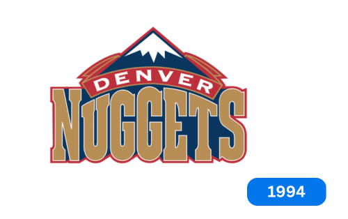
Did the Nuggets sports club introduce a new logo design in 1993? Later, they changed it again, adding a further sign with the same mountain peak and the word “Nuggets” in bold letters. They made sure to incorporate the first part of their name, “Denver,” into the design of the semi-arch over the mountaintop.
In 2004
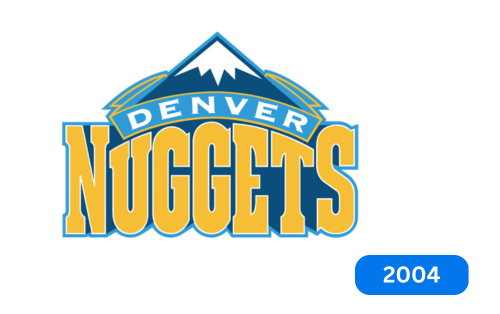
In 2004, our logo designers decided to change the color palette. They wanted to freshen things up, so they lightened the colors and gave the nuggets a lovely golden hue. They also changed the red background in the middle rectangle for a cooler blue color. These adjustments may be minor, but they gave our logo a whole new look.
In 2009
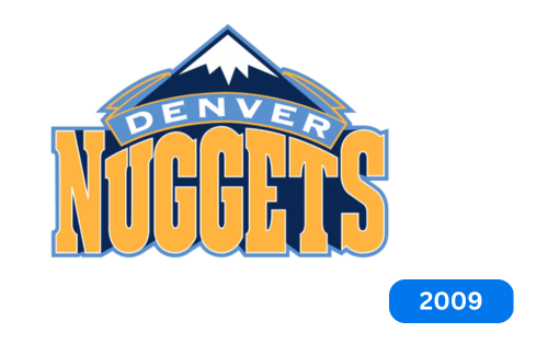
In 2009, the Denver Nuggets basketball team updated their color palette. However, they didn’t want to change their existing logo completely, so they kept it as is. All they did was enhance the color of the word “nuggets” to make it brighter. Additionally, they made the shades of blue and yellow darker, giving their logo a more appealing and eye-catching look. They also changed the color of the arched banner to light blue, representing Colorado’s cold and snowy mountains. Overall, the new color palette elevates the look of the Denver Nuggets logo and gives it a fresh and modern feel.
Today
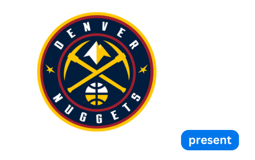
They updated our logo design in 2019. The new logo features two golden pickaxes crossed in the center, taking up most of the space. Between the pickaxes, you can see mountain peaks that look like they are basking in the sunlight. Underneath the pickaxe, you’ll find a basketball resembling a globe. The designer created this effect by using lines resembling those on the map. A thin red line surrounds all central elements, and the phrase “Denver Nuggets” appears below the pickaxe in a wide stripe. The stars are placed between the upper and lower words, adding to the design’s overall appeal. The logo is surrounded by a double border around the outer edge; This gives it a well-defined shape. Overall, the new design represents the team’s toughness, resilience, and connection to the mountains and the great outdoors.
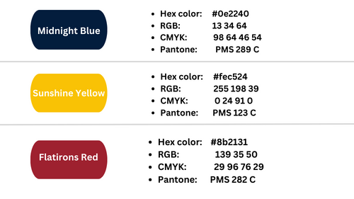
Colour Codes Of Denver Nuggets logo
Conclusion
The history of the Denver Nuggets logo traces the team’s journey from its inception in 1967 to its current identity. Over the years, the logo has evolved to represent team name changes, rebranding efforts, and ties to Colorado history. From the Denver Rockets’ original orange basketball to modern depictions of crossed pickaxes and mountain peaks, each logo tells a story of the team’s resilience, growth, and commitment to its roots. As the Denver Nuggets continue to make their mark in the NBA, their logos are a visual reminder of their rich history and bright future.

