When discussing fashion dolls, it’s hard not to think of the iconic Barbie doll that generations of girls have loved. Did you know that Barbie’s full name is Barbara Millicent Roberts, and she was created in America in 1959 by the founders of Metal Creations, Ruth and Eliot Handler? Over the years, Barbie has been a beloved toy not only for girls but also for boys. It was the first of its kind in North America and has had an incredible impact on popular culture in its 63-year lifespan. While many people recognize the pink Barbie logo, only some are familiar with the many redesigns it has gone through. If you’re a Barbie fan, you’ll enjoy reading our detailed blog, where we cover the complete history of Barbie and its logo.
Brand Overview
Type Fashion doll
Inventor(s) Ruth Handler
Company Mattel
Country United States
Availability March 9, 1959–present
Materials Plastic
download free logo PNG&SVG
History of Barbie dolls
Before the advent of Barbie dolls, children played with regular dolls meant for children or paper dolls that looked like adults. The idea for Barbie came to life when a businesswoman named Ruth Handler saw her daughter playing with dolls and dressing them up like adults. Ruth created a doll that looked like an adult but was meant for children. During a trip to Europe, Ruth came across the famous German doll Bild Lilly, who inspired her to create the Barbie doll in 1959. However, Barbie’s design initially caused controversy as some parents felt it was too suggestive. Despite criticism, the multinational toy company Mattel, Inc. has been producing Barbie dolls since 1959. The company has sold more than a billion Barbie dolls, making it one of the most popular dolls in history.
Evolution of the Barbie Logo
The Barbie logo has evolved over the years – from its bright pink wordmark in the 1950s to today’s minimalist design. Despite several redesigns, the logo retains its signature look and feel. The company has made minor changes to the logo over the years, keeping it relevant to new generations. Interestingly, the brand returned to its original girly logo in 2009, making it its official visual identity. The Barbie logo shows that staying true to your roots can take you far. If you need to familiarize yourself with the changes, here’s a list.
1959-1975: The Handwritten Era
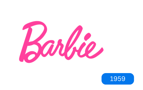
Did you know that the original Barbie logo was very similar to the current one we know today? The first logo featured a simple pink calligraphy name in a custom cursive font that looked childish. The font was distinctive and memorable and was used by the company for over 15 years. A unique feature was the playful jumping letters that added character to the logo. The first letter of the name was capitalized, but the rest were lowercase, and not all letters were the same height, giving the logo a playful and simple feel. Overall, the original Barbie logo was memorable and distinctive, written in a pink handwritten style.
1975-1991: A 3D Touch
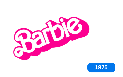
Barbie updated its logo to reflect the modern brand. The new three-dimensional design features lowercase letters in a continuous line, angled upwards to express happiness. The wordmark is white with a bright pink outline and broad shadow, thick and rounded letter ends, and a long curved tail on the capital “B.” The new look exudes hope and joy in line with the company’s modernization efforts.
1991-1999: Flat and Refined
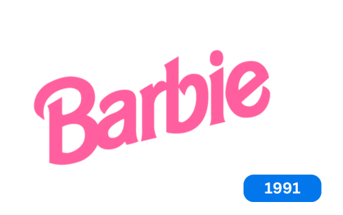
During the 90s, Barbie underwent a significant redesign that completely changed its logo. The new logo features strong letters with a simple design, removing unnecessary curves. The new color palette is more muted, featuring pastel tones rather than the bright pink of the previous version. The result is a more elegant and playful design that perfectly captures the essence of the Barbie brand.
1999-2009: Experimentation and Evolution
Cursive comeback
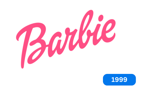
The Barbie logo received a makeover in 1999 with a new handwritten style and italics that leaned slightly to the right. The color was somewhat brighter, but the tone remained even. The new logo was personalized, cohesive, and consistent with the brand’s visual identity.
Flower addition
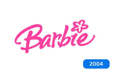
In 2004, the Barbie logo received a makeover with a five-petalled flower above the “i.” The new design aims to make the brand more relevant to children. However, the logo’s lack of sophistication only lasted a year. The floral element completely changed the look of the sign, and the color was subtly changed to a bright pastel pink. The new logo had a youthful and carefree feel, with the letters bouncing and staggering unevenly.
Short-lived designs
The company removed the floral element from its logo a month later because it seemed unnecessary and complicated. The new logo is similar to the previous one but with a darker pink color. The letter “a” is unclosed, and the leg of “e” is extended upwards. The brand considered it a slight improvement on its already iconic logo.
2009-Present: A Timeless Return
Barbie returned to its original logo in 2009 when the brand first emerged. They chose to keep the same design but now featured a pink Barbie head above the 1959 script on a white background. Despite making many changes over the years, the company decided to stick with the original logo as it holds great historical significance for the brand.
What font is Barbie
The Barbie logo has a timeless look, with a playful yet elegant handwritten font called Dollie Script. Although the logo has changed over the years, the overall style has remained constant since its creation in 1959.
The Importance of Font Choice
Choosing easy-to-read fonts is essential for effective communication. Not only do they improve the appearance of your text, but they also help readers understand it better. Choosing the right color, font, and text size can attract your target audience and convey your brand’s appropriate tone and purpose. Fonts can have a significant impact on the way we read and understand information. Different fonts are used for various brand logos, each with unique significance.
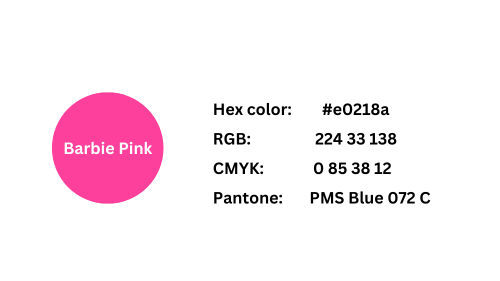
color codes of Barbie logo
Conclusion
Barbie dolls are a famous and popular toy produced by Mattel, Inc. Made in 1959. The iconic doll logo has undergone many changes, but its visual identity has remained a critical factor in its popularity. To stay true to its history and brand, the company chose to return to its original logo, which is simple and clean. Barbie dolls have become global children’s toy icons in the toy industry.


