Introduction
The logo of a brand is more than just a visual symbol; it is the essence of its identity, conveying its values, legacy, and connection with its audience. Burger King, one of the world’s leading fast-food chains, has undergone several transformations in its logo to keep pace with changing times and tastes. This article delves into the fascinating history of Burger King and the evolution of its iconic logo, highlighting the design elements that have made it a household name.
The History of Burger King
Burger King, one of the most recognizable fast-food chains globally, was founded in 1954 by James McLamore and David Edgerton in Miami, Florida. Initially named “Insta-Burger King,” the chain started with the innovative Insta-Broiler technology for cooking hamburgers. This approach ensured efficiency and consistent quality. Within a few years, McLamore and Edgerton acquired the rights to the company, rebranded it as “Burger King,” and began its expansion journey.
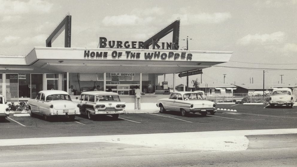
The company became known for its flame-grilled burgers and iconic menu items, such as the Whopper, introduced in 1957. Burger King’s commitment to quality, innovation, and customer satisfaction set it apart in the competitive fast-food industry. Today, Burger King operates in over 100 countries, serving millions of customers daily and competing fiercely with other fast-food giants like McDonald’s.
The History of the Burger King Logo
The evolution of the Burger King logo reflects the company’s growth and changing design trends. The logo’s journey mirrors the brand’s efforts to maintain relevance and establish a strong identity in the fast-food industry.
1954-1957
The Original Logo The original Burger King logo was a simple text-based design. It featured the brand’s name in bold, capitalized letters, emphasizing clarity and professionalism. This logo set the tone for a straightforward and approachable brand identity.
1957-1969
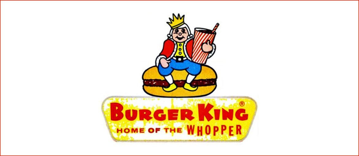
The King Mascot Logo In 1957, the company introduced its first major redesign. The logo depicted a cartoonish “King” character sitting on a hamburger, holding a beverage. This playful design aimed to appeal to families and children, a significant target audience for fast-food chains. The bright colors and whimsical elements signified fun and affordability.
1969-1994
The Bun Logo The 1969 redesign marked a significant shift toward modern branding. This logo featured the words “Burger King” placed between two stylized halves of a hamburger bun. The design was bold, clear, and instantly recognizable, laying the foundation for future iterations. The logo remained consistent for over two decades, becoming synonymous with the brand’s identity.

1994-1999
A Sleeker Bun Logo In the mid-1990s, the bun logo received a minor update to give it a more polished look. The text became slightly more refined, and the color palette was brightened, making it more visually appealing for contemporary audiences.
1999-2020
The Swirl Logo The 1999 redesign introduced a dynamic and energetic look. The logo retained the burger bun concept but added a blue crescent swirl encircling it, symbolizing motion and modernity. The typography also became more rounded and playful, reflecting the brand’s approachable and family-friendly ethos.
2021-Present
The Retro-Inspired Logo In 2021, Burger King unveiled a nostalgic logo inspired by its 1969 design. This minimalist design features a flatter aesthetic, aligning with current trends in branding. The logo uses warm colors, a retro-inspired font, and a simplified layout, emphasizing the brand’s focus on quality and authenticity.
Design Elements of the Burger King Logo
- Color Palette The Burger King logo predominantly uses red, yellow, and blue. These colors are associated with energy, warmth, and trust. The red and yellow evoke appetite and excitement, while the blue adds a sense of reliability.
- Typography The logo’s typography has evolved to reflect changing design trends. From the bold, no-nonsense font of the 1950s to the rounded, playful typeface of the 1990s and the retro-inspired font of 2021, the text has always maintained readability and visual appeal.
- Shape and Layout The circular elements in the logo—whether the hamburger bun or the encompassing swirl—convey inclusivity and harmony. The balanced design ensures that the logo remains versatile across various mediums, from packaging to digital screens.
- Iconography The use of a burger as the central element reinforces the brand’s core product. The incorporation of a crown in earlier designs highlighted the “king” aspect, emphasizing quality and superiority.
The Popularity of the Burger King Logo
The Burger King logo is one of the most recognizable symbols in the fast-food industry. Its widespread appeal can be attributed to several factors:
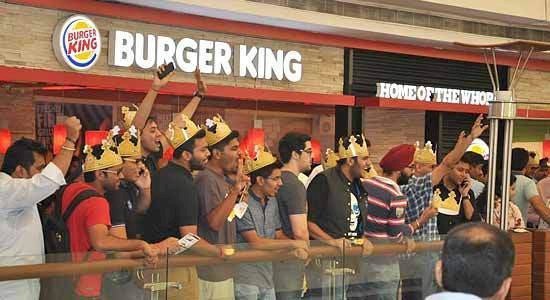
- Global Presence With its extensive network of restaurants worldwide, the Burger King logo is a familiar sight in urban and suburban landscapes. Its consistent branding ensures that customers recognize it instantly.
- Adaptability The logo’s design is versatile, allowing it to adapt seamlessly to various applications, from storefronts to mobile apps. Its scalability and clarity make it effective across different formats.
- Emotional Connection The bright colors, playful typography, and burger imagery evoke positive emotions and appetite, creating a strong connection with customers.
- Nostalgia The 2021 redesign tapped into nostalgia, resonating with customers who have grown up with the brand. By embracing its roots, Burger King strengthened its identity and appeal.
- Marketing Campaigns Burger King’s creative marketing strategies often leverage the logo’s visual appeal. From humorous advertisements to digital campaigns, the logo remains a central element, reinforcing brand recognition.
The history of the Burger King logo is a testament to the brand’s ability to evolve while staying true to its core identity. From its humble beginnings as a text-based design to its modern retro-inspired logo, each transformation reflects Burger King’s efforts to adapt to changing trends while maintaining relevance and appeal. The logo has consistently captured the essence of Burger King’s promise: quality, flavor, and a touch of fun.
The 2021 redesign, in particular, represents a thoughtful blend of nostalgia and innovation. By revisiting its roots, Burger King has celebrated its heritage while embracing modern aesthetics. This approach highlights the importance of adaptability in branding, showcasing how thoughtful design can forge deeper connections with a global audience.
As the world of branding continues to evolve, the Burger King logo stands as a prime example of how a visual identity can adapt to cultural shifts, market trends, and consumer expectations. It remains an enduring symbol of the brand’s legacy and a vital element of its success in the competitive fast-food industry. Whether on a storefront, a digital platform, or a paper wrapper, the Burger King logo continues to invite millions worldwide to “Have It Your Way.”
