Fruit of the Loom is one of the most iconic and recognizable clothing brands in the world, known primarily for its high-quality underwear and casual wear. The brand has a long and illustrious history, and its logo has undergone significant changes over the years. The emblematic design has become a symbol of reliability, comfort, and authenticity. This article will delve into the meaning, history, and evolution of the Fruit of the Loom logo, tracing its journey through decades of brand identity and design transformation.
Meaning of the Fruit of the Loom Logo
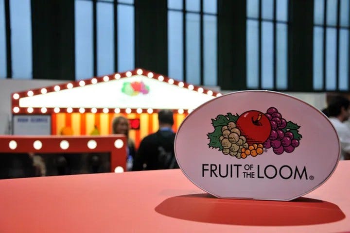
The Fruit of the Loom logo is a visually captivating design that features a cluster of fruits, including apples, grapes, currants, and leaves. The imagery is vibrant, colorful, and wholesome, representing freshness and natural quality. Each fruit depicted in the logo symbolizes different attributes associated with the brand:
- Apple: The apple represents health, vitality, and timeless appeal.
- Grapes: These fruits signify abundance, richness, and the brand’s long-standing commitment to excellence.
- Currants: Currants add diversity to the logo, symbolizing the company’s wide range of products.
- Leaves: The green leaves embody growth, renewal, and sustainability.
Together, the fruits in the logo convey an image of natural purity and enduring quality. The vibrant color scheme reinforces a sense of cheerfulness and positivity, qualities that the brand has embraced since its inception.
Historical Overview of the Fruit of the Loom Logo
The history of the Fruit of the Loom logo dates back to the 19th century when the company was founded in 1851 by Robert Knight and Benjamin Knight in Rhode Island. Initially, the brand focused on producing high-quality textiles and later became synonymous with comfortable and durable clothing.
![]()
Early Years: 1851 to the Early 20th Century
In the late 1800s, Fruit of the Loom adopted its first official logo. The early design was simple and featured a cluster of fruits with a ribbon banner bearing the brand name. The imagery was more artistic and less defined compared to modern iterations, but it already captured the essence of the brand’s commitment to natural quality.
The original logo was hand-drawn and detailed, a common practice for logos of that era. Despite its simplicity by today’s standards, the logo successfully conveyed a message of wholesome values and reliable craftsmanship.
Mid-20th Century: Simplification and Modernization
By the 1940s and 1950s, the Fruit of the Loom logo underwent a significant transformation. The design was streamlined to reflect modern graphic trends, with cleaner lines and a more structured arrangement of fruits. This period marked the beginning of the brand’s focus on mass production and national recognition.
The ribbon element was retained, but the fruit cluster became more stylized. The logo began to appear prominently on product packaging and advertising materials, further cementing its identity in the minds of consumers.
1970s: A Bold New Look
During the 1970s, Fruit of the Loom introduced a bold and colorful version of its logo. This redesign featured brighter colors and a more defined arrangement of fruits. The logo now included a more three-dimensional appearance, giving it a dynamic and contemporary look.
This era saw the brand expanding its reach globally, and the vibrant logo helped create a strong visual identity that resonated with a diverse audience. The fruits were meticulously illustrated with attention to detail, creating a visually appealing and memorable design.
The brand’s marketing strategy during this time emphasized the vibrant new look of the logo. Consumers associated the bright and cheerful imagery with high-quality and comfortable clothing. The logo became a trusted visual marker for Fruit of the Loom products.
1980s and 1990s: Refinement and Consistency
In the 1980s and 1990s, the Fruit of the Loom logo underwent further refinement. The design retained its core elements but adopted a cleaner and more polished appearance. The color palette was standardized, and the fruit arrangement was made symmetrical to enhance visual balance.
This period also saw the introduction of digital design technologies, which allowed the logo to be reproduced with greater precision and consistency. The brand focused on maintaining a timeless and recognizable identity while keeping up with modern design trends.
Fruit of the Loom also began to emphasize the importance of brand consistency across different platforms and media. The refined logo became a central element of advertising campaigns and product packaging, contributing to a unified brand identity.
2000s: Minimalist Approach
In the early 2000s, minimalist design trends influenced the Fruit of the Loom logo. The brand opted for a simpler and more straightforward representation of the fruit cluster. The logo became flatter, with fewer shadows and gradients, aligning with contemporary design aesthetics.
This minimalist approach made the logo more adaptable for digital media and various print applications. Despite the changes, the logo continued to embody the brand’s heritage and core values.
The shift to minimalism was also driven by the need for better scalability. As digital platforms became more prevalent, a cleaner and simpler logo ensured better visibility and readability across different screen sizes and resolutions.
Recent Years: A Return to Roots
In recent years, Fruit of the Loom has embraced a design approach that combines modern aesthetics with a nod to its historical roots. The current logo features a refined and elegant arrangement of fruits, with vibrant colors and a clean, symmetrical layout.
The return to a more detailed and colorful logo reflects the brand’s commitment to authenticity and tradition while staying relevant in a competitive market. The logo continues to be a symbol of comfort, quality, and trust.
This renewed focus on heritage has resonated with consumers who appreciate brands with a strong sense of tradition and authenticity. The logo serves as a reminder of Fruit of the Loom’s long-standing reputation for quality and comfort.
Symbolism and Brand Identity
The Fruit of the Loom logo has become synonymous with reliability, comfort, and authenticity. Its consistent use of fruit imagery has helped create a strong visual identity that sets it apart from competitors. The logo’s symbolism extends beyond mere aesthetics:
- Wholesomeness: The natural imagery reinforces the brand’s commitment to providing high-quality, comfortable clothing.
- Heritage: The logo reflects the brand’s rich history and enduring presence in the market.
- Adaptability: Despite design changes, the logo has retained its core elements, demonstrating the brand’s ability to evolve while staying true to its roots.
The use of vibrant colors and natural elements also helps create a positive and uplifting image for the brand. Consumers associate the logo with products that offer comfort, durability, and value.
Cultural Impact and Consumer Perception
The Fruit of the Loom logo has become a cultural icon, recognized by generations of consumers. Its timeless design and positive associations have contributed to strong brand loyalty. The logo’s cheerful and vibrant imagery evokes feelings of trust and familiarity, making it a beloved symbol in the clothing industry.
Over the years, the logo has also been featured in various marketing campaigns, advertisements, and product packaging. Its presence on clothing labels serves as a mark of quality and authenticity, reinforcing the brand’s reputation.
Fruit of the Loom has also embraced social and environmental responsibility, which is subtly reflected in the imagery of its logo. The natural elements in the design symbolize the brand’s commitment to sustainability and ethical practices.
The logo has even found its way into popular culture, appearing in parodies and references in various media. This cultural recognition further solidifies the logo’s iconic status.
The Importance of a Timeless Logo
A well-designed and timeless logo is a crucial asset for any brand. The Fruit of the Loom logo exemplifies this principle by maintaining its core elements while evolving to meet changing design trends and consumer expectations.
The logo’s longevity and adaptability have played a significant role in the brand’s success. By staying true to its heritage while embracing modern aesthetics, Fruit of the Loom has created a visual identity that stands the test of time.
Conclusion
The Fruit of the Loom logo is a testament to the power of effective branding and visual storytelling. Its evolution from a hand-drawn fruit cluster to a refined and elegant design reflects the brand’s journey through decades of innovation and growth. The logo’s enduring appeal lies in its ability to convey core brand values such as quality, comfort, and authenticity.
As Fruit of the Loom continues to adapt to changing consumer preferences and design trends, its iconic logo remains a symbol of the brand’s commitment to excellence. The journey of the Fruit of the Loom logo serves as an inspiring example of how thoughtful design and brand identity can create a lasting impact in the competitive world of fashion and apparel.
If you’re passionate about design, creativity, and high-quality visual resources, VectorDose is a must-follow website. Offering a vast collection of premium vectors, illustrations, and design assets, the platform caters to graphic designers, content creators, and creative professionals seeking fresh and innovative visuals. With regularly updated content and user-friendly navigation, VectorDose makes it easy to find inspiration and elevate your design projects. Check it out at vectordose.com for endless creative possibilities.