The Chicago Bears are undoubtedly one of the most respected football franchises in the league. Their logo is a famous symbol that many people love. Over the years, the sign has seen significant changes, and the team has won several titles. Bears have a massive following in Illinois and across the state, and their popularity continues to grow. Like the Miami Dolphins logo, the Bears logo is unique, and the story behind its evolution is genuinely fascinating. If you’re a Bears fan, you’ll enjoy reading our detailed blog, where we cover the complete history of the Chicago Bears and their logo.
Brand Overview
NFL championships: 1986
Head coach: Matt Eberflus
General Manager: Ryan Poles
Chairman: George McCaskey
Fight song: “Bear Down, Chicago Bears”
Founded: September 20, 1919
Founder: Virginia Halas McCaskey
Headquarters: Chicago, Illinois, U.S.
Website: chicagobears.com
Download free logos PNG & SVG
Chicago Bears Logo History
The Chicago Bears are a professional American football team that competes in the National Football League (NFL). The team was founded in 1919 and was initially called the Decatur Staleys. They moved to Chicago in 1921 and changed their name to the Chicago Stallies. The team then became the Chicago Bears in 1922. The Bears have won nine titles, including eight NFL championships and one Super Bowl, which they won in 1985.
The Bears are best known for their rivalry with the Green Bay Packers, which has continued since their first meeting in 1921. To date, the Bears lead the series 94-92-6. The Bears have inducted 26 players into the American Football Hall of Fame, more than any other NFL team.
The Bears are one of the NFL’s oldest teams, founded in 1920 in Decatur, Illinois. They are known for their long and rich history in the game of football. The team’s success and longevity have made the Chicago Bears a household name in American football.
Chicago Bears Logo evolution
The Chicago Bears have been around since the 1920s, and their logo has undergone many changes. This article is perfect if you are a team fan or just interested in sports logos! We’ll look at all the logos the Chicago Bears have had over the years and explain why many people think it’s one of the best sports logos ever.
1920
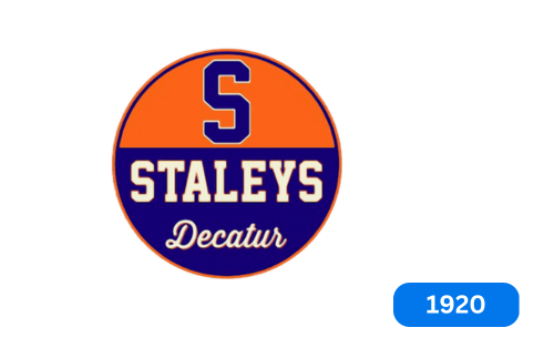
The Decatur Staleys, owned by the A. E. Staley Company had its first logo in the 1920s. They wanted to represent their food starch production and used a blue “S” logo against a dark orange background on the top half of the circle. The bottom half was blue with the words “Staleys Decatur” in white in a script font. “Staleys” was written in capital letters.
1921
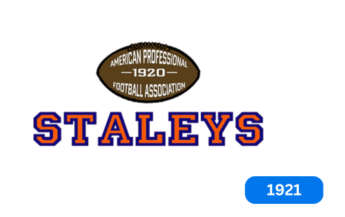
When the football team known as the Stallies moved to Chicago, it changed its name to the Chicago Stallies. As part of this rebranding, they created a new logo. The new design was sporty, and featured A.E., No reference to the Staley company, was included. It featured a light brown American football with a black outline and the team’s founding date “1920” in the center. Under the ball was the team name “Staleys,” which was orange with a blue outline, written in small serif capitals. The new logo was a significant change from the team’s previous logo, which featured a giant rugby ball in the center with the word “Stale” underneath. Fans loved the new design, and it remained unchanged until the 1940s.
1940
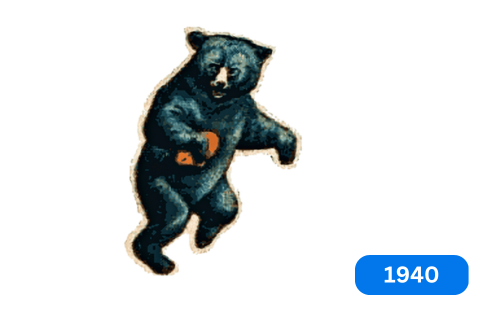
The Chicago Bears, a famous American football team, got its name in 1940 with its first logo. The original logo featured a black bear carrying a football and running on its hind legs, symbolizing strength and invincibility. Later, the team changed their logo and adopted a new one featuring a giant bear holding a rugby ball. This unique design became the team’s symbol for the next few years and is still remembered as the original representation of the iconic bear in the team’s official logo.
1946
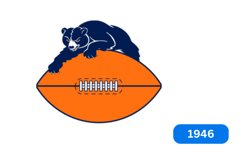
In 1946, the Chicago Bears football team decided to change their logo. They replaced their old logo with a new one showing a navy blue football with a white bear on top. The bear was drawn in a simple style with white lines along its body, sharp claws, drooping eyebrows, and an open mouth, giving it a fierce look. The football was dark orange with blue stripes and white stitching around the edges. Fans across America loved the new logo and thought it represented their beloved team best. The team decided to keep the same color combination of blue and orange for their logo, which is still used today.
1962
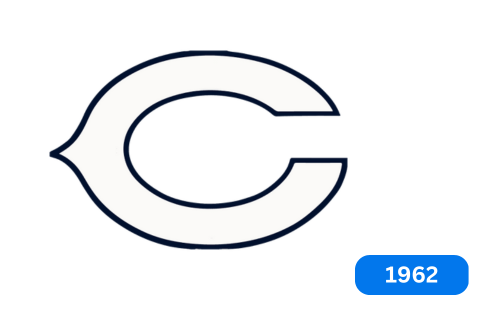
In 1962, the Chicago Bears introduced a new black and white logo utterly different from their predecessor. The designers wanted to make the logo more generic and straightforward. Instead of featuring a bear, they used the letter ‘C’ to represent the city of Chicago. The ‘C’ was white with black borders, and fans well received the new design for its sophisticated and classy look. The club continued with this approach and made minor changes to the logo in 1974.
1974
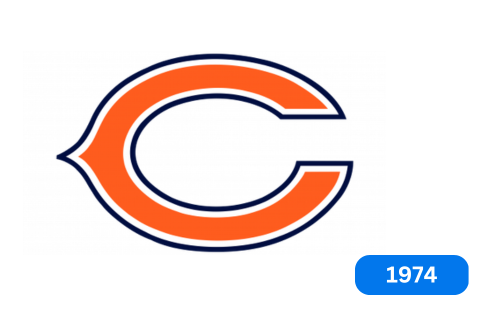
The Chicago Bears logo has been around since 1974 and has been slightly updated. The letter “C” is orange with a double outline of white and black. The letter itself has been improved to look more modern and professional. The logo’s color palette represents positive energy, stability, and a severe style. 1993, the logo was updated to include a white and blue bear head on a yellow wishbone “C.” Although the logo was eventually retired, the bear’s head remains vital to the club’s visual identity. Today, the bear’s head is executed in orange and dark blue, often used instead of the letter “A” in “Bears.” The team also uses a combination of an orange and blue bear on the “C,” but the two symbols are often used separately. The Chicago Bears logo is simple yet iconic and represents the club’s strong values.
1993
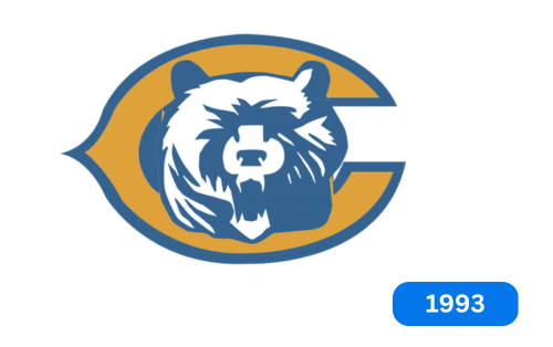
In the 90s, the Chicago Bears tried to develop some new logos. They made a few artifacts, including a roaring bear’s white and blue head. They superimposed it on an orange letter “C” with a thick blue outline. However, the logo never entered the public eye and remained unused.
New Symbol 2023 – today
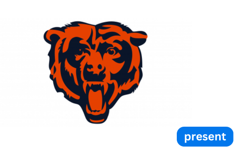
The Chicago Bears recently unveiled a new logo for their team. The blue and orange bear head design, once as important as the iconic wishbone “C” logo, now takes center stage as the primary logo. The change reflects a modern design aesthetic while embracing the team’s traditional colors. The bear head logo evokes the fierce and competitive spirit of the team, signaling a fresh start and renewed focus on future success.
Font and color
The Chicago Bears logo is made up of a capital letter “C” with a triangle in the middle that looks like a bone. It symbolizes good luck on Thanksgiving Day, so the team chose it. The “C” stands for Chicago and has a corner to the left that indicates. The logo is primarily orange with a white outline on the inside and a dark blue outline on the outside. This color scheme matches the team colors. The Chicago Bears wordmark is written in a bold typeface that looks great. The team uses two different versions of the wordmark, one with the team’s full name and the other with a wishbone in the center.
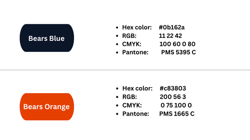
Color codes of the Chicago Bears logo
Conclusion
The Chicago Bears are an American football team that has become a household name due to their prestigious rise in the sport. Their unmistakable logo is a testament to their dominance, and the team has won numerous titles over the years. To stay current, the team has updated its logo from time to time. This blog explores different versions of the Chicago Bears logo from the 1920s. The team is known for its unique logo, which is still held in high regard by fans and the team’s Hall of Fame. If you want to learn about other NFL teams, you may be interested in searching for the Miami Dolphins or LA Rams logos.


