Would you like to become more familiar with the history of the Lamborghini logo? Would you like to know the meaning and history of the Lamborghini logo? Lamborghini is a famous luxury car brand that produces high-performance cars admired for their sleek design and impressive speed. The Lamborghini emblem, featuring a bull, symbolizes strength and determination, inspired by the founder’s love of animals. People worldwide recognize the Lamborghini logo as a symbol of style, sophistication, and automotive elegance. Please keep reading if you’d like to know the history and meaning behind the Lamborghini logo.
Brand Overview
Founded in 1963 by Ferruccio Lamborghini, the Italian automaker set out to challenge established brands like Ferrari. Lamborghini cars are known for their exceptional performance, groundbreaking designs, and luxurious appeal. Over the years, the company has introduced legendary models such as the Miura, Countach, Diablo, and Aventador, each bearing the iconic bull logo that signifies strength and agility.
Lamborghini brand history and founding
Lamborghini is a famous brand of luxury sports cars founded in 1963 in Italy by Ferruccio Lamborghini. Lamborghini comes from the last name Ferruccio, which means “little sheep” in Italian.
Initially, the company built tractors, but after a disagreement with Enzo Ferrari, Ferruccio decided to make cars that could compete with Ferrari. The first Lamborghini car, the 350 GT, came out in 1964, and soon after, models like the Miura helped make the brand even more popular.
Despite its success, Lamborghini was financially damaged by the 1973 oil crisis, and in 1974, Ferruccio sold his shares, leading to many changes in ownership. The brand was owned by several companies, including Mamran Brothers in the 1980s and Chrysler in 1987. After that, it was owned by an Indonesian investment group before being bought by the Volkswagen Group
Lamborghini has always been passionate about creating high-performance cars that are both beautiful and powerful. From the classic 350 GT to the modern Aventador and Urus, they continue to push the boundaries of what is possible. So, if you are looking for a car that turns heads and provides an exhilarating ride, Lamborghini is a great choice.
Lamborghini Logo Evolution
Over the years, the Lamborghini logo has changed only a few times. The old sign was very different from what we know today. However, once the Lamborghini team found its proper form, it kept the same logo as much as possible. If you need to familiarize yourself with the changes, I have a list for you.
In 1953
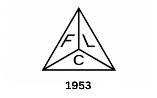
When Lamborghini first started, their logo completely differed from the iconic logo we know today. The original logo was introduced in 1953 and was very simple in design. It featured a pyramid with three triangles, each containing a letter: F, L, and C. The initials were “Ferruccio Lamborghini Cento,” written in a sans-serif typeface font. Since no graphic design standards existed, different fonts were used for each letter. The Lamborghini logo has undoubtedly come a long way from its humble beginnings.
In 1963
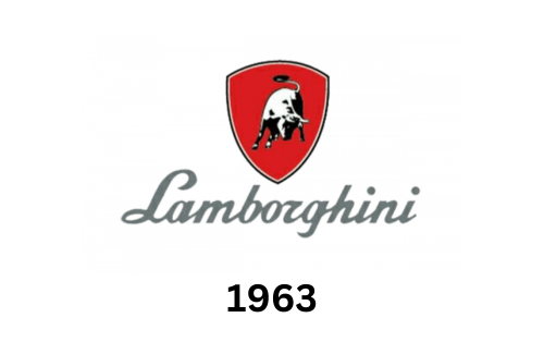
In 1963, Lamborghini unveiled its new logo, now an iconic brand symbol. The logo featured a mighty bull in motion against the background of a prominent shield. The original design featured a monochrome bull on a red shield, with the word “Lamborghini” written in a sleek silver sans serif font. The lettering had sharp and thick lines, giving it a sense of speed and power. Today, the Lamborghini logo is still recognized worldwide and a symbol of excellence in the automotive industry.
In 1972
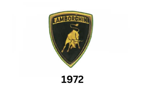
In 1972, the Lamborghini brand introduced a new visual identity that we still see today. The update includes the famous gold and black color scheme and uthe nique placement of the Lamborghini name above the running bull in the shield. The company also switched to a new font with capital sans serif characters, giving the logo a more modern and streamlined look. Fast forward to today, and the Lamborghini logo is one of the most easily recognizable and iconic car badges worldwide. It represents the brand’s exceptional performance, power, and luxury reputation.
In 1974
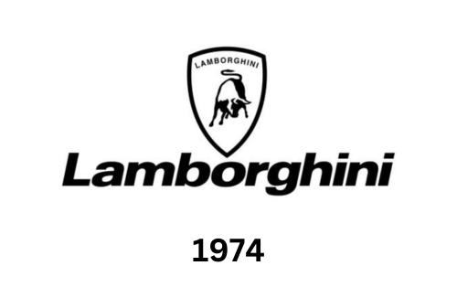
In 1974, Lamborghini came up with a new version of its logo. This time, they opted for a more modern and sleek look. The new design features a monochrome color scheme with a bold, sans-serif wordmark placed below the iconic charging bell in the sentence case. It gave the sign a more prominent and minimalist look. However, the brand name was still displayed in capital letters, and the signature bull logo was retained to ensure that the logo still recognizably represented the brand.
Modern Era (1998s-Present)
The Lamborghini logo we see today is an updated version of an emblem that has been around for years. The golden bull in the symbol is detailed to highlight its strength and muscle and looks more realistic than ever with added shadows and highlights. The use of gradients in the golden elements of the logo gives it a vivid and energetic look, synonymous with the Lamborghini brand.
The company name is now written in all capital letters in gold, making it easy to read and giving it a consistent look. Gold against a black background is a perfect representation of luxury. To add a touch of elegance, there is a golden outline around the black shield.
Overall, Lamborghini’s updated logo is a perfect example of how a simple design can be made to look modern and luxurious.
Symbol meaning
Have you ever wondered why the Lamborghini logo has a bull? There are a few reasons for this.
First, the founder of Lamborghini was born under the astrological sign of Taurus – the Bull. He had a passion for bullfighting and participated in many events. The bull symbolized strength and beauty to him, making it the best representation of his automobile brand.
But there is more to it than that. Lamborghini believed that the Bell shared many characteristics with the design of its cars, such as power and speed. The bull has long been associated with strength and energy worldwide, and even in Greek mythology, it was a symbol of Zeus, the leader of all the gods.
The bull motif in the Lamborghini logo has remained virtually unchanged throughout the brand’s history. This presents the bull in a stable state, ready for action. Today, logos help to capture a brand’s unique identity, distinguishing it from the competition.
Lamborghini logo color
Did you know the Lamborghini logo has undergone a few color changes over the years? While the company has played chiefly with monochrome logo versions, it has also experimented with red and white to convey passion and power. However, the most popular colors in the Lamborghini logo are black and gold. A black shield behind a bull symbolizes sophistication, energy, and status, making it an excellent choice. On the other hand, the golden elements of the logo are associated with luxury, wealth, prestige, and beauty. So, the next time you see a Lamborghini, you can appreciate the thought that went behind the logo design!
Conclusion
The Lamborghini logo is one of the most iconic designs in history, known for its luxurious and stylish appearance. The golden color of the logo represents excellence and enjoyment, while the black color symbolizes strength and power. The logo features a bull, known as “Taurus,” the perfect symbol to emphasize the company’s stability and performance. It’s no wonder the Lamborghini logo is recognized worldwide – its sleek and striking look is hard to miss!
