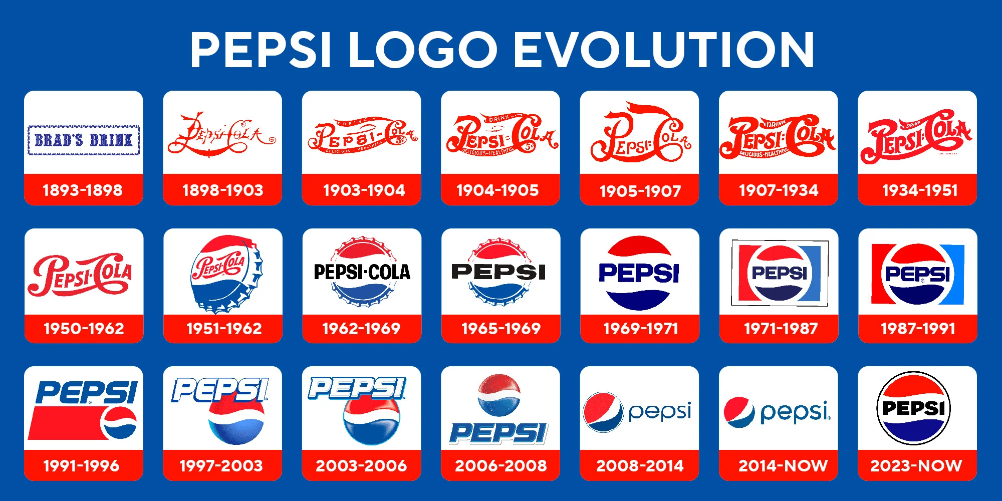
The history of the Pepsi logo is a fascinating journey through over a century of branding, design trends, and cultural evolution. From its inception in the late 19th century to its current iteration, the Pepsi logo has undergone numerous transformations that reflect the changing tastes and times. This article will explore the evolution of the Pepsi logo in detail, delving into its origins, redesigns, and the significance behind each iteration.
The Beginnings of a Beverage Empire
Pepsi-Cola was first created in 1893 by Caleb Bradham, a pharmacist from New Bern, North Carolina. Initially called “Brad’s Drink,” it was intended as a refreshing beverage that would aid digestion. By 1898, Bradham renamed the drink to “Pepsi-Cola,” combining the terms “pepsin” (a digestive enzyme) and “cola” (a reference to the kola nut, a key ingredient).

The first Pepsi logo, introduced in 1898, was a simple, swirly script resembling handwriting. This logo had a sense of authenticity and charm, typical of turn-of-the-century branding. It reflected the artisanal nature of Bradham’s product and his focus on quality.
Early 20th Century Of Pepsi Logo: Establishing a Brand Identity
1905: The First Redesign
In 1905, the logo underwent its first redesign. The updated logo featured a more refined and streamlined script, with cleaner lines and a slightly more professional appearance. This redesign marked the beginning of Pepsi’s efforts to position itself as a competitor to Coca-Cola, which was already dominating the soda market.
1906: Emphasizing Purity
Just a year later, Pepsi updated its branding again to include the slogan, “The Original Pure Food Drink.” This addition highlighted the beverage’s purity and health benefits, aligning with consumer concerns of the time. The logo maintained its script style but became more structured, with additional flourishes and decorative elements.
The 1930s: Surviving Economic Turmoil
During the Great Depression, Pepsi struggled financially and faced bankruptcy. However, the brand managed to survive by rebranding itself as an affordable alternative to Coca-Cola. The logo remained relatively unchanged during this period, but the emphasis shifted to marketing campaigns that highlighted value and accessibility.
1940s: Enter the Bottle Cap
The 1940s were a transformative decade for Pepsi’s branding. During World War II, Pepsi adopted a patriotic theme to appeal to American consumers. In 1943, the logo took on a new form: a bottle cap design featuring red, white, and blue colors. This design not only resonated with wartime patriotism but also set Pepsi apart from its main rival, Coca-Cola. The bottle cap logo became an iconic element of the brand’s identity and remained a key feature for decades.
1950: Streamlined and Modernized
In 1950, Pepsi modernized its logo once again. The bottle cap design was retained, but the script was simplified, and the overall look became cleaner and more contemporary. This redesign reflected post-war optimism and the growing consumer culture of the 1950s. The emphasis was on making the logo easily recognizable and visually appealing.
The 1960s: Embracing Modernity
1962: The Shift to Sans-Serif
The 1960s brought significant cultural and aesthetic changes, and Pepsi’s logo evolved to match the times. In 1962, the brand introduced a bold sans-serif typeface for the wordmark, abandoning the script style entirely. The bottle cap design remained but was simplified further, with a more minimalistic and modern look. This redesign marked a significant departure from traditional branding, signaling Pepsi’s embrace of modernity and innovation.
The 1970s: A Global Perspective
1973: The Pepsi Globe is Born
One of the most significant milestones in the history of the Pepsi logo came in 1973 with the introduction of the “Pepsi Globe.” The bottle cap design was replaced with a circular emblem featuring red, white, and blue waves. The wordmark was placed next to the globe, creating a balanced and visually striking composition. This design reflected the brand’s growing global presence and its aspirations to be a universal symbol of refreshment.
The 1980s: Bold and Dynamic
The 1980s were marked by bold and dynamic design trends, and Pepsi’s logo evolved to reflect this aesthetic. The globe design was enhanced with brighter colors and sharper lines, creating a more energetic look. The wordmark was also updated with a sleeker typeface, emphasizing the brand’s forward-thinking attitude.
The 1990s: A New Era of Innovation
1991: A Sleeker Look
In 1991, Pepsi redesigned its logo to give it a sleeker and more contemporary appearance. The globe was tilted slightly, creating a sense of dynamism and movement. The wordmark was modernized with a more rounded typeface, and the overall design became more polished. This redesign reflected the brand’s commitment to staying relevant in an increasingly competitive market.
1998: Celebrating 100 Years
To mark its centennial anniversary in 1998, Pepsi introduced a new logo that retained the core elements of the globe and wordmark but added depth and dimension. The globe featured a more pronounced three-dimensional effect, while the wordmark was placed inside a blue rectangle, emphasizing the brand’s corporate identity. This redesign was part of a broader campaign to celebrate Pepsi’s rich history and its vision for the future.

The 2000s: Digital Age Adaptations
2003: The “Pepsi Globe” Refined
In 2003, Pepsi refined its logo once again, focusing on simplicity and clarity. The globe was given a more polished and streamlined appearance, with gradients and shading to enhance its three-dimensional effect. The wordmark was updated with a cleaner, more modern typeface, and the blue rectangle was removed to create a more open and inviting design.
2008: The “Smile” Logo
In 2008, Pepsi underwent one of its most radical rebrands yet. The new logo featured a redesigned globe with asymmetrical waves that resembled a smile. This design was intended to convey optimism, joy, and a youthful spirit. The wordmark was also updated with a lowercase typeface, giving the brand a more approachable and casual look. This redesign was part of a broader effort to appeal to younger consumers and reinforce Pepsi’s identity as a fun and modern brand.
The 2010s: Refinement and Consistency
2014: Subtle Adjustments
In 2014, Pepsi made subtle adjustments to its logo to enhance consistency across different media and platforms. The globe’s design was refined for better scalability, and the wordmark was slightly modified to improve legibility. These changes reflected the brand’s focus on maintaining a cohesive visual identity in an increasingly digital world.
The Current Logo: Timeless and Iconic
Today, the Pepsi logo remains one of the most recognizable symbols in the world. Its bold red, white, and blue colors evoke a sense of energy, refreshment, and patriotism, while the minimalist design reflects contemporary tastes. The evolution of the Pepsi logo is a testament to the brand’s ability to adapt to changing times while staying true to its core identity.
The Cultural Impact of the Pepsi Logo
The Pepsi logo is more than just a symbol of a beverage; it is a cultural icon that has played a significant role in shaping pop culture. Over the years, Pepsi has partnered with celebrities, musicians, and athletes to promote its brand, further cementing its status as a global phenomenon. The logo has appeared in countless advertisements, movies, and music videos, making it a familiar and beloved symbol for generations of consumers.

Pepsi vs. Coca-Cola: The Logo Wars
Pepsi’s logo history cannot be discussed without mentioning its rivalry with Coca-Cola. The “Cola Wars” have been a defining aspect of the beverage industry, with both brands vying for dominance through innovative advertising and branding strategies. Pepsi’s logo redesigns have often been influenced by this rivalry, as the brand seeks to differentiate itself and appeal to younger, trend-conscious consumers.
The Psychology of the Pepsi Logo
The use of red, white, and blue in the Pepsi logo is not just a nod to American patriotism; it also carries psychological significance. Red is associated with energy and passion, blue conveys trust and reliability, and white symbolizes purity and simplicity. These colors, combined with the logo’s clean and modern design, create a sense of freshness and vitality that resonates with consumers worldwide.
Fun Facts About the Pepsi Logo
- Hidden Costs of Rebranding: The 2008 redesign reportedly cost Pepsi over $1 million, making it one of the most expensive logo redesigns in history.
- Celebrity Endorsements: The Pepsi logo has been associated with iconic celebrities like Michael Jackson, Britney Spears, and Beyoncé, further enhancing its global appeal.
- Cultural Milestones: The Pepsi Globe has been featured in space missions, international sporting events, and even art exhibitions, showcasing its cultural significance.
Conclusion
The history of the Pepsi logo is a story of innovation, adaptation, and cultural resonance. From its humble beginnings as a pharmacist’s creation to its status as a global brand, Pepsi has continually reinvented itself to stay relevant and appealing. Each iteration of the logo tells a story of the times, reflecting societal trends, technological advancements, and consumer preferences. As Pepsi continues to evolve, its logo will undoubtedly remain a central element of its identity, symbolizing refreshment, energy, and the joy of life.


