The University of Denver is a prestigious institution focusing on scientific research and education. It was founded in 1864 in Denver, Colorado, and has since become one of the state’s most successful and prominent universities. The university offers various services to students, including tutoring and providing them with the tools they need to complete their projects. With more than 120 specialized programs spanning business, philanthropy, and mechanical science, students have many educational opportunities. The university has two campuses and consists of 10 schools and colleges.
Brand Overview
The University of Denver (DU) is a prestigious private research university located in Denver, Colorado, United States. Established in 1864, the institution was originally founded as Colorado Seminary and later rebranded to its current name in 1880. With a rich history spanning over 159 years, DU was founded by Methodists but now operates as a nonsectarian institution, welcoming students from diverse backgrounds. The university’s motto, “Pro Scientia et Religione,” translates to “For Knowledge and Spirit,” reflecting its commitment to academic excellence and personal growth. DU is academically affiliated with several organizations, including CUMU, IAMSCU, NAICU, and is recognized as a space-grant institution. As of 2020, the university’s endowment stood at an impressive $990.3 million, supporting its various programs and initiatives. Jeremy Haefner currently serves as the Chancellor, overseeing an academic staff of 782 and an administrative staff of 1,773 as of Fall 2022. DU boasts a total student population of 13,735, comprising 6,152 undergraduates and 7,583 postgraduates. The university’s urban and residential campus spans 125 acres (51 hectares), providing a vibrant environment for learning and extracurricular activities. DU’s official newspaper, The DU Clarion, keeps the community informed about campus news and events. The school’s colors, crimson and gold, are proudly worn by its athletic teams, known as the Pioneers, who compete in NCAA Division I as part of The Summit League and the NCHC for men’s hockey. More information about the university can be found on its official website, “du,” where students and supporters can also download the university’s official logo in PNG and SVG formats.
University of denver History
The University of Denver was initially called Colorado Seminary and focused on theological and philosophical studies. However, in 1880, the seminary was reformed and renamed the University of Denver. Since then, the university has continuously expanded its list of programs and courses. The university has an official seal that has been updated over time to represent the university’s brand in line with modern times.
Evolution of logo
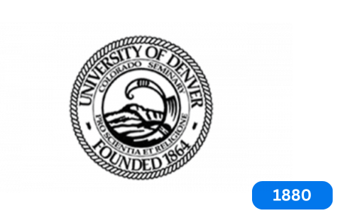
1880

The University has a symbol called ‘Seal,’ which has two main parts. The exterior bears the name of the university and the year it was founded. In the center is the first name of the university and its motto, ‘For Science and Religion.’ In the seal’s center is an image of a mountain landscape. There is also a rectangular ornament on the edge of the seal. This symbol is used on essential papers and documents signed by University officials and authorized facilities.
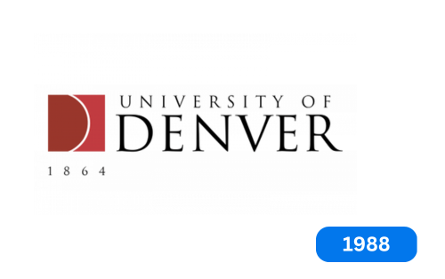
1988

When electronic and internet technologies emerged, the university needed a logo representing its values. In 1988, the first primary logo for the brand was created. The emblem comprises two lines of text in capital letters and a symbol. The symbol is a square divided in half by a circular line. The first half is dark red and shaped like the letter ‘D,’ while the second is brighter and resembles a truncated rectangle.
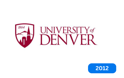
2012

The University of Denver changed its logo in 2012 with the help of its brand design branch. The new logo has two significant differences from the old one. First, the word “of” in the university’s name is now written in lowercase letters, as before. Second, the previous symbol is replaced by a shield. The shield depicts a substantial building on the university campus, set against a beautiful mountain backdrop. Above the shield, you can see the year the university was founded, 1864.
Today

The University of Denver recently upgraded a visual identity as part of a brand renewal program. The program focused primarily on the academic mark, with only a few other elements modified.
To keep up with the times, the higher education institution announced a multi-year and multi-purpose evolution of its brand in September this year. This evolution aims to unify the university’s programs and its two campuses. The move took a long time to prepare, with two years of research and market leading up to it. Students wanted a familiar DU logo to enhance prestige and unity. As a result, the university now has a new logo, improved font, modern elements, and an expanded palette.
Font and color
The new sign design features interlocking block letters. The “U” can be seen in the space of the “D” instead of above it. The glyph in the background is gold; on the front, it is dark red to improve visibility. The corners of the letters are no longer cut off and are rounded for a more elegant look.
The lettering on the side of the sign has been updated with a finer font that replaces the classic serif with a slight thickening. The pointed ends of the letters make them look sharp and distinct. The background of the inscription is a silver ring.
Conclusion
The University of Denver has changed its logo numerous times to stay current and relevant. The latest interlocking DU logo represents the university’s vibrant spirit and diverse community. A solid and consistent brand identity is crucial for any institution, significantly higher education. The University of Denver’s rebranding journey demonstrates the importance of staying true to its roots while adapting to a changing landscape, ensuring the university remains a symbol of excellence and innovation.


