The Miami Dolphins logo has been with the team since its inception in 1966. This excellent and unique design uses two colors and shows a dolphin jumping in the Florida sun. Although the logo has changed, the main idea has remained the same. It is one of the best logos in sports and has been around for a long time. Although the Dolphins haven’t been as successful recently, they have a great history with excellent players like Don Shula and Dan Marino. In this article, we’ll look at how the logo has changed over the years. If you are interested in logos, you may also want to check out our list of free brand logos.
Brand Overview
The Miami Dolphins are a professional football team based in Miami, Florida. They are a member of the American Football Conference (AFC) East division in the National Football League (NFL). The team was founded on August 16, 1965, and has since become one of the most recognized franchises in the league. The Dolphins were established by Stephen M. Ross, who played a significant role in shaping the team’s early years and laying the foundation for its success. Over the years, the team has achieved numerous milestones, with some of the most notable being their back-to-back NFL championships in 1973 and 1974. These victories solidified the Dolphins’ reputation as a dominant force in professional football and highlighted their ability to compete at the highest level.
Currently, the Miami Dolphins are led by head coach Mike McDaniel, who has brought a fresh and innovative approach to the team’s strategy and gameplay. His leadership style emphasizes adaptability, creativity, and a strong work ethic, all of which have contributed to the team’s ongoing efforts to achieve success in the modern NFL landscape. Working alongside him is the team’s general manager, Chris Grier, who has been instrumental in shaping the roster and making key personnel decisions to build a competitive squad. Grier’s expertise in player evaluation and team management has helped the Dolphins stay competitive and strive for excellence in the AFC East division.
The Miami Dolphins’ official website, miamidolphins.com, serves as the primary source of information for fans and followers of the team. The website offers updates on team news, player profiles, game schedules, ticket information, and exclusive content for Dolphins supporters. Whether fans are looking for the latest updates on the team’s performance or seeking behind-the-scenes insights, the website provides a comprehensive platform to stay connected with the franchise. Additionally, for those looking to showcase their support for the team, the website offers the option to download the official Miami Dolphins logo in both PNG and SVG formats, allowing fans to use the logo for personal or promotional purposes.
Throughout their history, the Dolphins have built a rich legacy that includes numerous playoff appearances, legendary players, and iconic moments that have left a lasting impact on the sport. Their commitment to excellence and their dedicated fan base have made them one of the most beloved teams in the NFL. The team’s success in the 1970s, highlighted by their undefeated season in 1972, remains one of the most remarkable achievements in professional sports history. That season, the Dolphins went a perfect 17-0, culminating in a Super Bowl victory, a feat that has yet to be replicated by any other team.
As the Dolphins continue to build for the future, they remain focused on their mission to bring another championship to Miami. With a strong leadership team, a talented roster, and the unwavering support of their fans, the Miami Dolphins are poised to make an impact in the NFL for years to come. Whether through their historic achievements or their present-day pursuits, the Dolphins continue to embody the spirit of resilience, determination, and excellence that defines the franchise.
Dolphin’s logo history
The Miami Dolphins are a professional football team that is located in Miami, Florida.. They are part of the AFC Eastern Division and have been a member of the NFL for many years. The team was formed in 1965 when two men named Danny Thomas and Joseph Ruby received a franchise to expand their team at a cost of approximately US$8.1 million. He initially intended to leave the team in Philadelphia, but a league manager recommended that he move to Miami instead. Joseph Robbie became the team’s sole manager until the 1990s when Wayne Huizenga bought part of the shares.
2009 Stephen M. Ross became the team manager after purchasing 95% of the shares. The team name was chosen by the competition when it was first created. The dolphin symbolizes the team’s location and is known as an innovative and fast sea creature. Joseph Ruby explained that dolphins are very brave and can even be forced to attack sharks.
Miami Dolphins logo Evolution
The Miami Dolphins have always had a unique logo representing their sunny connection to Miami. Over the years, the team has made several changes to its logo but has always stuck to the original concept and style that has made it recognizable. The Dolphins logo is one of the most iconic in the NFL and is instantly recognizable to fans. This article will examine how the iconic dolphin symbol has evolved while retaining its original essence.
In 1966-1973
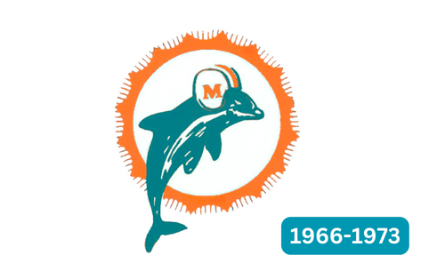
The Miami Dolphins first unveiled their logo in 1966, the same year the team was formed. The original design featured a dolphin standing on its tail within an orange circle. The Dolphins wore a sports helmet with an “M” written on it, representing the team’s name. The dolphin’s body was painted white and orange, making it look wet, and it had just jumped out of the water. The logo also included a sun with rays radiating from its center. The dolphin was turquoise, and the orange was bright and light.
In 1974-1989
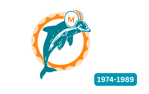
In 1974, the Miami Dolphins decided to redesign their logo nearly ten years after its creation. The new image featured a sleeker and more oversized dolphin silhouette, which was shifted to the right and overlapped with the contour of the sun. A dolphin’s head was placed behind the circle, and the logo was completed with a football helmet painted in white and blue, with the team’s monogram “M.” The orange color was changed to a lighter, powdery shade, and the particles on the dolphin’s body were simplified, leaving only white. Even the sun rays were improved, giving the logo a fresh, appealing look.
In 1989-1996
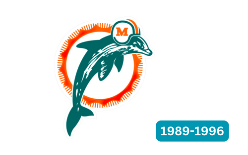
In 1989, the Miami Dolphins logo was changed. The designers made some subtle changes to the logo, such as darkening the turquoise and orange colors and giving the blue a hint of green. They also changed the font to make it bolder. The logo became more pronounced, and the lines on the helmet were widened to give the dolphin a sleeker look. The dolphin’s body became more extended and narrower, and the fins became longer and more powerful. This made the logo look more balanced. The white spot on the dolphin and the sun’s rays remain the same.
In 1997-2012
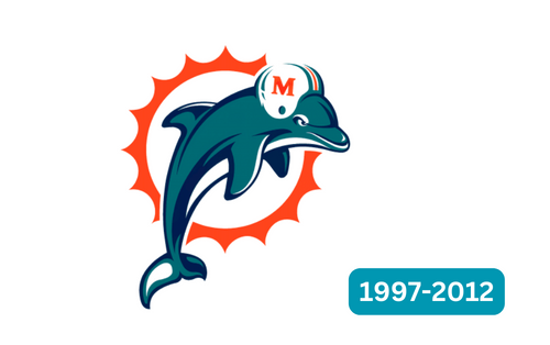
In 1997, the Miami Dolphins changed their logo. The new design featured a more cartoonish dolphin that was longer and more balanced. Spots were removed, and light strokes were added around the eyes and phlox. A broad white line was also drawn in the stomach. The design was more accurate, with brush strokes replacing the previous lines, making the dolphin look more realistic.
The helmet was also redesigned with a more realistic look, thinner lines, and an additional eyelet. The smaller rays of the sun were removed, and the more comprehensive, sharp rays were left behind. Colors were more vibrant, and aquamarine was added to the blue color scheme. The lines of the dolphin and the sun were smoothed out, adding depth to the image.
In 2013-2017
Back in 2013, the Miami Dolphins decided to update their logo. They wanted it to look more modern and less cartoonish, so they replaced the old image with a cute design featuring a jumping dolphin.
The new logo was based on the original version, but the shapes and lines were cleaned up, and additional design details were added to highlight the sun and dolphin. The dolphin was drawn without a helmet, and Sunburst lengthened and sharpened some of its lines to create a more realistic look. The updated logo features a turquoise, blue, and white palette, giving it a fresh, contemporary feel. It was a significant change that reflected the club’s desire to stay relevant and move with the times. Overall, the new logo looked much better than the old one and helped rebrand the Miami Dolphins as a more modern and progressive team.
In 2018-today
Did you know that the current logo of the Miami football team is an updated version of the previous one? The designers made some changes to the design, such as making the circle of the sun a darker orange and giving the dolphin a more elegant appearance. They also took off the helmet that the dolphin was wearing. Interestingly, the designers found that the logo was still easily recognizable without the letter “M,” which was added to represent the city of Miami. Compared to the previous version, the current Dolphin looks more dynamic and agile, perfectly representing the football team’s strengths, speed, and intelligence. The elongated shape of the dolphin’s body gives it a sense of movement, making it seem like it is in the middle. The logo symbolizes the team’s ability to overcome obstacles and drive to succeed.
Font and colors
A company logo has only the letter “M.” Its typeface was a classic, clear serif type. The color scheme is famous, with orange representing the sun and tea for the Atlantic Ocean. In the logo’s center is a light blue dolphin with a white solar disk surrounded by sharp orange triangular rays. The dolphin’s position has changed over time, and the current version uses coral red, blue, and white for the rays, dolphin, and sun disk.
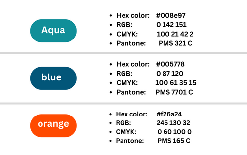
Color Codes Miami Dolphins logo
Conclusion
The Miami Dolphins have had a few different logos over the years. What do you think about these changes? Did you like the old logo better or prefer the current one? The Miami Dolphins are Florida’s most senior football team, with much to be proud of. Both their logo and mascot are trendy and well-known. Everyone loves the dolphin logo – it’s classic and unforgettable. Every time you see him, you can’t help but feel like you’re part of the team. The dolphin logo, in particular, is timeless and memorable, leaving a deep impression on anyone who sees it.


